1.0 Introduction
Recent correspondence made me realise that the reasons why Semplice is built the way it is might not be obvious to everyone, so I thought I'd collect my responses and thoughts here.
Q. Why does Semplice insist on square album art?
A. Partly because the CD jewel case standard insists on it (the design of the standard CD jewel case allows for a 120mm x 120mm booklet/liner note, and the front page of that will be the visible album art. So, CDs generally used square album art (there are always exceptions, obviously: boxed sets are the most obvious example) and Semplice just followed that standard.
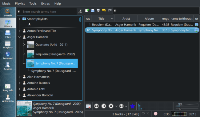
Additionally, many software music players will display album art, and they tend to display it in square windows or panels. For example, this is Clementine in its default, fresh out-of-the-box configuration:
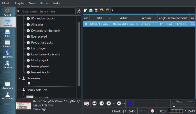
The tiny album art thumbnail you see down at the bottom-left of the screen is Clementine's default way of showing album art: and it's a square thumbnail. Even when the embedded album art is extremely non-square, the display panel indicates it would prefer square artwork:
Here, obviously rectangular artwork is still displayed in a panel that leaves 'letterbox' blank space above and below, so the display component of that panel is pretty blatantly designed to display square, or nearly-square, artwork.
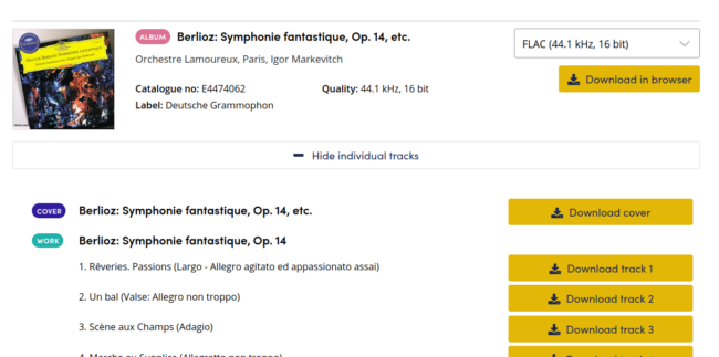
Finally, most downloadable FLACs of my acquaintence all come with nearly-square artwork, fresh from the record company. Here, for example, is a purchase I made of some Berlioz:
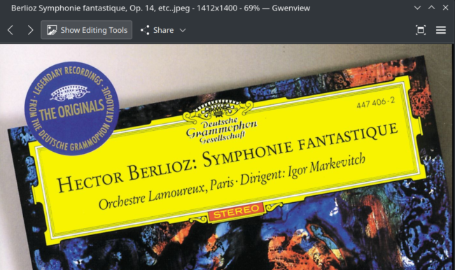
...and if I download that 'Cover' item and open it in a graphical editor, we see this:
From the program's title bar, you can see the downloaded artwork is 1412 pixels by 1400: pretty square! That's also true for practically any other album art I've ever downloaded from sources such as Musicbrainz, AllMusic, Discogs and so on: the specific pixel dimensions will vary, but the general requirement for squareness will not.


