 The name 'AIMP' doesn't trip easily off the tongue, but it stands for "Artem Izmaylov Media Player", with Artem Izmaylov being the original developer. It's been around a long while: the first version was released back in 2006. Development continues apace, meaning that you can be confident the player has a future -and plenty of bug fixes. Unusually, it's available for both Windows and Android -so if you wanted to be consistent about using the same player on your desktop PC and on your smartphone, AIMP has a lot going for it.
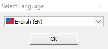
The software is available for free download from the project's website. I used version 4.60.2156, which was the current stable version at the time of writing. It's a pleasingly small download at that: just 11MB or so. The installation is slightly more complicated than I think it should be, though. First you have to select a language:
Only then are you presented with the standard sort of installation wizard:
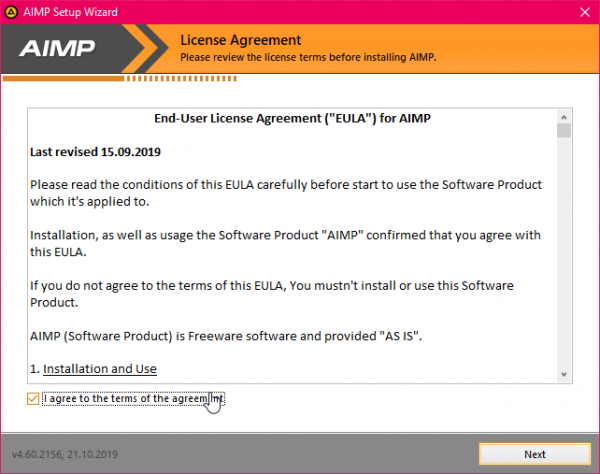
Unfortunately, when you click [Next], there's then a license agreement to approve before you can proceed further:
I've read the EULA presented here and feel reasonably confident that it doesn't hide anything untoward in its legalese. So, tick the 'I agree' box, and click [Next]. It would be nice if the installation process then began, but it doesn't:
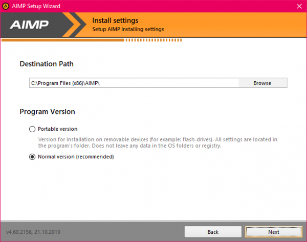
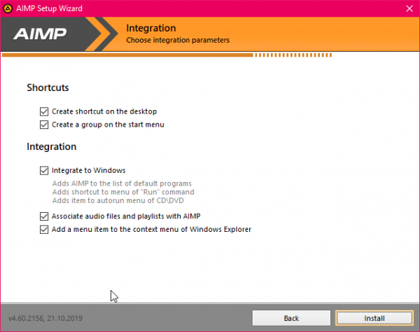
Instead, you have to make a choice between using the 'portable' install or the 'normal version'. I went for the normal version, so another click of the [Next] button... now does the installation start? No. Instead you get this:
I appreciate these are all valid questions to ask, but they get in the way of the actual installation process. They also will cause problems if left set to their defaults, as I'll show you in just a second. For now, you can finally kick of the actual installation process by clicking [Install]. Files are then copied in less time than it took to click through to that last screen!
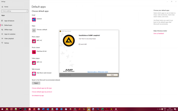
Once the installation process completes, you see this:
This is where all those 'integrate to Windows' options I mentioned earlier come to bite you: they don't work terribly well on Windows 10! For a program to become the default way of handling music files and playlists, it is no longer sufficient to click an option in a program's installation wizard: you also have to use Windows' own 'Default apps' settings utility, which is why that has popped up in the background. If you just close it without doing anything, AIMP won't have been set as the default player for your PC, despite what you asked for in the installation wizard.
It's a bit clumsy, in short. It's not particularly the program's fault (Windows 10 is just awkward like that!), but it highlights what happens when a program that was designed for the likes of Windows 7 and XP aren't thoroughly updated to work on Windows 10.
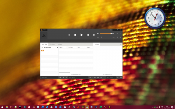
Anyway: I finally launched the player and was presented with this:
That's to say, the program appears in a small window in the middle of your desktop, not full-screen. I don't particularly like that, though I appreciate it's a matter of taste and not a show-stopper in any event, but I'd prefer the program would display full-screen by default.
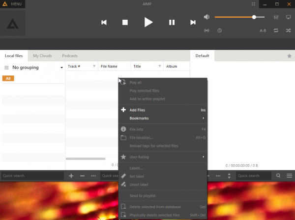
There are two other things I don't like at this point, too: the 'flatso' look of the player isn't attractice to my eyes for one thing. Secondly... what do I do next? It's in no way obvious how you go about adding your music collection to the player's own database. I clicked around for a while without much success, until I happened to try right-clicking the main display area:
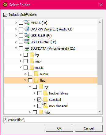
The context menu that appears at this point allows you to click the 'Add Files' option, which in turn brings up the 'File monitoring' screen which has a large [Add] button on it. Once that's clicked, you can navigate to your music collection:
Here, I was able to select my classical music collection on the Z: drive, which is a mapped network drive on my desktop PC. You can also navigate directly through the 'Network' option (not shown in the above screenshot), which allows you essentially to point the program at a network URL directly (eg, \\monteverdi\bulkdata\music... and so on).
Once you've added that directory and clicked [Update], the display in the main program window first changes to this:
...which indicates "something" is happening. After not too many minutes, that part of the main display then changes to this:
I was very pleased to see this! It's proper feedback, telling you that actual music files have been found in the specified location and that they are being added to the program's database. The count ("177 of 55762") tells you exactly how far the music collection process has got. It's the sort of useful feedback that all music players should provide when first scanning your music collection -but which many do badly, or not at all. Full marks to AIMP on this score then!
Unfortunately, the program's main screen area remains completely devoid of any music until all of it has been scanned and added. It means that it will be many hours before you can begin to play anything with AIMP, if you have a large music collection like mine. In this, AIMP is not unusual, but the gold-standard approach would be Foobar2000's, where music is displayed on the main screen (and is thus playable) as it's collected, rather than having to wait until all music is collected before any of it is playable. On the other hand, the good news is that AIMP does its music collection as fast as Foobar2000 (around 6 hours to collect my entire music library over a wireless network connection, which is significantly faster than the likes of Strawberry or Dopamine can manage).
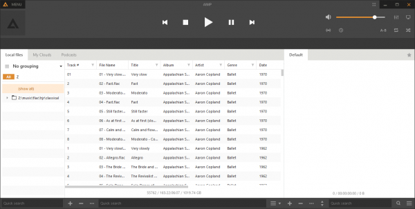
Once the music collection process is complete, the main program display changes to this:
There is a lot wrong about this display! For a start, as it tells you on the top-left, there is 'no grouping' applied to this long list of individual tracks. That's not difficult to change, of course: click the drop-down arrow next to those words and you can select to group by 'Artist - Album', for example:
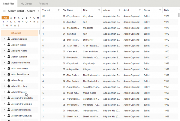
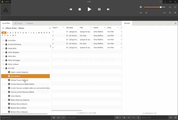
This, at last, gives us a browse-able list of composers to work with -though the main panel still displays every track by every composer. That only changes when you click one of the composers in the left-hand pane:
So that gets us to a music library listing that is, at least, usable. But it's all very textual with very little graphics to lighten proceedings. The little 'person' icon next to each composer name suggests you should be able to add 'artist art' for each one -but I could find no way of doing so, and it would be a major manual effort to do so, anyway. There are also no obvious dividers between the 'A' artists and the 'B' ones, or between the B's and C's for example: you just get a long list with no obvious sections within it. Not the best way of presenting this information, I think.
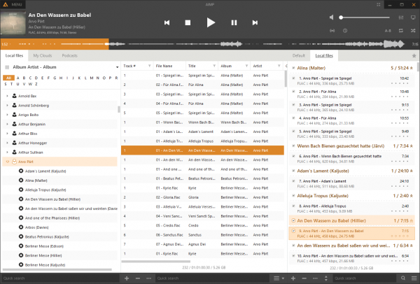
When you start playing a track, the display changes to this sort of thing:
If you squint a bit, you might just be able to make out a bit of album cover art in the top left-hand corner. There's also a weird 'bar' across the top of the playlist area that displays a 'waveform' of the track being played: the orange colour creeps across it, telling you how far through the track you are. But the overall impression at this point is: it's a hell of a lot of text! It's pretty ghastly, to be frank: one of the worst textual displays I've seen in any of the players, to be honest (though I realise that's a matter of opinion only).
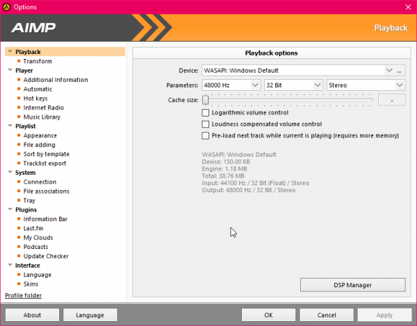
If we click the Menu item and select Preferences (or press Ctrl+P), we see a huge number of things to tweak and fiddle with:
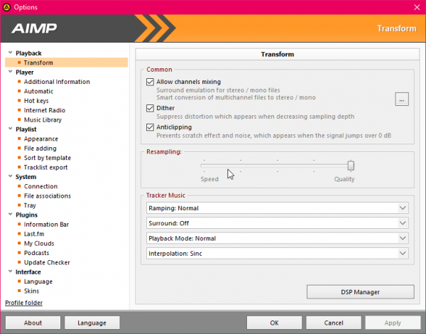
For starters, there's a very comprehensive set of output options under the 'Playback' item: if you have a complex setup with multiple sound cards or output devices, it's easy to configure the program to use the exact device you want. I am not so keen on the options available on the 'Transform' screen, however:
I get that these might be useful to some people, but here we have a music player configured by default to 'dither' and do 'anticlipping' the music signal. Obviously, I can switch those options off at this point... but I don't want my music player fiddling with the audio signal at all unless I tell it to, so this set of options is the wrong way round for me. I want opt-in, not opt-out. My music player of choice should leave my music signal unchanged unless I specify otherwise.
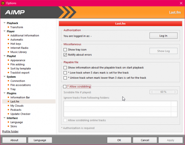
On a more positive note:
...AIMP will easily scrobble to Last.fm (that is, report my listening habits to Last.fm, which is something I've done for years and like to see a music player being able to do natively, as AIMP does). It is slightly disappointing to not see an option to scrobble to Libre.fm as well (or instead of), but that's something I could live with.
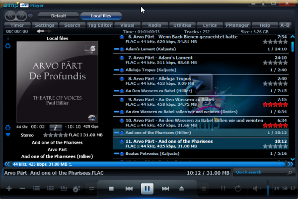
The last item on that Options screen is 'Skins', and there are a wide variety of skins you can download and apply to completely change AIMP's appearance. For example:
That's exactly the same player as before, only this time with the SplashX skin downloaded and installed, which is the most popular skin at the time of writing. I'm not convinced it is the sort of skin I'd like to use for very long, but it's perhaps nice to know you can perk up AIMP's default display without too much effort. Skins are, at least, a lot easier to deploy than those for (say) Foobar2000.
Apart from the programs tendency to want to fiddle with the audio signal (which you can turn off), AIMP plays my music well. The big question is, can it do proper gapless playback though? My standard test for this is to play the bit from Britten's Gloriana when the Queen stops singing and the chorus start singing 'Victor of Cadiz': if you hear a noticeable gap between the two, the player isn't doing true gapless playback. How does AIMP fare on this test? Well, here's what it sounds like:
And here's what it looks like:
Now this is an interesting one, because there's no obvious gap visible in the waveform of the capture there (the track transition is at around the 6.5 second mark). And if you simply listen to the audio track, you'd also perhaps think that there's no gap between the tracks too. And there isn't -but it's because AIMP is fading out from one and fading in to another, which results in a nasty spot of 'overlap' or 'blur' between the tracks, rather than true gapless playback. At around 6.5 seconds, in other words, you can hear the Queen singing and the chorus at the same time -which isn't what's written in the score and shouldn't be what you hear on a decent music player! You can get away with that sort of thing as you mix between one 'pop music' track and another, but in classical music, it's a complete no-no. AIMP fails the gapless playback test quite badly, then.
It is perhaps possible to get slightly better transitioning between tracks if you turn off all the audio processing options I've already mentioned and maybe there are other ways (or maybe a plugin) to achieve it ...but, frankly, this is a solved problem these days and if you have to do battle with your media player to achieve it, I'd rather not waste my time.
I shall therefore end the review at this point, realising that there is a lot of functionality I haven't fully explored.
In conclusion:
Good Points:
-
- Under active development
- Good feedback displayed when collecting music from your music folder for the first time
- Reasonably fast music collection process
- Easily skin-able
Bad Points:
-
- Over-elaborate installation process
- Default looks are flat and unappealing
- Won't display any music (or allow playing of any music) until the entire library has been scanned
- No default grouping: you have to apply your own, otherwise you just get a long list of individual 'songs'
- Very confusing text-everywhere look when playing music
- Scanning/navigating through a large music library not as easy as it could be: lots of scrolling, no obvious breaks between sections of composers etc
- Default options are to mess with the sound signal
- Most skins look dreadful and very visually 'challenging'
- No proper gapless playback. Eliding between tracks doesn't count. Showstopper.
Overall Score: 3/10. It looks as if it ought to be a very capable, modern player, but it gets the basics wrong (no default grouping, no gapless playback, default is to muck about with the music signal). I really wanted to like it, but its defaults are very poor. The 'pretend' gapless feature, whereby it overlaps two tracks to make it seem gapless is a really bad way of handling classical music!
