 Winamp is a curious beast. It's possibly the music player reviewed here with the longest development history: Version 1 was released waaaay back in 1997. Unfortunately, it's been a bit of a rollercoaster ride since then: Version 2 (1998) was loved; Version 3 (2002) was mostly despised. The company which originally developed it sold out to AOL in 1999; AOL then sold it on to Radionomy. Radionomy have done nothing with it since acquiring it in 2014, except to leak a beta version 5.8 and to declare that a version 6 would be released in 2019. It is now November 2019... and the crickets are chirping!
I cannot in all honesty recommend a piece of software whose development history is so chequered, to the point where its current owners promise to release a new version and then don't.
Nevertheless, version 5.8 can be downloaded from the winamp website -which, please note, doesn't use https and is therefore declared 'insecure' by most modern browsers. Their own, rather abandoned, website declares that this version is "not an ongoing project", though it then goes on to promise future developments. My own sense is that version 5.8 is more or less 'abandonware', which makes doing a full review of it somewhat redundant. Nevertheless, I'll take a quick walk through its key features.
Installation is straightforward, although it does prompt for the Windows firewall to have ports opened for it, which means some sort of connection to the Internet might happen, which isn't really what you want to see for a straightforward media player. Nevertheless, I allowed access when prompted. You are then immediately asked to pick a 'skin' to determine the look and feel of the player: you can't actually see the player at that point, and the thumbnail images in the dialog are small, so you really don't have a good idea of what it is that you're selecting or the benefits of one skin over another. It's a choice that can be changed later on, but it's silly to make you choose it at this point. A good, standard, default skin automatically applied to kick things off would be a better approach, I think. Anyway: I went with 'Bento Big', if it helps any!
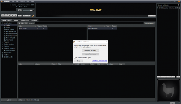
The first time Winamp then runs, it auto-plays a rather silly 'brand song': "Winamp, it really whips the llama's ass". It's a nod to its ancient 1997 heritage, but it's pointless and rather annoying! You are immediately prompted to tell the program where your music is stored:
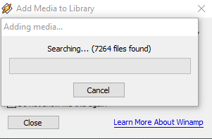
Clicking that 'Add Media' button brings up a standard Windows file manager, allowing you to point to any local or network source of music files. As soon as you confirm the location, it starts scanning it:
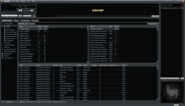
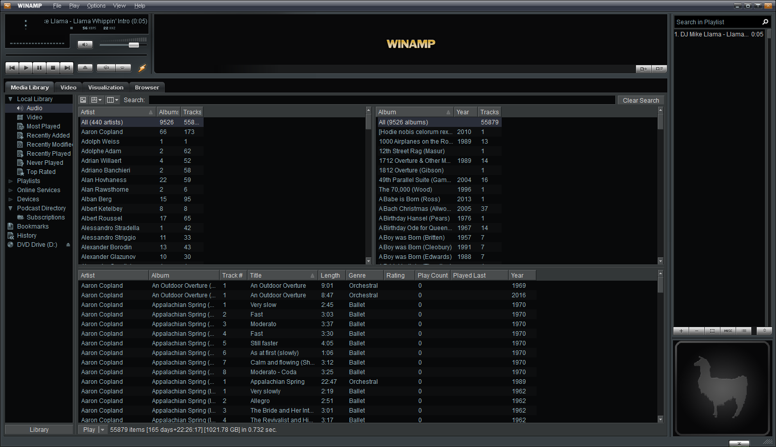
Joy of joys, you get a proper progress dialog box, so you are left in no doubt how far it has got and how long you're likely to be left waiting before it scans all your music!! More music players should do this sort of feedback! Unfortunately, this dialog is modal, so you can't use the music player at all until it has finished collecting all the music. This isn't uncommon, but really decent music players (like Foobar2000, for example), do the collection in the background and let you play the music collected so far, making the player much more immediately usable. The music collection/scanning process itself is done reasonably quickly and when it completes, this is what things look like:
I'm not overly impressed with that as a 'first look'! There's a lot of nonsense going on in the far-left panel: I'm only interested in playing music, so the 'audio' item is the only thing I really want to see in the tree of options there, but Winamp wants to be all things to all people, so clutters things up. The main music navigation is going to take place in those three middle panels: select an 'artist' on the top-left, select an 'album' on the top-right and the tracks associated with that album will appear in the bottom panel. It's OK as far as it goes, but it's a clunky way to walk your way through a large music collection, I think, especially as there's no quick way to jump between sections of the alphabet (from the As to the Ds, for example), and no separators between alphabet sections. It's just one great long list of composers and is accordingly very awkward to use. It also leaves one wondering what the very top panel (displaying 'WINAMP') is for, or what the two far-right panels are going to display.
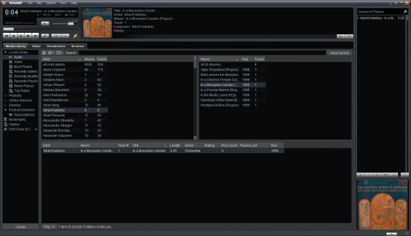
Once you play a track, it becomes a bit clearer what those extra panels are for:
The bottom-right panel displays the album art. But, er... so does the top panel, albeit with some media information associated. I can't help thinking that's a lot of wasted space on top! The upper far-right panel is the 'playlist': you can right-click a track selected in the middle of the player and select 'enque selection' from the context menu that appears; that new track will then be appended to the list of tracks shown in that upper-far-right panel, which then shows you what tracks are 'coming up'. It's not especially bad nor especially good as interfaces go. The text is small, the graphics don't really add much to proceedings and the play controls (up in the top left) are rather small and a little skeumorphic for my tastes (I don't need my digital music player to have buttons which look like real chrome buttons off a 1980-vintage stacked audio amp!)
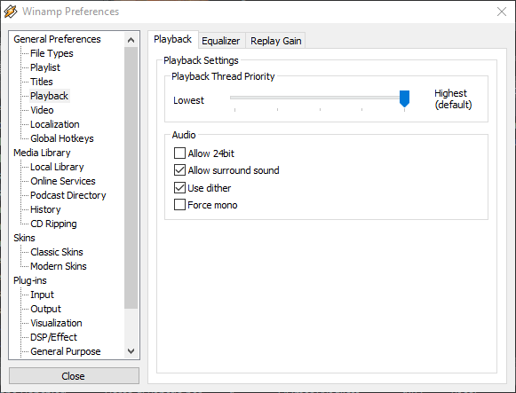
In terms of preferences to tweak things... well, this caused me concern:
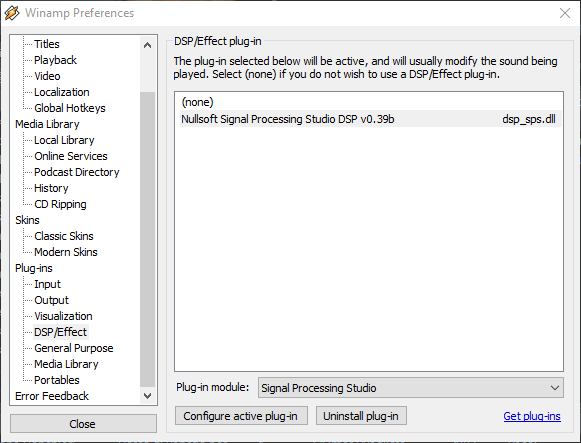
I don't exactly know what 'Use dither' is, but I don't want my music players messing with the music signal at all, let alone have an option to do so by default. It's easy to turn off, of course -but I shouldn't have to. More alarming still: down in the DSP/Effect section was this:
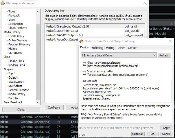
...which seems to confirm that your music signal will 'usually be modified'. Again: changeable by selecting None from the list of plugins, but I shouldn't have to. Meanwhile, if your PC uses an advanced audio setup with multiple output devices, Winamp can be configured to fit in with them by clicking on the Output option, selecting one of the output drivers and clicking the 'Configure' option:
That drop-down displaying 'Primary Sound Driver' can be selected to choose any other sound driver to which output will be directed, if need be.
I couldn't find, though, a native option to scrobble my music listening habits to Last.fm (something I've done for years). You can always download a separate audio scrobbler from Last.fm themselves: on installation, it will detect that Winamp exists on your PC and offer to scrobble from it. It works fine: but not having the Last.fm option built-in is unusual these days. Most other players do, after all, so this may be a sign of Winamp's advanced age.
So, all is not entirely well on the sound production side of things... but, to my relief, it can do proper gapless playback. Here's my standard test for that: a track rom Britten's Gloriana, where the Queen sings 'Go!' before switching to a completely separate track where the chorus sings 'Victor of Cadiz!': it's supposed to be a seamless transition. Here's what Winamp's attempt sounded like:
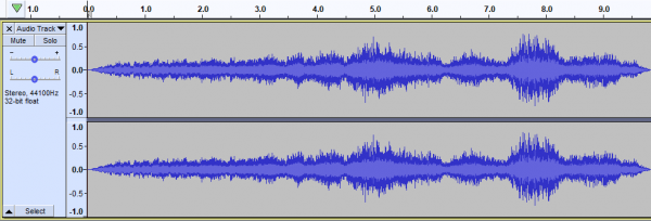
And here's what the waveform of that audio looks like:
In both cases, the track switch takes place at around 5.5 seconds in. I can't hear it, neither does the waveform display it.
I'll leave it there: if Winamp wasn't released as 'beta' software; if its owning company appeared genuinely to be developing a future version... well, then, maybe I'd suggest it was a half-decent player. It's library navigation tools are not the best; its configurability is not up there with the best, either -but, on the other hand, it works quite well out of the box and doesn't look a complete dog's breakfast whilst doing so. I dislike that some audio 'processing' (i.e., altering) options are on by default, but at least they can be turned off. The player has some reasonable metadata editing capabilities, though I prefer my music players to have none: if you are going to have them, though, then it's as well to make sure they are highly functional, which Winamp's mostly are. The tool reeks of not being a classical music player, though: from the 'whipping a llama's ass' audio that plays the first time it's launched, through to talking always about Artists, Albums and Playlists, it's obvious the player doesn't really understand composers, compositions and movements!
In conclusion, then:
Good Points
-
- Finds and scans a large music library reasonably quickly
- Gives proper, comprehensive feedback about how far it's got in scanning your music folders
- Doesn't seem to do a lot of pulling bad metadata from the Internet and over-writing your own metadata
- Looks and works OK out-of-the-box, for the most part
- Does proper gapless playback
- Don't appear to be too many advanced configuration options to deal with
Bad Points
-
- Can't play anything until the initial music scan is complete
- Lots of options to fiddle with the music signal are on by default
- Tiny playback controls (play, pause, volume control etc)
- Very dense on text, not a lot of use for album art (at least with the default skins): fairly old-fashioned look-and-feel accordingly
- Limited visual configurability: the skin you choose is pretty much all you'll get
- No native integration with Last.fm
- Seems to be, essentially, 'abandonware': neither updates nor bug-fixes are being actively developed or released
Overall Score: 6/10. It's not the best-looking player out there; it's not the most functional one either. But it plays music decently -at least it does proper gapless playback. It ultimately gets marked down because of its development history: it's not clear if this player has a future and in the meantime, there are no patches or bug-fixes being produced for it. That lack of active development is also demonstrated by the lack of Last.fm integration, the overall 'tired' look that relies more on text than graphics and the absence of really decent navigation tools with which to tackle a large media library. It's not the worst player I've seen, but it's not in the first division, either.
