 Foobar2000 (hereafter, just ‘Foobar’!) is a very small download (just 4MB). The latest version at the time of writing, and the one I’m reviewing here, is 1.4.8, which was released in late September 2019 -so, development of the program is active and on-going, which is always good to know.
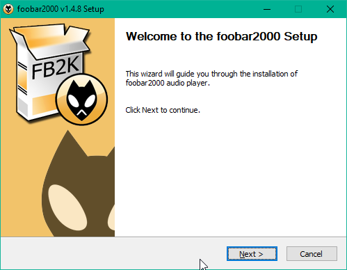
Double-clicking the download immediately launches the usual sort of installer wizard:
Note that Foobar must be a correctly-signed application: unlike Strawberry or Dopamine, for example, launching the Foobar installer doesn’t trigger Windows 10’s SmartScreen anti-malware defence tool. That’s again something which inspires confidence in the product.
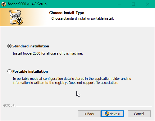
One click of [Next], followed by an [I Agree] to the license conditions (which are not onerous, but aren’t open source, either) leads you to this screen:
You can choose to run Foobar directly from an uninstalled executable, or do a ‘normal’ installation. I chose to do the Standard installation. You are then prompted as to which components to install: I think this is a bit unfortunate, as it complicates the installation process as compared to any other media players I review on this site. On the other hand, it’s ok to just click [Next] when prompted and thus to install the ‘default’ set of components. Installation then completes in just a few seconds.
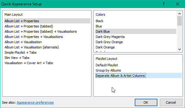
When first launched, Foobar presents you with a ‘Quick Appearance Setup’ window. This again complicates the process of running the software: it would be nice if there was just a standard, default appearance setting that you could change later on if you wanted, but could live with if you didn’t. Anyway, I selected the following options:
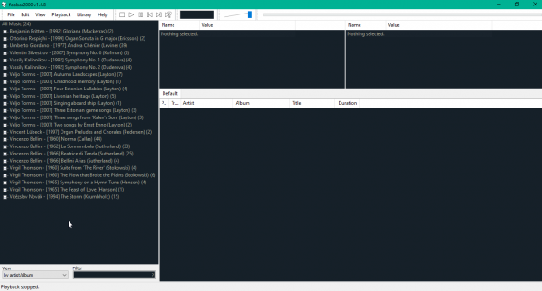
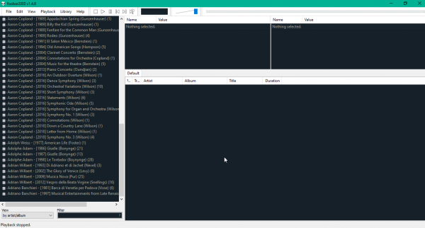
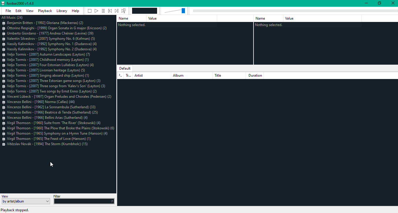
Helpfully, the program changes its look-and-feel in real time in the background, so you can immediately see the effect of selecting various options. Your choices are also not permanent: you can change them at any time in the future by merely clicking View -> Layout -> Quick setup. Once you have made your selections, the main program window will then be accessible:
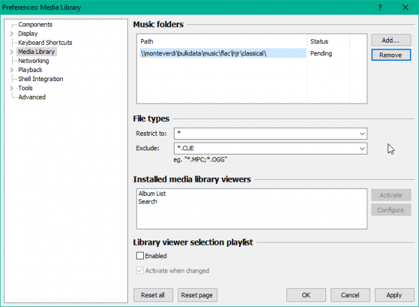
Note that the left pane is already populated: the program assumes your music lives in your C:\Users\username\Music directory -which is a bit annoying if your library is actually stored elsewhere. But no matter: click File -> Preferences and select the Media Library item. Click on the existing library directory entry to select it and then click [Remove]. You can then click [Add] to specify the actual location of your music files:
Note that you can specify a network-based URL without a problem. Mapped network drives work fine too -and, of course, the dialog lets you add multiple music folders if you have them. The rest of the options can be left as they are: just click [OK] to have the new folder scanned and added to Foobar’s database of music.
There is, unfortunately, no obvious progress indicator shown to tell you how far along with ‘acquiring’ your music files the program has managed to get. Back in the Media Library screen of the preferences, you will see the Status column next to your music folder path change from ‘Pending’ to ‘Initializing’, which is some evidence of progress… but it doesn’t change the fact that, basically, you just have to hope something is happening! On the other hand, the left pane of the main program display will eventually update with data as it’s acquired by the music scanning process, so there is feedback after all (but only after you are left guessing if anything is happening at all for several long minutes!):
That said, Foobar was able to scan my entire music library over a wireless network connection in just over six hours. This seems slow, but my music library is large and it was using a poor wireless network rather than a good wired one, so I think it’s a reasonable result.
When the music scanner completes, you’ll see your entire music library displayed in the left-hand pane:
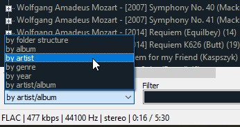
You’ll notice immediately that the grouping order is not ideal: as it says right at the bottom of the screen, it’s grouping by artist-album, meaning that every composition ends up being listed uniquely -which isn't really a grouping at all, is it?! A more sensible grouping is to just group by artist:
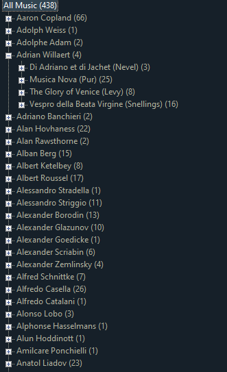
Select that option and the left pane switches to displaying this sort of thing:
That’s much more sensible: it’s slightly annoying that it’s not the default grouping nor one that can be selected from the Quick Appearance Setting dialog you are shown when first running the player. However, it is easy to change, so no real harm done: each composer is now listed alphabetically with a ‘+’ sign that’s clickable and will reveal the individual ‘albums’ (i.e., compositions) by each composer.
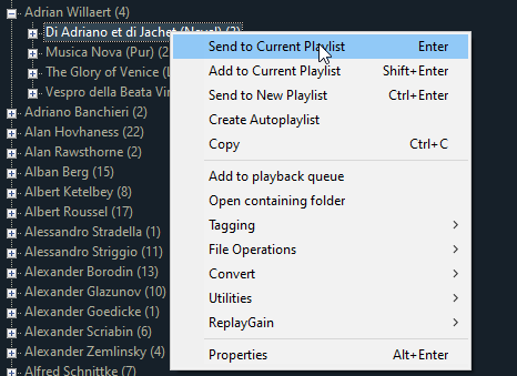
You can right click a track (or an entire composition) to add it to the main panel on the right-hand side of the program’s display, which is the ‘default playlist’:
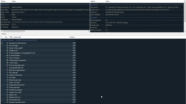
‘Send to playlist’ will make the album’s tracks (or the individual track selected) appear in the right-hand pane and immediately start playing. ‘Add to playlist’ will copy the tracks into the playlist area, but won’t commence playback:
Notice how the individual tracks within an album are subtly distinguished from each other with an alternating colour stripe. The track which is currently playing isn’t highlighted in any truly obvious and unmissable way, but at least gets an '>' icon at the start of the line. The panes at the top of the screen also display useful information about the track or tracks you’ve highlighted, such as the metadata associated with them, their physical location on disk, size, length and so on. It’s good to have such a large amount of information about one’s music so readily to hand.
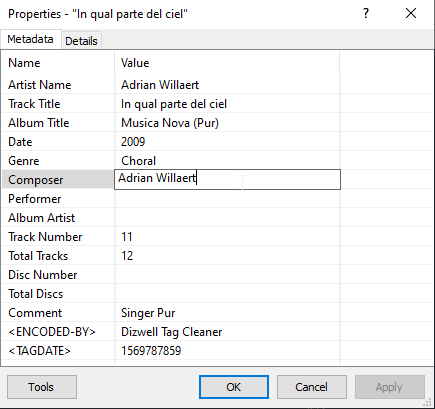
If you right-click a track and select [Properties], you can see and edit the metadata associated with that track:
I’m not actually a fan of a music player being able to edit my metadata in this way -but at least Foobar doesn’t offer to ‘helpfully’ fetch dodgy metadata from the Internet and update your tracks without your knowledge!
Sound quality when playing is fine; the choice of sound device to play is obviously made for you but can be changed if you need to from a fairly straightforward dialogue under File -> Preferences -> Playback -> Output. In terms of built-in audio formats, Foobar is fine: FLAC, MP3, WMA, OGG and WAV are all supported, right out of the box (together with a load of others that I don't personally use, such as AAC and AIFF). Even more formats are supported if you install an appropriate plugin/component.
Most importantly, perhaps, Foobar does proper gapless playback. My standard test for this is to use a media player to play between two tracks of Britten’s Gloriana. The point where the queen stops singing and the chorus takes over is a track change -but if you can hear it, then it’s not gapless!
Here’s what it sounds like:
Don’t worry about how bad that sounds in general: that’s a reflection of Audacity’s recording capabilities, not Foobar’s playback abilities. The point to get from listening to that is to see if you can hear where the tracks change -and I’m betting you can’t. Here’s what that sound track looks like:
The track transition actually occurs at about the 5.1 second mark: but again, I bet you can’t really see that happening in the sound plot. Foobar2000 therefore does pass the ‘can it do gapless’ test!
So far, so good: it’s a fairly quick setup, it fetches music files via wireless networking if it has to, playing something is simple and works well and can be properly gapless when required. But… but… It’s pretty ugly, really, isn’t it?! The default Foobar interface is just lots and lots of text. It’s information-dense alright but gives no joy to the eye at all.
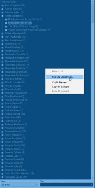
Fortunately, that’s fixable to some extent. Click View -> Layout -> Enable layout editing mode. Switching this on means that if you now right-click any area of the main program window, you can delete it or replace it with some other graphical element. For example:
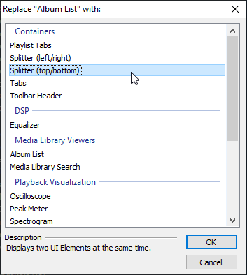
Here, I’ve right-clicked the list of artists in my music library. The entire panel has gone bright blue and from the context menu that’s displayed, I’ve chosen to ‘Replace UI Element’. Clicking that brings up this dialog:
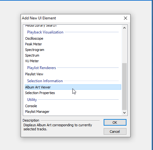
I’m replacing the Album List panel with a top/bottom splitter. When I select that and click [OK], the main program screen changes to display the old artist list in the top part of the original panel and a blank space in the bottom part of it. Right-click that bottom empty space and you can choose what to fill it with:
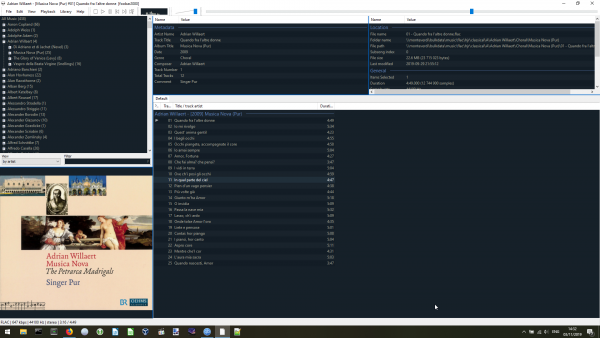
I’ve chosen to add the Album Art Viewer to the bottom part of my left-hand pane, so the main program window now looks like this:
Now, that’s not a huge improvement! But it’s certainly a bit more graphical than before and at least the currently-selected track’s album art is displayed clearly and at a good size. I could do a lot more tweaking in the same vein, but I think the point is that Foobar is indeed a plain Jane music player but can, with a little bit of effort, be knocked into something that isn’t the ugliest thing you’ve ever seen!
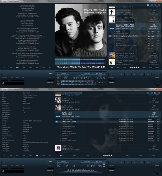
Some people take this tweaking to extremes: it’s possible to download complete ‘skins’ for Foobar and turn it into something that looks like this:
I’m not saying that this is perfect either: you could legitimately declare that to be a visual mess that makes it hard to concentrate on any given piece of information! But the scope for making Foobar a graphically-compelling application is definitely there.
That said, I find applying any of these third-party skins to be a complex affair that often goes horribly wrong, so I’ve actually never bothered to do it myself and I’ve always stuck with the plain vanilla-with-album-art version you saw earlier. Unless you a confirmed tweaker and twiddler, then, I think you commit to using Foobar2000 in the certain knowledge that it will lack quite a lot in the looks department -but will nevertheless present you with all the information you want in a highly functional, readable way.
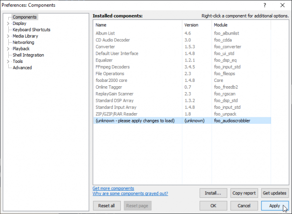
Getting Foobar to scrobble information to the Internet (that is, make a record of what you listen to at sites such as Last.fm or Libre.fm) is not as easy as it could be. You first have to download a plugin, then click File -> Preferences -> Components:
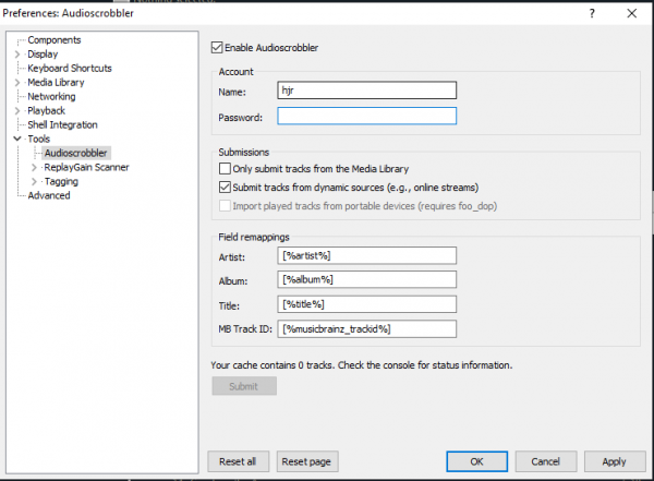
That lists all the default components that Foobar2000 ships with -so you now click [Install], point the program to wherever you downloaded the scrobbling plugin and then click [Apply] (which makes the program re-start). When you have re-launched the program, go back into the Preferences dialog and in the [Tools] section, you’ll now have this option:
Fill in your Last.fm credentials and switch on the ‘Enable Audioscrobbler’ option: job done, everything you now play will be recorded at Last.fm without further drama. There’s no easy way of scrobbling to Libre.fm, though: for that, you’ll either have to play around in the [Networking] option or start editing the code within the audioscrobbler plugin you just installed with a hex editor: neither method is exactly intuitive!
I’ll leave it there. Foobar2000 is often referred to as a program that ‘power users will love’: there are indeed a bazillion configuration option that you can fiddle with if you have the time or inclination and this review could accordingly get very long! But if we stop at this point, you’ve seen the core product. It’s not pretty, but it’s functional. It does gapless playback perfectly. It can display album art if you force it to. It can scrobble your music tracks if you wrangle it to do so. It won’t mess with your metadata, but can be used to tweak it on occasion if you have to. It's a good combination of power and flexibility and repays investing time and effort in working out how to make it do things.
In conclusion, then:
Good Points
- Easy to set a music library up
- Basic navigation tools means stepping through a large music collection is easy
- Does gapless playback properly
- Doesn’t fetch metadata from the Internet by default, won’t update your music files without your approval
Bad Points
- The default display is very text-based and unless you do full-on skinning (which is difficult) you will not get Foobar2000 to look attractive
- Can’t scrobble to Last.fm natively: requires a plugin (which is easy enough to install, though)
- Can’t scrobble to Libre.fm at all without complex tricks and configuration changes
- Doesn’t have an option to minimise to the system tray. It doesn’t get completely out of your way in the way some other players do
Overall Score: 9/10. Despite its tired looks, Foobar2000 does what it’s designed to do very well: fetch and organise a music library and let you use it efficiently to play music. It is information-dense (which is mostly a good thing!), though that also means it’s not pretty. It’s complexities and flexibility are well-hidden: you don’t need to interact with them if you don’t want to.
