 Groove is Microsoft's latest attempt to build an all-conquering media player. It has its roots on the Xbox console and in Microsoft's ill-fated Zune music hardware. For my money, that makes it a dubious player from the outset, since it has a track record of being one thing, then another. Who knows how long Microsoft will stay interested in it -particularly since they've already had second thoughts about its integration with a cloud-based music subscription service (which they killed off in 2017)?!
You should find Groove is already a component of Windows 10, so no installation is required. However, if you are like me and automatically remove all Microsoft's built-in Windows 10 "apps" the moment you do a fresh install of Windows, you may need to visit the Windows Store and download the software afresh. Note that when you do so, you will be continually bombarded with requests for you to sign in to the Windows Store (something I refuse to do on privacy grounds): it is however not necessary to do so before the software will download and install in the background. Wherever possible, just keep closing the login prompt windows or ignore those you cannot close. The unnecessary tie-in between the music player and the Microsoft Empire in the form of its Store is the first strike against the player. (For the same reasons, when prompted to share the app across devices, decline to do so: sharing across devices requires a Windows Store login).
When you first run the player, you will see a bit of an animation as the player configures itself:
It doesn't look like any classical music concert I've ever been to! It's your first clue (if the name wasn't one already) that this player is aimed more at the hip and groovy youff of today rather than us old fuddy-duddies listening to classical music, I think 🙂
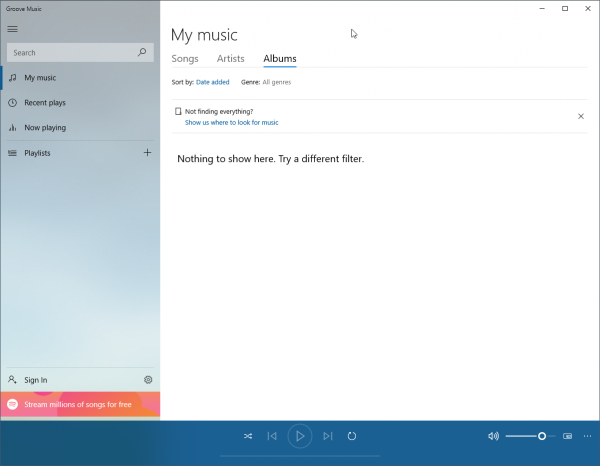
Eventually, you'll get taken to this screen:
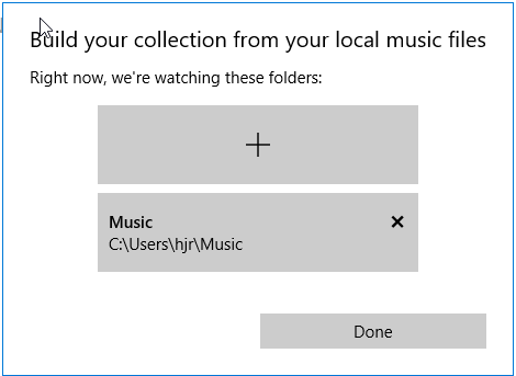
It's the usual Windows 10 aesthetic of a lot of blank space doing not very much, I fear! By default, the player is configured to 'look for music' in your user's local C: drive's Music folder... though there's nothing to tell you that on this screen. If your music collection is to be found elsewhere (as a large one probably will be), then click that 'Show us where to look for music' option in blue in the middle of the screen:
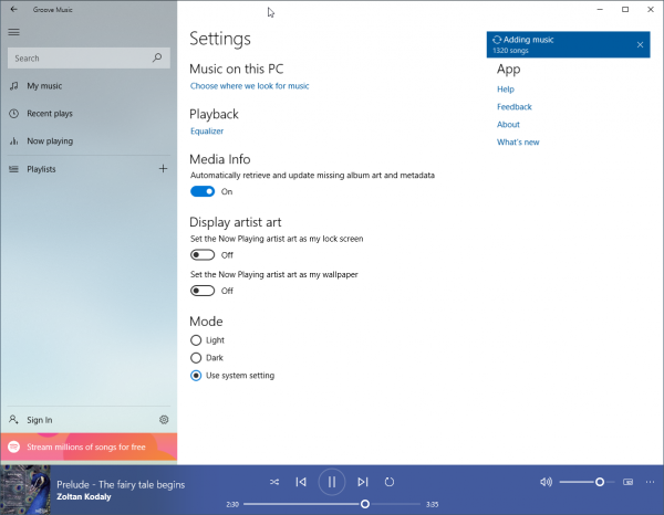
Now you can see the default option, it's easy enough to click 'X' to get rid of it. Bizarrely, when you do so, a warning will appear: "If you remove the Music folder from Music, it won't appear in Music anymore, but won't be deleted". I trust that is as clear as mud to you as it is to me! What it actually means is, "if you delete the Music folder using this dialog, we won't monitor that folder any more, but the folder and its contents will remain unharmed on your hard drive". So click to confirm removal when prompted. Then it's trivial to click the '+' button (could they make it any bigger?!) and point to where you actually store your music. Click [Done] when you've done that... and then scratch your head wondering what's happening! Because nothing happens at all when you first add a new directory to monitor. It's an infuriating piece of 'user interaction' (or non-interaction!). If you wait long enough, then all of a sudden at a time all of its own choosing, you will suddenly see this:
Now that's a proper piece of feedback, including a nice record count of how far it's got, so you know precisely what the program's doing and how long it's likely to be doing it for. It's just a shame that there is no telling when you'll see this! I had to wait at least 10 minutes with my program apparently doing precisely nothing before that sort of progress message appeared. That's poor user interface design in my book.
Once the music discovery process is underway, however, it's quite good news: the music is displayed in the main program as it's discovered, so is immediately playable there, whilst discovery continues in the background. This is a nice touch: you can play parts of a large music collection before all of it is processed. Other players should do this, I feel!
But the bad news resurfaces before long. What's this option under the Settings screen (which you can only get to by clicking a cog-wheel icon at the bottom of the left-most pane):
Oh dear: 'Automatically retrieve and update missing album art and metadata'. Well, I suppose it's something that it's only threatening to use Internet-sourced metadata when you've neglected to tag your files with it yourself, but that is still a very unwelcome feature. I deliberately do not tag my files with 'Album Artist', for example. Classical music has no concept of an album artist, so just Artist and Composer will do fine. This option means my deliberate decision to not supply an Album Artist will be over-ridden -and the metadata that will appear in that tag is going to be of extremely dubious quality. No, no, no! Music players should stop doing this sort of nonsense and let me tag my files as I choose, without seeking to 'help me out' when it thinks I've done it wrong (because I haven't!)
Other problems then become apparent: there's no ability to scrobble to Last.fm (that is, send details of the music to which I listen up to a web service). You can't even download the scrobbler from Last.fm themselves and have it see that you're using Groove. So there's no native scrobbling capability, and there's no 3rd party way of adding that capability. This immediately rules Groove out from serious use as far as I'm concerned (though I realise that not everyone is as keen on sharing their listening habits with the wider world as I am, so this lack of functionality may not be a problem for some people).
Here's yet another issue:
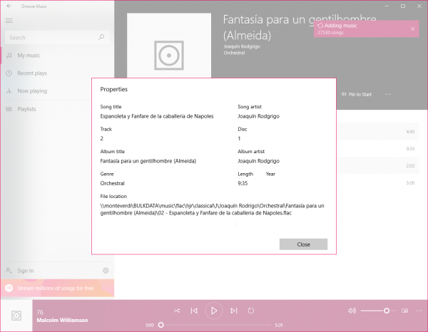
You can show specific tracks on an 'album', right-click on one of them and then select 'Properties' from the context menu that appears. Here's what you see when you do so. Everything you see is read-only: Groove has no apparent ability to edit metadata at all. Whilst I generally don't like music players getting into the music editing business, I do appreciate being able to tweak a bit of metadata from within a player now and then. The complete absence of such a facility in Groove is a drawback as far as I am concerned. Also note that there's no way to control what metadata is shown at this point. If you wanted to see the 'Encoded By' tag, or the 'Tag Date' information I apply to all my music... well, fat chance. The app is not written to show that information, so that's the end of the story!
A lack of functionality and flexibility is, in short, the overall experience I have when trying to use Groove. Another example of this is the <cough> multitide of ways you can sort your music by:
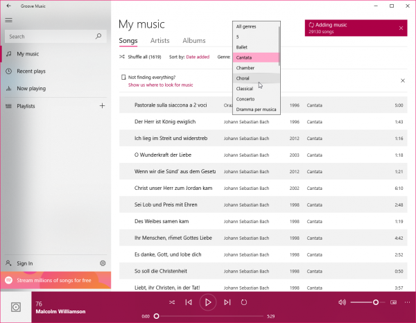
That is, you can group by Artist or Album, but that's it (the 'Songs' item producing merely an undifferentiated listing of every track you've got, effectively representing no grouping function at all). Artist and Album are fine as far as they go... but if you wanted to group your music by genre, say? Nope: not in the program spec, so not available. Oh hang on... click on the 'Songs' option after all and...:
Well, what do you know! On the Songs grouping, you can select a Genre to filter by. Which isn't the same thing as displaying everything and grouping by an attribute (since if you select 'Cantata' from that list that's showing in that last screenshot, the main screen will stop showing you things that are 'Choral' or 'Chamber', for example). But if you can explain why the program lets you filter by an attribute it won't let you group by, you'll have a firmer grasp of what this music player is all about than me! Oh, and don't forget that you can filter by genre on the Songs screen and the Albums screen... but not on the Artists one for some reason that escapes me (it's a perfectly legitimate thing to want to see Britten's output sorted into Choral, Orchestral, Opera, Film and so on. But the program doesn't think so, so doesn't let you do it).
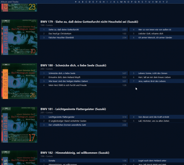
Now, here's the best feature of all: when I catalogued my Bach cantatas, I carefully named them so that they'd all be grouped together. This is how MusicBee lists them, for example:
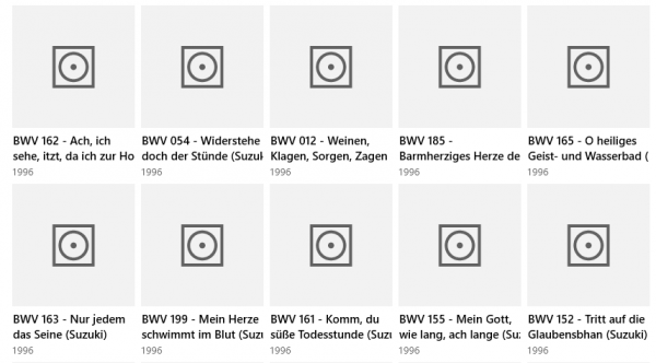
See: BWV 179 followed by BWV 180 followed by BWV 181 and so on. If I fancy listening to cantata BWV 12, where do you think I'll find it? Why, after cantata BWV 10 and before canata 13, right?! Right. Well, let's just see how Groove deals with this:
Obviously, Groove thinks that BWV 12 is a lot happier sitting in between BWV 54 and BWV 185!
Now it happens that Masaaki Suzuki recorded BWV 12 in 1996 (as that last screen shot tells you). He recorded BWV 10 in 2002 and BWV 13 in 2008. Groove decides that the year in which something was recorded is so much more important than mere details like the name of the piece being recorded, so it prefers to sort by recording year rather than name -meaning it is impossible to find anything by name. It is an utterly bizarre way to do it -and when I said that Groove "prefers" doing it this way, I may inadvertently have led you to believe that you can alter the sort order to something more in tune with your way of organising your music. I apologise if I misled you in that way, then: because this sort order is *it*!! It's date order or nothing once you're looking at all the compositions written by a composer. Hopeless!! At a stroke, that makes Groove completely useless as a classical music player, and the review can end right now.
(And by the way: notice the complete absence of album art in Groove's display in that last screenshot. It's what happens when you tell it not to fetch stuff from the Internet, I suppose ...but as I always embed album art within the metadata for every track, I can't quite believe Groove's inability to parse and display it instead).
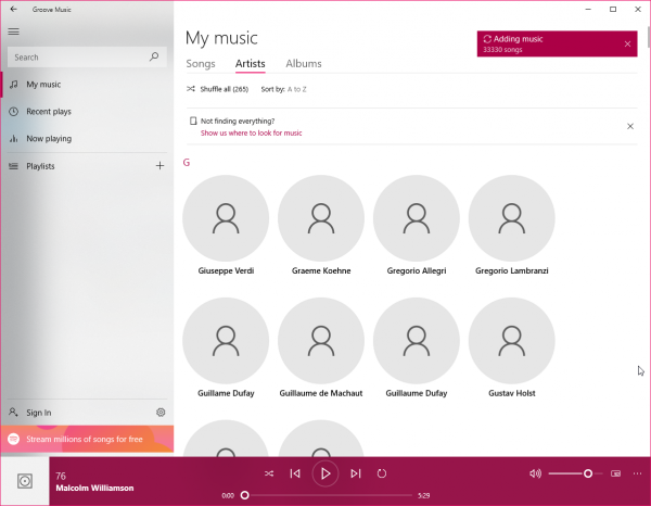
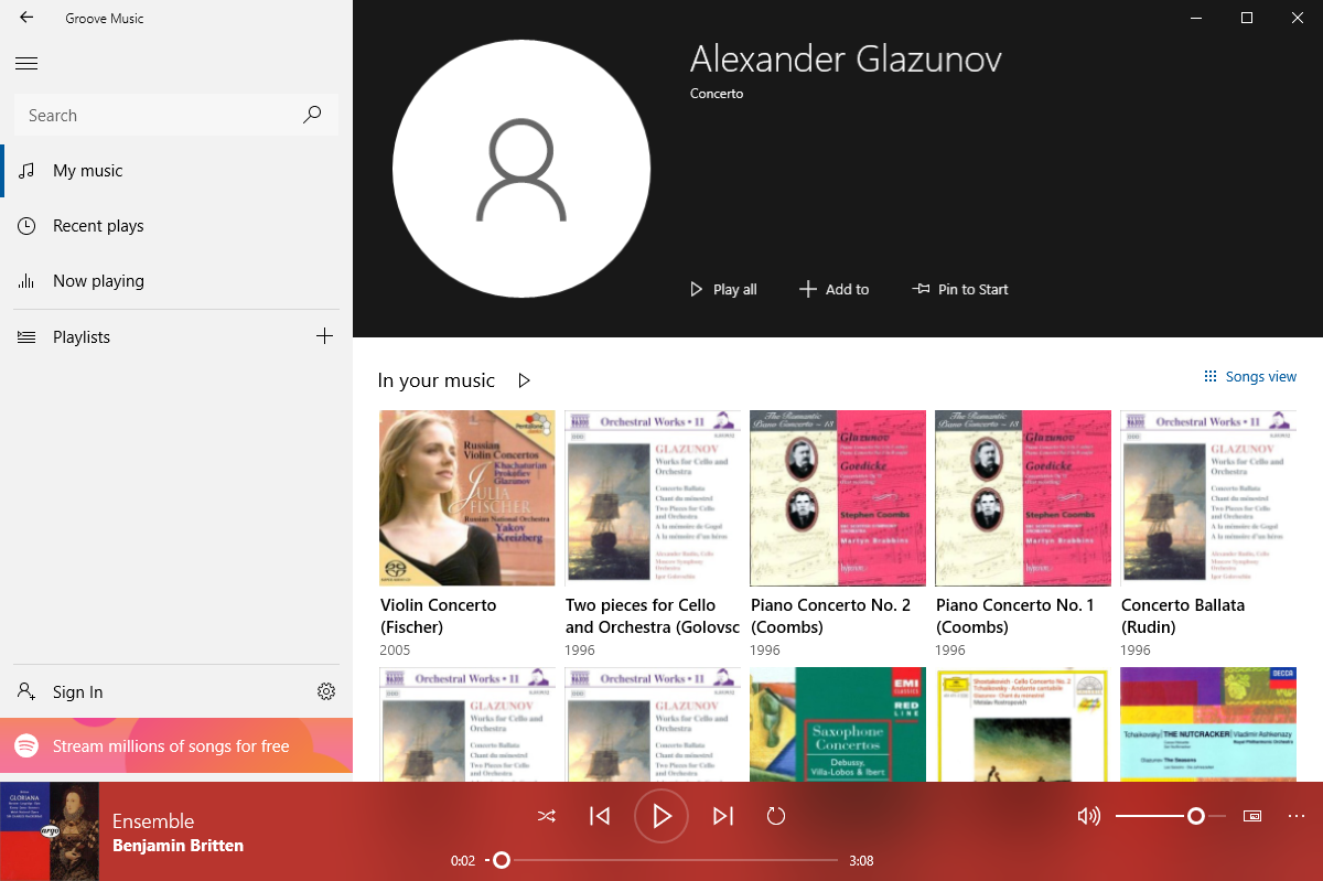
Before I do that, however, I will just mention a couple of other points. First, artists are listed in a large lump in the middle of the screen:
See how they all have the same 'generic head and shoulders' sort of icon attached to them? Yeah, you will need to get used to that, because they don't acquire better artist art later on (probably because I stopped the program from pulling stuff down from the Internet) and, rather more woefully, there's no option to assign your own artwork to each artist. Useless graphics, then, taking up a lot of space -making scrolling quickly through from the As to the Ws impossible- and adding precisely nothing to proceedings by way of usability or visual pleasure.
If you were wondering, you can't configure the sound card output for the player (it uses the Windows default, and that's it) but it does do proper gapless playback (which is something, I suppose). It's about the only redeeming feature I can find in this player, though. It is otherwise form over function at every step, rendering the player practically unusable.
Good Points
-
- None really
Bad Points
-
- Too many to mention, but the sort order of the albums is just a travesty
Overall Score: 0/10. It's completely unusable as a serious music player for serious music. It's an appalling bit of programming, too, taking away choice and configurability in return for a graphical look-and-feel that is, I suppose, supposed to be 'on trend', fashionable and modern. Unfortunately, that trade-off merely results in an unusable abomination (and it doesn't even get the graphics looking nice if you don't let it have access to the Internet!)
