 MediaMonkey is the only music player in this review that comes in a version that you can pay for. Visit the developer's website and you can choose between downloading the 'free' version (in quotes, because it's a proprietary player, so it's free of cost, but not free as in open source) and the 'Gold' version (which will set you back USD $25). The differences between the two editions are made nicely clear on that website: it basically boils down to CD ripping functionality and some rather dubious automatic media management features. The 'support for customized collections, eg Classical' sounds interesting, but won't feature in this review -which is strictly of the zero-cost, non-Gold freebie version.
The download is a relatively svelte 15MB. When the setup executable is launched, it first prompts you for a choice of language: unfortunately, there's only one choice of 'English', which is presumably the American version. No UK customization is available, which is a shame; 27 other, non-English languages are catered for, though. The usual sort of installation wizard then appears, meaning you click [Next] a lot and agree to the software license (which goes on at length, largely because each individual component appears to have a separate copyright notice! It appears fairly innocuous otherwise -though you agree to have any legal disputes in Quebec!). There are a couple of options provided about skinning and so on: I just accepted all the defaults.
When first launched, the program appears near-full screen, but with a 'welcome wizard' to step through:
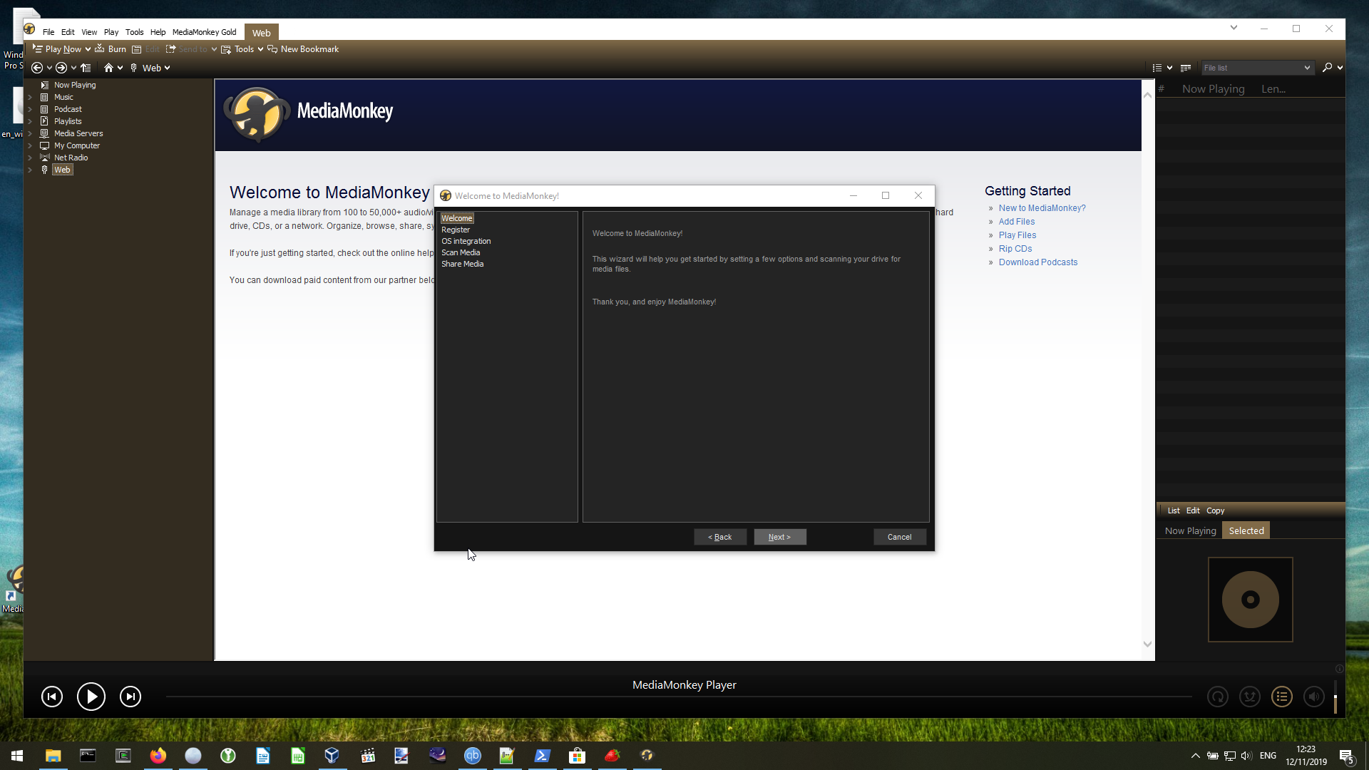
The initial impression I had at this point was: "It's very brown! Hopefully the looks get a bit better soon!" Anyway: the wizard offers you an option to register, which you can ignore; and an option to integrate itself with Windows (an option I left set to its defaults). It then prompts for the location of your music library:
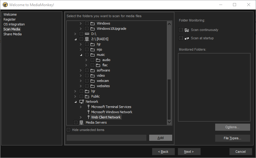
The file/directory navigation at this point appears to be provided by MediaMonkey itself (rather than use the standard Windows Explorer file manager, for example). I found it small, fiddly and not at all easy to work with. I couldn't get it to browse my network, even though the option to do so is listed. Instead, I pointed it to my Z: drive, which is a mapped network drive and so got to my network-stored music files that way. Once correctly pointed at the right directory, I then switched on the option to scan continuously:
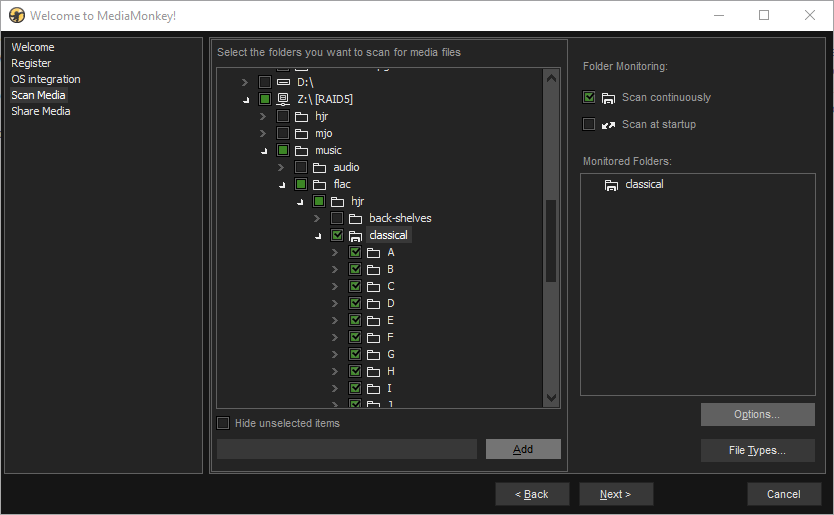
I'm not entirely clear why this is an extra option that has to be manually selected: most players I've reviewed tend to continuously monitor the music directly by default -and I would be annoyed if they didn't, because as I add new music to my collection, I definitely want my player to pick it up automatically. I think this is an example of fine-grained control gone a little too far, in other words. Because it's displayed, I also clicked the [Options] button (and kind of wished I hadn't!):
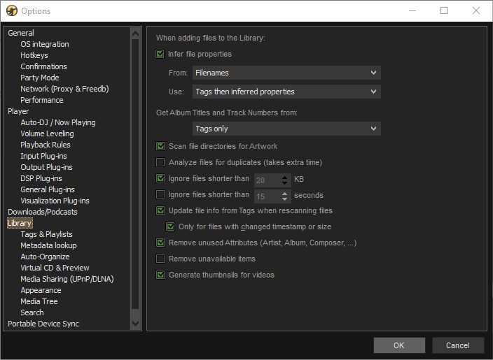
That's quite a scary dialog to see this early in the piece! There are some important options here, though: 'Ignore files shorter than 20KB' is switched on by default. I don't care how short a piece of music is (or how small the file it's stored in happens to be): I want my music player to catalogue everything. So switching that off is rather important. I also switched off the 'Scan file directories for Artwork' option: I embed album art within my music files and I don't want stray JPGs being used instead of it. With those options re-adjusted, I was able to close that dialogue and click [Next] once more. This rather interesting screen then appeared:
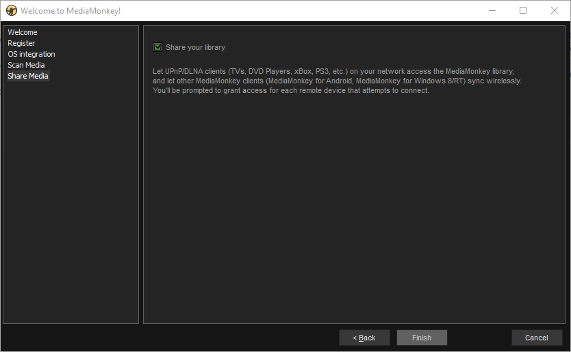
By default, MediaMonkey offers to act as a DLNA server to the rest of your network. That is, it will act as a server to which other PCs and devices (such as tablets) can look to retrieve media files. It's not a bad bit of functionality -but completely inappropriate for a simple music player! I already have Plex servers and the like doing the job of acting as media servers to the household, so I don't need MediaMonkey trying to duplicate that functionality. I therefore switched that option off and then clicked [Finish].
Immediately, the wizard pop-up disappears and you are taken to this screen:
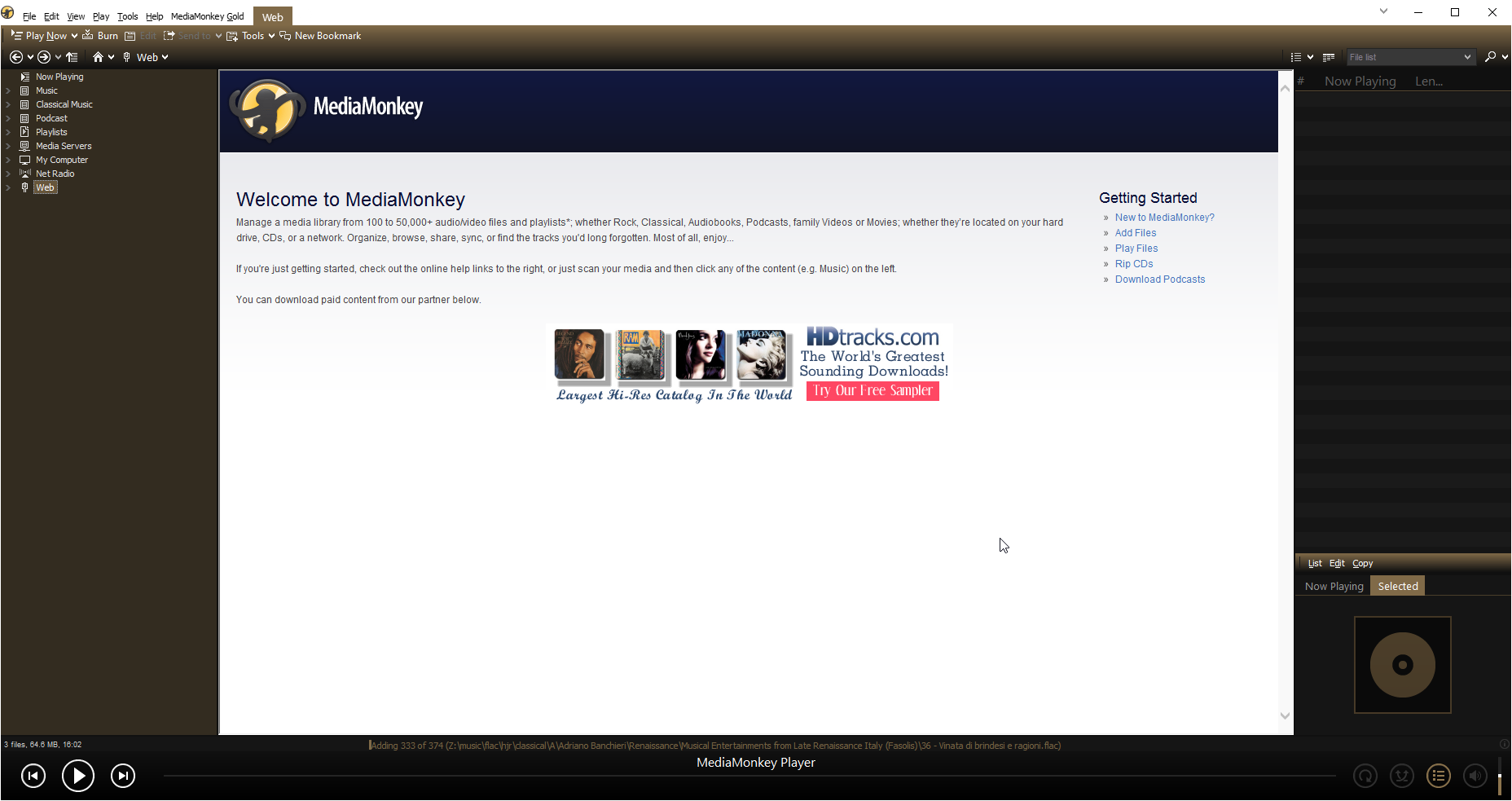
This is a bit of a shame for me: it's MediaMoney pretending to be a web browser! That is, it's dumped me on the 'Web' item in the far-left pane, and the big white area in the middle of the screen is some sort of web page that's being displayed. I dislike it when music players feel they have to embed web functionality within themselves (I already have dedicated web browsers for that sort of thing!) However, my annoyance was tempered by what I saw at the bottom of that screen:
![]()
That is a useful bit of feedback! It's a proper progress bar telling you how much of your music collection has been added to MediaMonkey's database so far. So many players leave you guessing at this point, it's a really good thing to see this done properly!
Even better: click the 'Music' item in the far-left pane tree menu:
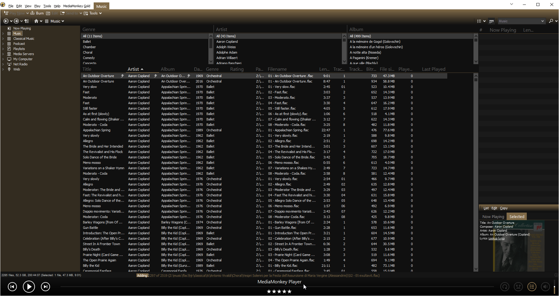
Brilliant! The player is displaying music it's already fetched, even though the message at the bottom of the screen tells you it is still fetching more music. In other words, you can see -and play!!- some music before the music collection process has completely finished. This is something so many other players get wrong: they make you wait for everything to be scanned before you can see any of it. With a music collection as large as mine, that can mean waiting hours! So this is a very nice thing to see MediaMonkey doing 100% right.
It's not going to be all unalloyed praise, however! The screen at this point is filled to the brim with text; lots and lots of text! All of it tiny and in a pretty ghastly font. If you squint hard, you'll see a little bit of album art displayed in the background at the very lower right, but there is really no graphical joy to alleviate this burden of text! On the other hand, I like this:
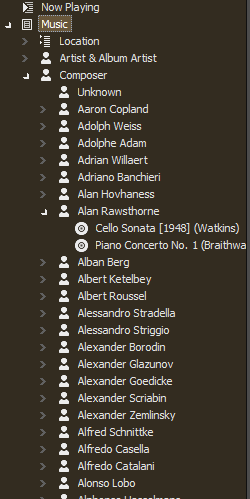
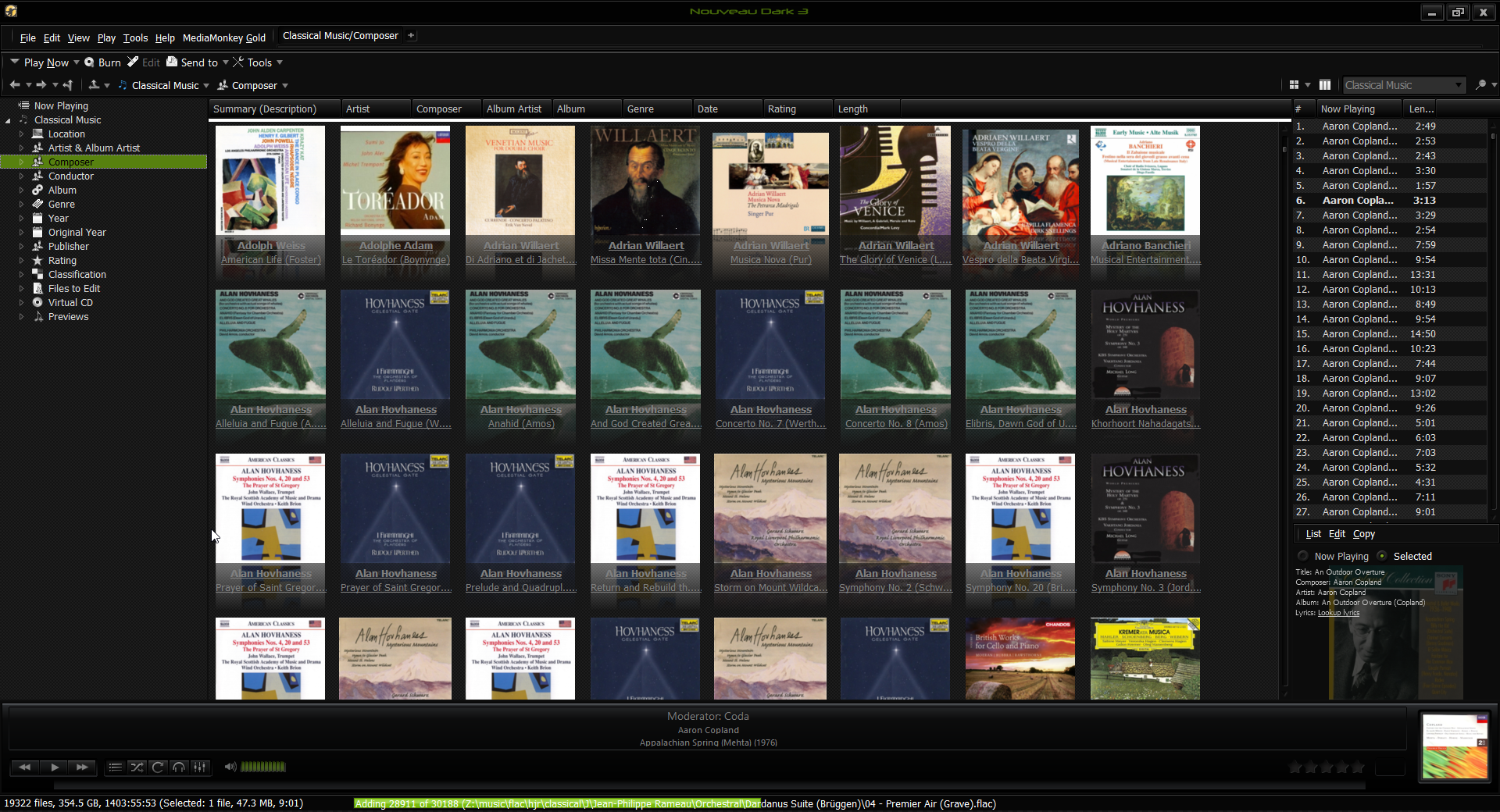
That is, you can expand the 'Music' menu item to reveal a list of all composers in your music collection. Very nice: seeing the composers listed like this makes it trivially easy to jump around within your collection: many players display composers as 'artist pictures', which take up a hell of a lot of space and therefore take an age to scroll through. MediaMonkey is doing it correctly here, then. Even nicer is the use of the 'Composer' label: this could be a 'proper' classical music player!
The joy of the use of 'Composer' labels is somewhat tempered by the realisation that the menu also lists 'Artist & Album Artist'... and that if you click on that, the display (for my music collection, at least) is identical to that for the 'Composer' item. I dislike the same information being displayed twice: it's redundant. It's even worse than that though, since there's an item called 'Classical Music' which, in its turn, has items for 'Composer' and 'Artist & Album Artist'... so the same information is actually available four times!
Some of this is because we're doing this on the cheap: MediaMonkey Gold lets you define collections, so that your classical music can be kept separate from your non-classical. It's a very clever idea that no other player I've reviewed does. The free version of MediaMonkey cannot use this functionality, however -but the separate menus for the 'non-classical' and 'classical' collections are nevertheless present. For me, the result is just a *lot* of redundancy.
Happily, MediaMonkey lets you fix this up in its Tools -> Options dialog:
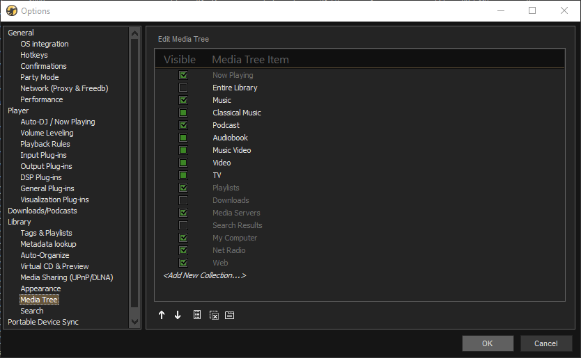
In the Library - > Media Tree item, you can switch off or on the visibility of any of the tree menu items. In my case, I would want to see this selection:
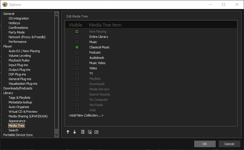
That is, I'm only interested in Classical Music; and I don't want the program to be my TV or Video or Podcast player! Configured like this, the left-most menu now looks much less complex:
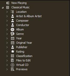
...which is a lot better. The duplication between Artist and Composer is still there, but it's better than it was.
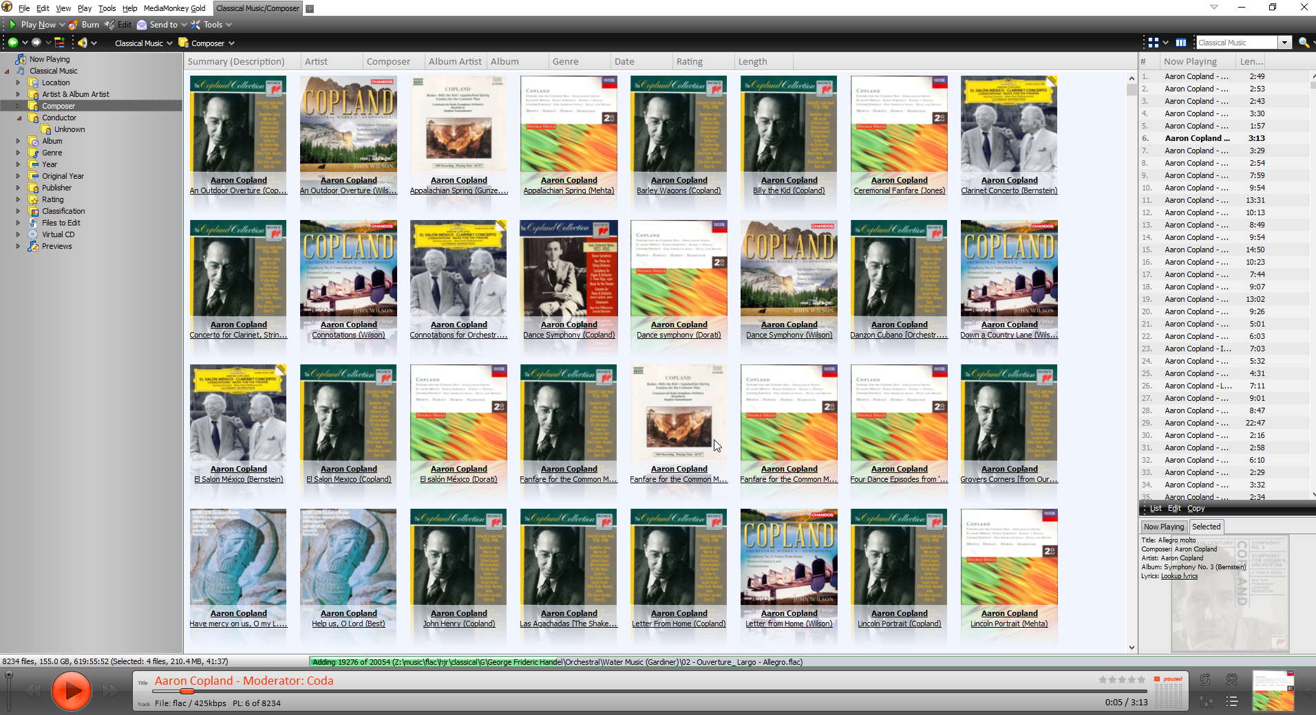
At this point, therefore, I was feeling reasonably good about MediaMonkey... except for all that damned text! Then I clicked View -> Show Art menu options and Lo! What a transformation:
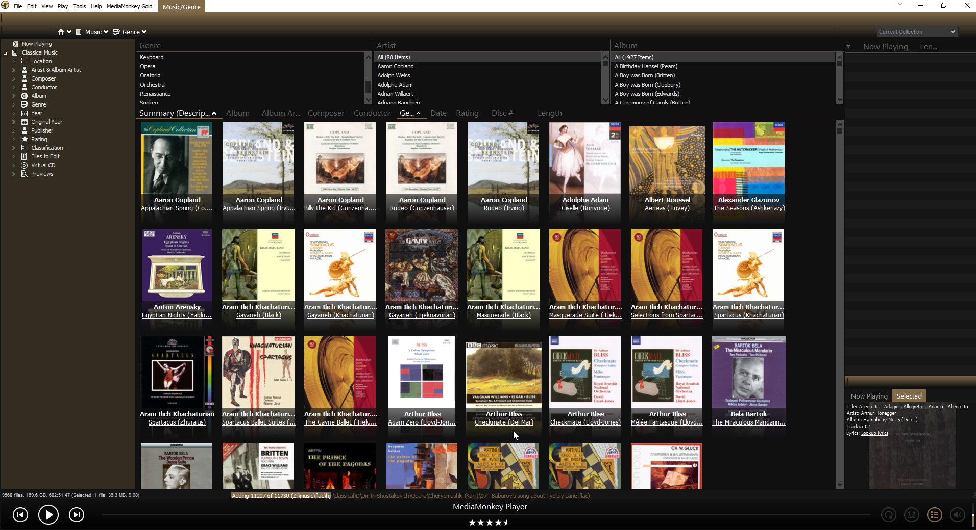
Suddenly, we have a very graphically rich way of navigating through our music collections. A double-click on any of those album covers immediately starts the playback of all the tracks associated with that 'album'. There's also the 'Art with Details' option:
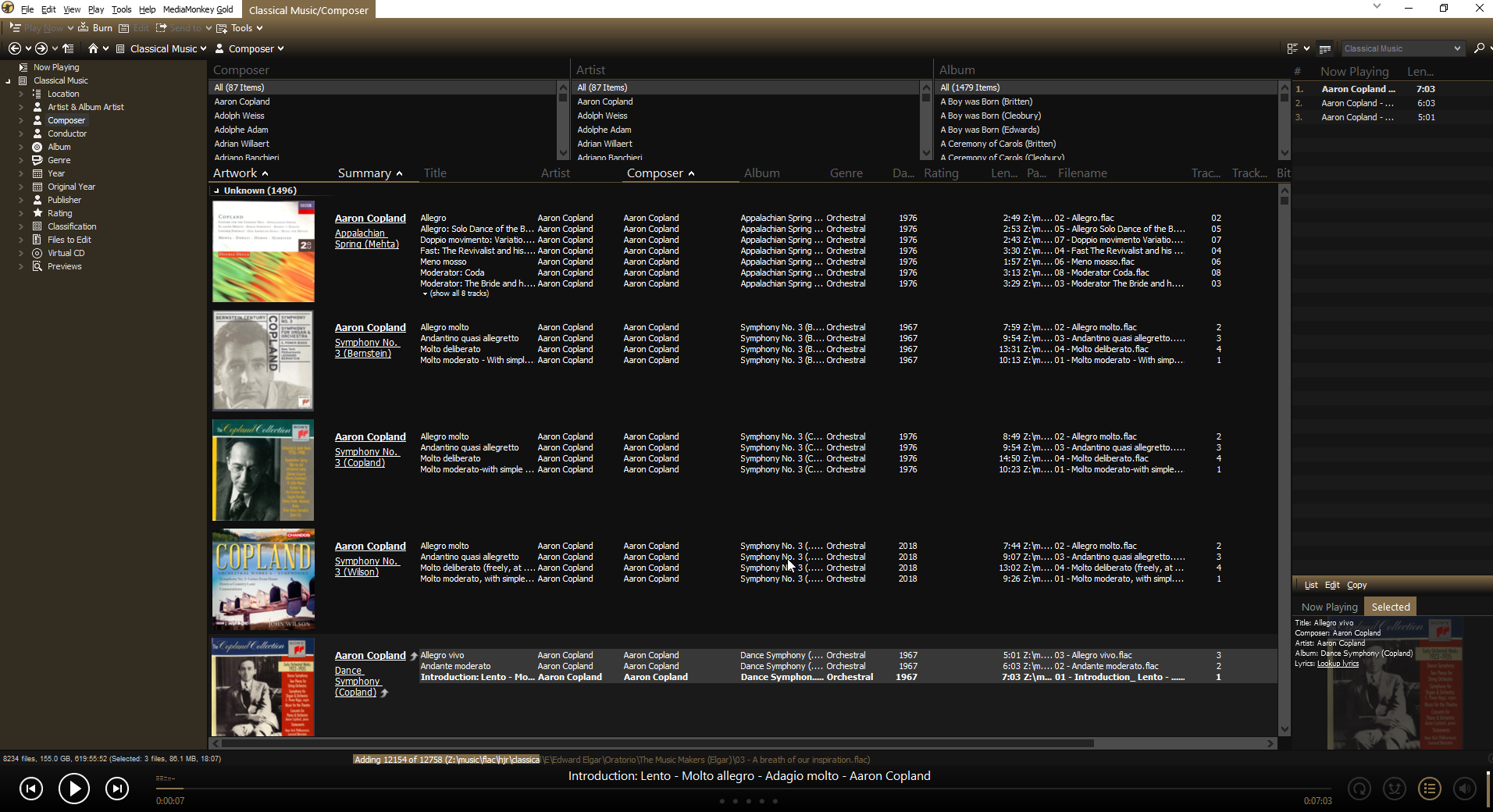
That still shows the album art, but now lists the individual 'tracks' making up the 'album'. So you can now double-click an individual track and start the playback at that point. This view is still rather 'textual' though, so I'm not entirely convinced I'd want to live with it for too long.
Right-click a track in the main body of the screen and click [Properties] from the context menu that appears and you get this sort of display:
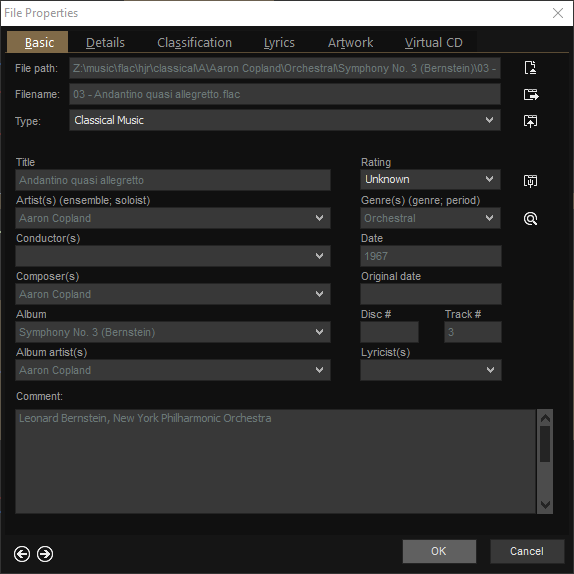
It's a good display of most of the metadata associated with the music file. All the fields are editable, too. Now, this is a double-edged sword: I prefer my music players to not be in the business of metadata editing (because I don't want my player mucking about with my carefully-curated metadata!); but I also quite like having the ability to do a little bit of emergency metadata fixing if the need arises, so having a competent metadata editor in situ is quite handy. My only complaint with MediaMonkey's efforts here, then, are that the choice of which tags to display are fixed. I cannot see my ENCODED-BY or TAGDATE tag data, for example, because MediaMonkey's programmers have not decided to display them. I also don't need to see a 'Conductor' tag, because I never use that tag for any of my music: but it's there in all its emptiness because the developers decided to show it. Several media players allow you to edit what tags are displayed by default, but no such flexibility is included in MediaMonkey as far as I could tell.
MediaMonkey's display can thus be tweaked quite a bit, just by selecting different views of things. To completely transform the look and feel of the player, however, you can re-skin it. Three skins are supplied with the software, with 'Metro M' being the one used by default (and the other two not being much use for anything very much!). To re-skin, you just visit the player's skin collection website and download one you like. Double-click the ".mmip" file once it's been downloaded and it should offer to install itself into MediaMonkey. Once that's done, just click Tools -> Options -> Skin and make your selection. Here's the player in the 'Gilded' skin, for example:
I'm not entirely convinced it's made a fundamental change to the overall look-and-feel, to be honest -and that's a skin with a 4-star rating by other users. (Incidentally, it would be nice if the website where you get new skins from would allow you to sort the available skins by 'most recently submitted' or 'most popular' or 'highest rated' and so on. Unfortunately, it merely lists them in no particular order, so it's harder than it should be to sift the wheat from the chaff).
No matter what skin I applied, however, I have to say that the player always used the same small, nasty text and thus the 'gut feel' about the player never changed. There is an option to change the font size to be (say) 125% of the default, which can help a little. But you don't appear to be able to change the font in use and thus cannot fundamentally shake the poor text foundations underpinning the application. According to this (rather acerbic!) help forum thread, the choice of font is actually made by the skin designer and cannot then be altered by the user. If you find a skin with a nice font, therefore, but awful design otherwise... well, you get what you're given!
Probably the best I could come up with was to apply one of the ND3 skins (I chose green!):
That uses a nicer font than that seen in any other skin I tried, but I personally don't like the dark theme that you have to live with if you want that font! MediaMonkey appears a little inflexible in this regard, which is a shame since it's so re-configurable in other respects.
Let us just conclude the 'look and feel' comments with: it's reasonable, it's skinnable, it's configurable... but the lack of choice of font is a bit of a let-down.
As regards the technical side of playback, MediaMonkey is a bit of a mixed bag. This, for example, is not a good thing to see switched on by default:
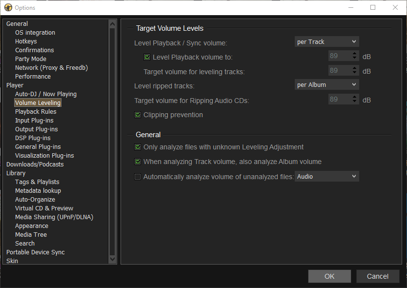
It got so much right before, being aware that it might be used for classical music playback... and here it's decided to do playback volume 'levelling', which is the last thing you want happening to classical music! All of these options need to be switched off if you want your music signal played back without being 'fiddled with'! That's easy to do, of course. It's just annoying you have to do it at all.
There are other annoyances in similar vein:
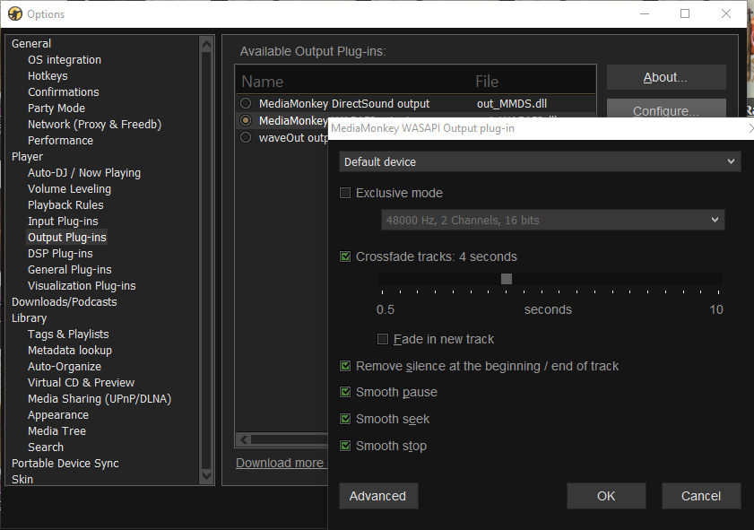
First thing to say here is that MediaMonkey is highly configurable in terms of selecting which device is used to output music to, so if your PC has several audio devices and you want to play to one rather than another, you can achieve that with these dialogs. But why on Earth is the use of crossfade switched on by default? Why does the player think it fine to trim silence at the beginning and end of tracks? Leave my music signal alone, please! Again, it's all switch-off-able, but I shouldn't have to... and who knows how many other options there are that "do things" to my music signal without my knowledge?!
I'd like to report that MediaMonkey does proper gapless playback... but it doesn't, quite. Bearing in mind I switched off the option to crossfade tracks, I performed my usual test for gapless playback at this point: play the bit from Britten's Gloriana where the Queen stops singing "Go!" and the chorus starts singing "Victor of Cadiz!". In between, there's a track change. If you can hear it -or see it on a waveform output- then it's not properly gapless. Here's MediaMonkey's attempt:
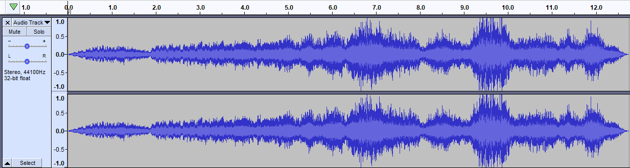
Visually, that looks fine: there's no gap of silence around the 7.1 second mark, which is the point where one track ends and the second starts. But here's the captured audio that the above waveform represents:
You'll have to listen hard, but at approximately 7.1 seconds in, there's a definite 'click' as the tracks change. It's small, but noticeable. It happened in exactly the same way on my desktop PC as it did on two different laptops, each with considerably different audio hardware, so it would seem to be intrinsic to the way the program works... and it's unacceptable if so.
In fairness, I don't hear that click as other tracks change and it's almost imperceptible as those two specific tracks change. But it's there, it's repeatably there... and other players on exactly the same hardware and with exactly the same music files don't produce it. I must therefore mark MediaMonkey down for not doing gapless entirely correctly, though it seems to do a reasonable job of it most of the time.
So what's my overall conclusion about MediaMonkey? Well, various things! I like it on the whole; I think it has a flexibility about how it can be configured that I like. It collects a large music collection very quickly -and allows music it has already found to be played whilst it continues collecting more in the background, which is brilliant. It does a lot of things right, including having special collections and labels for classical music. But it spoils some of that by switching on options which alter the sound signal without your say-so, which is a terrible thing for a music player to be doing. It also looks fairly hideous: lots of text, no matter which skin you use, and a choice of font made by someone else, not you! And I'm not convinced it really does gapless properly 100% of the time. So I'd like to like it more, basically, because it has a lot of good things going for it, but then goes and spoils it by some really silly default configuration choices and an interface that only a mother could love.
In summary, therefore:
Good Points
-
- Swift music collection process that runs in the background but lets you play music in the foregound: no waiting for the entire collection to be scanned before you can play some of it
- Excellent feedback during library scan: you know exactly where it's up to
- Easily skinned
- Can be made more graphical with simple view changes
- Flexible configuration
- Reasonable metadata editing options
Bad Points
-
- Interface is very text-based. Even the album art-based views are still quite 'texty'
- Interface tweaks are non-existent to crude (no font change, but font size can be increased, for example)
- Skins determine font
- Audio signal-modifying options are on by default
- Can't alter what metadata tags are displayed in the editing dialog
- Tries to do too much: lots of options to play video, act as a media server and so on
- Gapless playback is questionable: seems fine most of the time, but repeatably produces clicks between tracks on occasion
Overall Score: 7/10. It's a reasonable music player, if you knock it into shape by switching off its more questionable configuration choices. I can't help thinking it ugly, no matter what options I tweak or skins I apply, but it's functional and mostly flexible. If it had passed the gapless playback test with flying colours, I'd be happier with it; but it audibly didn't on occasion, which knocks a point or two off its score. Some places where you want more flexibility, it suddenly turns very inflexible on you (such as choice of font or which tags to display in the metadata editing window). A good effort, therefore, but there are better players out there by far.