 Songbird's current status is a little unclear. There's a minimalist website where you can download the 15MB software for free -but the site has no navigational features and doesn't appear to have been updated since 2014. If you then check out the story at Wikipedia, you discover that the software is in fact 'discontinued' -meaning, there's not been any development of it since 2013 and if there are security bugs that could compromise your PC or its data, they're not going to be fixed any time soon. There was a fork (clone) of it made in 2014, called Nightingale -but that, too, seems to have died a death and is no longer actively developed.
I am therefore not going to spend a lot of time reviewing what is ever-more out-of-date software!
I will mention that the Songbird installer declares that it's not designed to run on Windows 10 (which, of course, was only released long after Songbird stopped being developed), but that you can continue regardless ...and it seems to work OK after that (with the emphasis on the word 'seems': who can really tell?!)
On first being run, the program selects to send usage statistics to somewhere in the cloud: this is not a good option to have switched on by default, even though these days the servers where it wants to send such statistics probably no longer exists! The program also triggers the Windows Defender firewall application, if it is to be allowed to connect to the Internet: this makes using the player seem rather more complex than most other players out there. One of the main reasons for its request to be allowed to access the Internet is that the player includes a built-in web browser (which is way out of date and thus barely works at the best of times).
Once running, the player has a pleasing appearance: lots of grey and silver and plenty of good contrast. There's also good use of typography to make all the information displayed clear and easily viewed. Songbird can be 'skinned' by downloading and then applying what the software calls 'feathers'. Unfortunately, if you attempt to do this within the program, you'll fail, as the built-in web browser attempts to connect to songbirdnest.com, which no longer exists. The two built-in skins are quite good, though -and you can switch between them without interrupting playback (which is a first for any player I've looked at to date!): the player certainly disappears before coming back with the new skin applied, but playback continues as normal throughout. That's a nice feature.
You add your music collection to its database by clicking File -> Import Media. When you take this option, you can use a mapped network drive or point the program direct to a server by a UNC path equally well. Collection of the music from the specified location then takes place at a decent speed, with excellent feedback being displayed during the collection process. Unfortunately, you can't play anything at all until it's the entire collection has been added -which can take a long time for a large music collection. That's common for a lot of media players... but it shouldn't be!
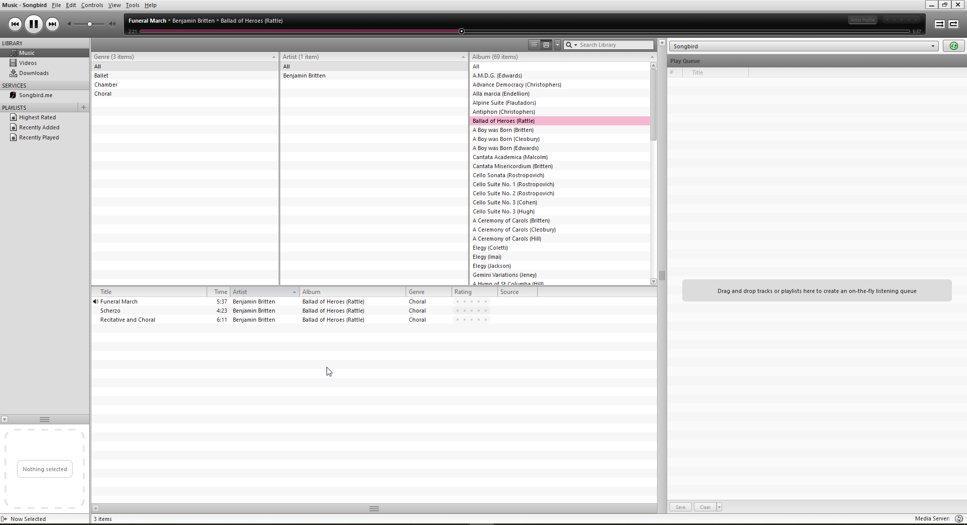
Once added, there's no default grouping applied to your collection: it's presented just as a large list of individual 'songs'. However, if you click a very inconspicuous button toward the top of the display (next to the 'Search Library' control) , you can make the program display three 'panes', which group the music by default by Genre, Artist or Album respectively. You can then (say) click a specific Artist name to see all the Albums available by that composer; click a specific album in the Albums pane, and the main pane then displays the tracks associated with that album. It is therefore quite easy to click through things to quickly get to a specific piece of music:
Unfortunately, you will note from that screenshot a complete absence of album art. The small square panel in the lower left-hand corner is supposed to display the artwork associated with the currently-playing track, but failed to do so for any of my music files. This is completely unacceptable -and something no other music player I've investigated has failed at.
I could personally do without the Genre tab -and whilst you can right-click any of those top three panes and change the thing they group by, you cannot simply get rid of one of them altogether. It's a little inflexibility I could live with, but wish wasn't there.
Playback is fine, though there don't seem to be options for configuring which output devices you want to play the sound through. On a simple setup, that's not a problem, but if you have multiple audio devices, the lack of such configurability may be a problem.
Sadly, the player is, by default, configured to apply 'replaygain'. That makes quiet tracks sound as loud as loud tracks if switched on ...so it's clearly a bonkers option to use when playing classical music, unless you particularly like your quiet, slow music to sound as loud as the bits where the entire symphony orchestra plays fortissimo! Obviously, you can switch that off, but it's annoying to be on in the first place. Fortunately, Songbird doesn't appear to have any other default options switched on that would result in your metadata being modified with auto-fetched data from sources of dubious merit, so it seems fairly safe in that regard.
On the plus side of things, gapless playback seems OK: in my standard test, you'll hear no gap between when the Queen sings 'Go!' and the chorus starts singing 'Victor of Cadiz!':
The transition takes place at around the 7 second mark in that clip -but I don't think you can actually hear the track change at that point. Visually, too, the thing seems seamless enough:
I did have the slightest suspicion at one point that Songbird, like AIMP before it, was doing track 'fade in and fade out' to blur between tracks, rather than doing a proper gapless transition between them. But having listened to my sample repeatedly, I think it's pretty good gapless after all.
Without spending too long investigating what is, at this point, essentially dead software, therefore, let me sum up by saying that's it's functional, attractive and makes sorting through a large music library to find the one composition or track you want to play relatively easy. If it could display album art properly, and was still under active development, I would quite strongly recommend it. Functionally, after all, it is a slightly more modern-looking version of Foobar2000 -which is high praise indeed. But, the album art problem is a show-stopper, as is the fact that development of the software stopped 6 years ago. I'm afraid that in this state, this music player, for all its merits, cannot be sensibly recommended these days.
In conclusion:
Good Points:
- Attractive, with good default appearance and font choice
- Good feedback when first scanning your music library
- Extremely quick to scan a large music library and add it to its database
- Once the genre-artist-album panes are displayed, navigation through a large music collection is efficient
Bad Points:
- Software no longer developed, so increasingly out of date (and complains it can't run on Windows 10, for example, though it ends up doing so acceptably)
- Doesn't read embedded album art, so there are no graphics displayed, even for tracks which definitely have been correctly tagged with album art
- Will always display three 'grouping panes'; you can change the grouping criterion for each, but you cannot just switch a pane or two off
- Defaults to wanting to apply 'replaygain' (i.e., alter the music signal)
- Lack of configuration options for playback hardware
- Web features (such as fetching new skins) broken (as the original websites are no longer maintained)
Overall score: 2/10. The software is attractive enough and plays music well enough (including being able to do gapless playback), but its inability to display album art is a show-stopper. It is also no longer being actively developed, so whatever bugs it contains will never be fixed. It's impossible to recommend unmain5tained software.

