Colour Perception and Sorting
This is yet another story about AMP (my ever-evolving music player) being updated. This one, however, has a subtle twist that most of you probably won't care about, let alone make use of.
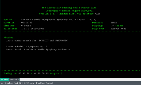
It's all to do with colour. In all my software, I try to use just four colours in a consistent way: (1) Terminal Default Foreground; (2) Bright Red; (3) Bright Yellow; and (4) Bright Blue. The terminal default will depend on what colour scheme you've configured your terminal to use. Commonly, as in the screenshot on the left, it's bright green for me and my desktops. It's used to display fairly 'static informational' text: things like the program name, the data labels and so on. Bright Red is used to display error or out-of-condition messages or alerts to program behaviours. Bright yellow is used to display user-input or fairly static information derived from user input (such as the folder path/name from which you're currently playing music). Finally, Bright Blue is used to display fairly dynamic text derived from user input (the name of the database you're using, for example, or any override switches you've specified that affects what music will be selected for play). I may not always be entirely consistent with the way I use my colours, but that's the general scheme I try to use and stick to, anyway! [...]
