 Dopamine is available as a small 7+MB download from the digimezzo website. Note that at the time of writing, there’s a stable version 1.5 or preview builds of version 2 to be selected: I chose to look at Preview 15 of version 2. It’s also available as a ‘portable’ edition or an MSI (meaning it installs properly to your PC’s hard disk): I decided to do the full-blown MSI installation.
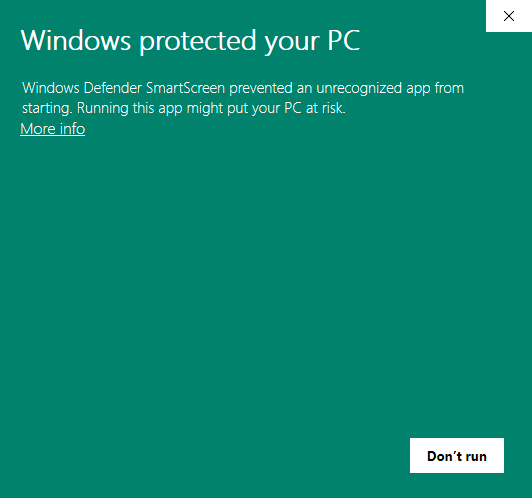
Unfortunately, we fall at the first hurdle:
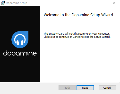
The program triggers Microsoft’s aggressive SmartScreen filter and, by default, the installer won’t run at all. But if you click the ‘More info’ link, you can click a ‘Run Anyway’ button, and that kicks of the usual sort of software installer:
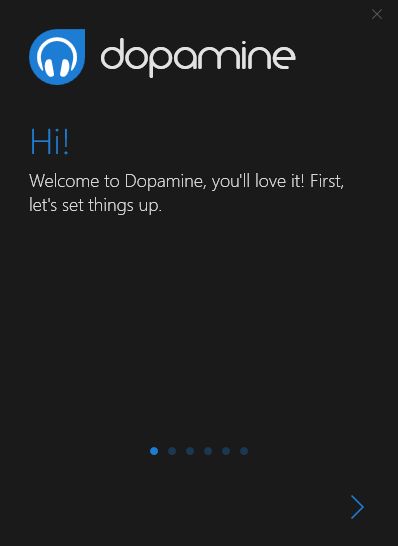
The installation process is straightforward: click [Next] a few times, approve the Windows security dialogue that pops up at one point, and you’re done. When you then launch Dopamine, you are treated to a ‘first time’ wizard:
You step through this wizard, once screen at a time, by clicking on the big '>' button. With it, you get to choose your language, whether to use the light or dark theme (I chose the light one) and a folder to point to that contains all your music files:
Note that I was able to point Dopamine to a mapped network drive (my Z: drive actually points to my remote media server, accessible over a wireless network). You can also point it direct to a network URL equally successfully (i.e., something like \\servername\sharename will work fine).
I must say, however, that when the wizard finishes and you are taken to the main program window, you are left to wonder what was the point of specifying a music folder at all, because no music of any sort is likely to be displayed as being available. There's no progress meter of any sort displayed, either: as far as you can tell, the program is just sitting there doing nothing at all and with no music to play! So you might be tempted to click around for options and so on to see what you can do about that. Unfortunately, there are no very obvious menus to click, either!
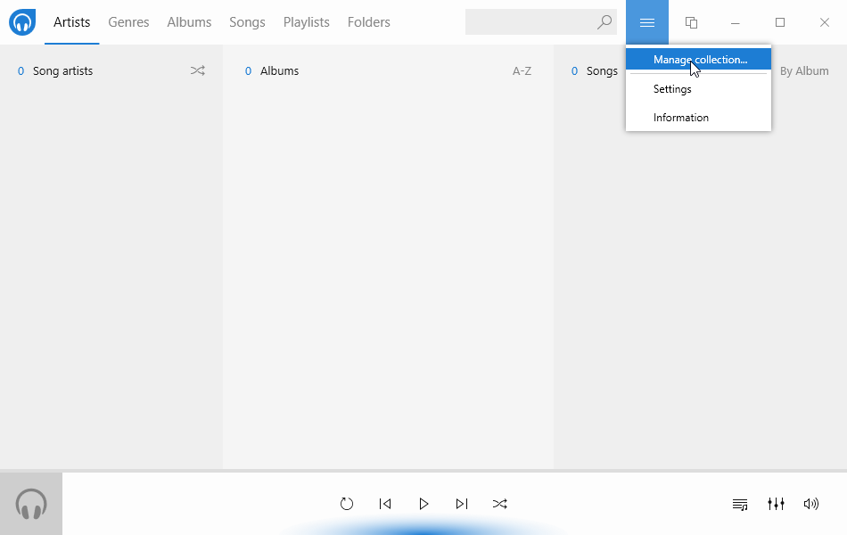
Instead, you need to click the hamburger menu in the top bar of the main display and select to ‘manage the collection’:
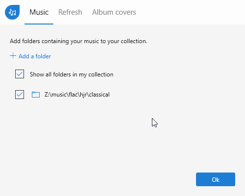
I dislike hamburger menus: they aren’t very ‘discoverable’, in that they hide the very functions you might most want to use. But anyway, having clicked ‘Manage collection’, I found this:
That is, it knew all about my Z: drive and was supposed to be finding music within it. I tried deleting the Z: drive entry (hover over it and an ‘X’ appears on the right: click on it and the entry is deleted. Again, hiding controls until you magically hover over the correct place by chance isn’t my idea of good interface design) and re-adding it, but that didn’t trigger any music discovery either, as far as I could tell.
I then read the developer's FAQs and discovered that in C:\Users\<username>\AppData\Roaming\Dopamine\Log there's a text log file which can view that shows you exactly what the program is doing:
2019-11-04 10:18:03.769|Info|FolderRepository.AddFolderAsync|35|Added the Folder Z:\music\flac\hjr\classical
2019-11-04 10:18:08.546|Info|IndexingService.CheckCollectionAsync|143|+++ STARTED CHECKING COLLECTION +++
...which is at least informative, even if it is hidden away in places no sane person is ever going to find it! It's not even that informative, though, in the sense that having told you that it has at least started checking your music collection, new log lines are not added giving any indication of continuing progress. Still, at least knowing that it was doing something, I felt able to walk away and be very, very patient!
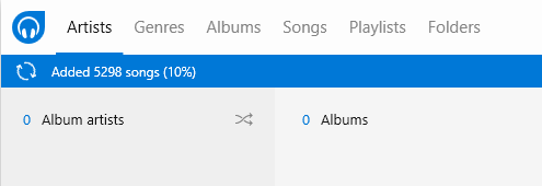
Now, as it happens, I then went shopping and when I came back two hours later, I saw this:
Finally! A proper progress meter and something that doesn't require a masters degree in poking about the place to find! In fairness, I will admit that my music collection is large (55,000 tracks or so) and connecting to it over a wireless network was always going to be excruciatingly slow. Slowness, however, I can cope with; a complete lack of feedback of any sort for a long period of time I can't. It wasn't a great user experience! Note also that although it's added 5,300 songs or so at this point, none of them are visible in the main program display window: you can't play any music with this program until the entire music collection has been scanned and added to the program's database. That is also not a great bit of user interaction design in my book (though it's common to many players, I should add in all fairness).
I will specifically call out this line in the hard-to-find log file, though:
2019-11-04 10:27:40.724|Error|FileOperations.GetValidFolderPaths|26|Error occurred while getting files recursively. Exception: Could not find a part of the path 'z:\music\flac\hjr\classical\C\Claudio Monteverdi\Opera\L'Incoronazione di Poppea (Hickox)'.
I don't know if that's just a trivial bug or not, but it appears to be choking on the apostrophe in the name of the Opera, thinking it is terminating the entire path and filename, as the one at the very end of the line is supposed to do. If so, that's wrong, because an apostrophe is a perfectly legal filename character for Windows (and other operating systems come to that) and there's no good reason why a program should get confused about seeing one. Not being able to handle paths and file names properly is a major problem for any program that claims to be able to scan paths and files for data to catalogue.
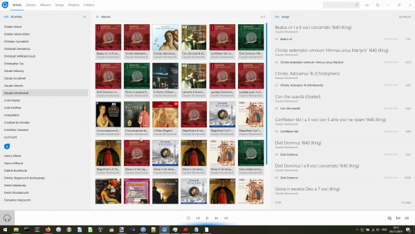
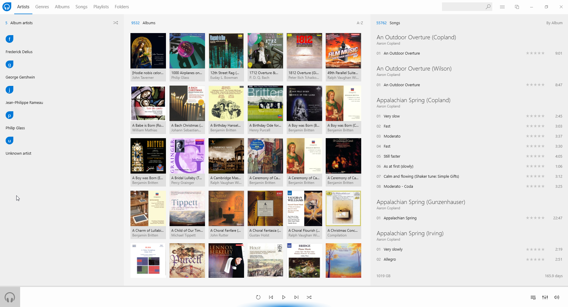
Anyway: the player eventually ended up taking about 12 hours to catalogue my entire music collection (which is considerably slower than, for example, Foobar2000 managed it). Nevertheless, it got there in the end -and this was the final result:
First impressions at this point were really quite good: it’s an attractive display. There's a lot of use of album art to make the thing visually appealing, so there's plenty of colour and visual information being imparted.
Unfortunately, the devil is in the detail: despite having successfully catalogued over 55,000 "songs", the program declares that they are all by one of just 5 different 'Album artists', one of whom is "Unknown". Now, this is a consequence of Dopamine not understanding my metadata tagging habits (and those habits having changed over time!). The fact is that very little of my music has been tagged with an 'Album Artist': classical music doesn't have such a concept, so classical music gets tagged either with 'Artist' or (and) 'Composer' ...and, clearly, Dopamine doesn't use either of those tags by default, which is ...unfortunate, shall we say?! That there are a handful of composers who still possess tracks formerly marked with 'Album Artist' is news to me -and something I shall fix swiftly! But that will then mean this screen will display everything belonging to just the one album artist: Unknown.
It's not all doom and gloom, however. If you left-click that word 'Album artist', it will toggle between displaying 'Album artist', 'Song artist' and 'All artists' (and yes, the fact that you have to click on words which don't appear in any way to be clickable is a "feature" of the Windows 10 visual paradigm... and is unutterably stupid!):
Here, I've toggled it to displaying 'All artists' -and, as you can see, we have a proper result at this point: composer's names such as Arvo Pärt and Benjamin Britten display appropriately after all. The little blue 'initial letter dividers' you see there are a nice touch, too: making it obvious when the A's have finished and the B's have started is a valuable enhancement to the navigability of your music collection. My joy at this usability enhancement is, however, somewhat tempered by the weird decision to fill the little blue 'drops' with initial letters in lower case!! Ugh. There's a reason we start sentences with capital letters and initialisms are always uppercased: for this program's developers to ignore those reasons is just irritating.
Incidentally, and whilst we're here: how about that error report in the Dopamine log I mentioned earlier? The one that says it couldn't find the full path for my recording(s) of L'Incoronazione di Poppea. Well, here are the 'albums' for Claudio Monteverdi:
Spot the first two albums in the third row? Yep: both my versions of L'incoronazione are catalogued perfectly well. So who knows what the error message in the log is all about?!
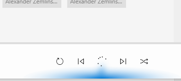
Anyway: let's talk playback functionality. First, it's probably another consequence of having such a large music collection, but getting the program to play anything at all is a struggle! For starters, you might think to double-click an album icon in the middle of the screen to start it playing. Well, when I do that, I then have to wait around 10 seconds for any part of the double-clicked album to play. For those 10 seconds, rather than music, I get to see this:
That is, the play button turns into a 'whirling circle' of dots, indicating "please wait". It does start playing eventually, but the delay is unacceptable. The other thing that's problematic about the program when it's playing something is that it's very hard to see what's playing:
The 'currently playing' track is indicated over on the right of that screen with a tiny blue bar graph (why a bar graph? Who knows?!) There's no other indication ...and if you single-click another album, the right-hand part of the display changes to show the tracks of that new album, not the tracks that belong to the album that's actually playing. It's a complete mess, to be honest.
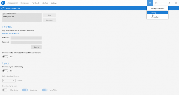
If we go back to the hamburger button and select the ‘Settings’ option for a moment:
…you’ll see that there are several options that involve working with online sources of information. One is good to see: Dopamine can “scrobble” details of all the music to which you listen to Last.fm, an online music-listening statistics website. I like doing this, so having the option is a ‘good thing’!
However, the option to ‘download artist information’ and ‘download lyrics’ are not so good. They are on by default -I’ve switched them off for that screenshot. This is extremely bad news, because it means your carefully-curated music library is likely to be attributed to all sorts of artists that Last.fm has records on, but which are likely to be completely false matches. I don’t like my media players fetching any metadata from online sources (since it will always, without fail, be rubbish). I especially don’t like players doing it by default -and me only finding out about it after I’ve added my music to the player. Being able to switch this sort of thing off before you add music to the player is really important for classical music, and it’s a shame Dopamine lacks this feature.
Back to the main business of playing music. A nice feature is the ability to ‘Switch Player’ -though, unfortunately, the option is tucked away behind an otherwise anonymous icon on the top bar:
That icon looks like the one most applications use to indicate a ‘copy’ or ‘paste’ function, so why Dopamine uses it to mean ‘switch player’ is a bit of a mystery. Click that button anyway, however, and the Dopamine display switches to this sort of thing:
That’s actually a very nice ‘compact player’ display. Again: lots of good use of album art makes this an attractive player, and the text makes the track title being played obvious. To switch back to the main full-screen display once more, you again click the ‘two documents’ icon at the top of the display.
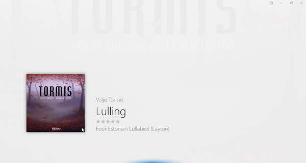
Once back at the main display, if you click the album art in the lower-left of the screen, an alternative form of display appears:
I’m rather less impressed with this one! The album art is displayed very faintly in the background, the other bits of textual information appears as faint grey text on the grey background: it doesn’t offer much extra value to proceedings!
In its three modes of display, however, the program does use the ‘visual styling’ that Windows 10 has introduced for its UWP applications. It’s the only media player in this comparative review that looks very much at home on Windows 10… and wouldn’t look so good on any other version of Windows!
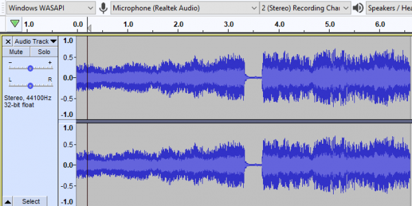
In terms of playing music, the program is fine for the most part: it defaults to using the default audio device, but this is configurable, so PCs with complex audio setups should be able to cope. Sound quality is good. There is one big exception to this, however: the program doesn’t do gapless playback properly. To illustrate this, I’ve captured the point where the program switches from playing track 36 to 37 of Britten’s Gloriana. The two tracks are supposed to flow directly from one to the other. Here’s what it looks like in Audacity:
Spot the flat section at around the 3.5 second mark: that marks the spot where one track ends and the next begins. The fact that there's a visually-apparent flat spot between them means there's a fraction of a second of near-silence at that point... and that's a gap! Here’s what it sounds like:
It will sound generally thin and ghastly, because the way Audacity captures the playback means it’s filtered and processed pretty horribly. So it’s not a fair or accurate representation of the quality of the playback from Dopamine! It is, however, a completely fair and accurate representation of what happens as my two tracks transition between each other: that audio ‘stutter’ you hear at the 3.5 second mark is absolutely what my ears hear, too.
Technically, Dopamine supports all the audio formats you’re likely to want to play with it, including FLAC, WMA, MP3 and OGG. If your PC has a dedicated graphics card, Dopamine uses it to help offload processing from the main CPU, which means your music player will continue to look good and do all its album art tricks, but your computer will remain responsive all the while, since the load on the CPU itself will be fairly light. On the other hand, if you’ve only got integrated graphics (no separate graphics card, in other words), all Dopamine’s graphical goodness will be clobbering your CPU quite hard.
Dopamine doesn’t attempt to do CD ripping or use automatic music organising features -but those are good things in my book. I want my music player to play music well -and I don’t need it to try doing a lot of other things, probably less well than my existing choice of tools.
So, to sum up:
Good points:
- Small download
- Looks great, with good use of album art and fits the Windows 10 aesthetic very well
Bad points:
- Some strange icon and other 'visual cues' choices
- Use of the hamburger menu: it's not very discoverable
- Very poor experience when adding a large music collection: little feedback to start with; no indication that anything at all is happening
- Records errors in the log, which then don't appear to matter
- Uses ‘Album Artist’ tags by default. Doesn’t use ‘Artist’ or ‘Composer’ tags until you tell it to
- Lots of use of 'playlist', 'songs', 'artist', 'album artist' and similar descriptors which all shout "I don't understand classical music" to me
- Options to fetch a lot of data from Internet sources are enabled by default
- Can’t do gapless playback of FLAC files properly.
Overall score: 4/10. It's a nice try and is visually very appealing but it's clearly not suited to playing classical music (being fixated on Album Artist metadata, for example). Its user experience when first adding a large music collection is terrible: little feedback is offered. The use of the Windows 10 aesthetic is nice, but has some nasty aspects (the hamburger menu, for example, and things to click which don't appear clickable at all). Fundamentally, too: if it can't do gapless playback, it's not a real contender.
