 MusicBee is available for free download at the MusicBee website. As seems to be common these days, you can either download a 'portable' version (means it can run directly after unzipping, without being formally installed anywhere), or the full-on, traditional 'Installer Edition'. There is also a Windows Store version, but I didn't try that one as I have nothing to do with the Windows Store! The Installer Edition download was a pleasingly-small 8.7MB. For unknown reasons, it is downloaded as a ZIP file which, when you unpack it, contains a single file called MusicBeeSetup_3_3_Update1.exe (at the time of writing): why you can't just download the EXE, I don't know. Maybe they think people's browsers will show dire warnings when you try to download an EXE?? It's slightly annoying to have to download something and then unpack it before you can use it, is all I'm saying!
Anyway: run the exe file after unpacking it. A standard installer will then appear:
As usual, just click [Next] to get things underway. You then get to agree to an End User License Agreement (EULA). This one's not too bad as it goes, except that it clearly isn't an open source license, as it restricts you in many ways (such as no decompiling, reverse engineering and so on). It's not too onerous, but it's a shame it's a proprietary product, no matter how free of monetary cost it is.
Once you agree to the license, you get to choose where to install the software: just click [Install] to accept the default suggestion and then things immediately start getting copied to your hard disk. It's a nice, short, sharp installer! When it completes, you can launch the program directly as you click [Finish].
Once you launch the program, you get prompted for a few things. To start with, choose a language:
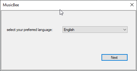
English users get a choice between 'English' (as shown) and 'English (US)': I was quite pleased that the US version of the language wasn't the default when I ran the program -but that may be because it's reading my laptop's default keyboard or language settings (which are UK English by default). If so, that's good for those of us on this side of The Pond! There are 16 non-English languages to choose from, which seems pretty comprehensive for a free piece of software!
Next, you get asked where your music files are lurking, so MusicBee can start scanning them and adding them to its database:
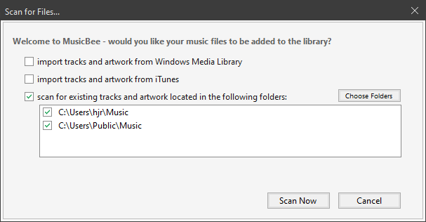
Notice that the user's own local Music directory (and the Public equivalent) are switched on by default -which means having to turn those folders off, clicking [Choose Folders] and then navigating to where your network-stored music is actually to be found:
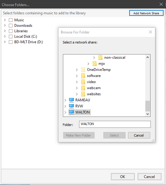
Notice thatthe original file searching dialog (in the background of the above screenshot) only shows local drives. A click of the [Add Network Share] button, however, lets you navigate, as you can see in the foreground, round your home network, so you can select from there directly, without having to map a network drive first. That's always a nice feature to have.
Once back at the original 'Scan for Files...' dialog, with the correct network home of your music properly specified:
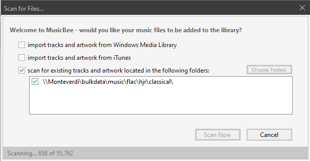
...you can click the [Scan Now] button and the music fetching process will begin. A very nice thing to see is the 'Scanning... 658 of 55,762' message at the bottom of the dialog box: so many music players leave you guessing if anything is happening as you scan for music! It's nice to see a counter updated in real-time:
![]()
It is slightly unfortunate that nothing is visible in the main program window for playing until all music tracks have been scanned and fetched, but that's not exactly unusual for most media players I've reviewed of late. At least MusicBee makes the wait bearable by showing you exactly how far it's got (and, by implication) and how far it has yet to go!
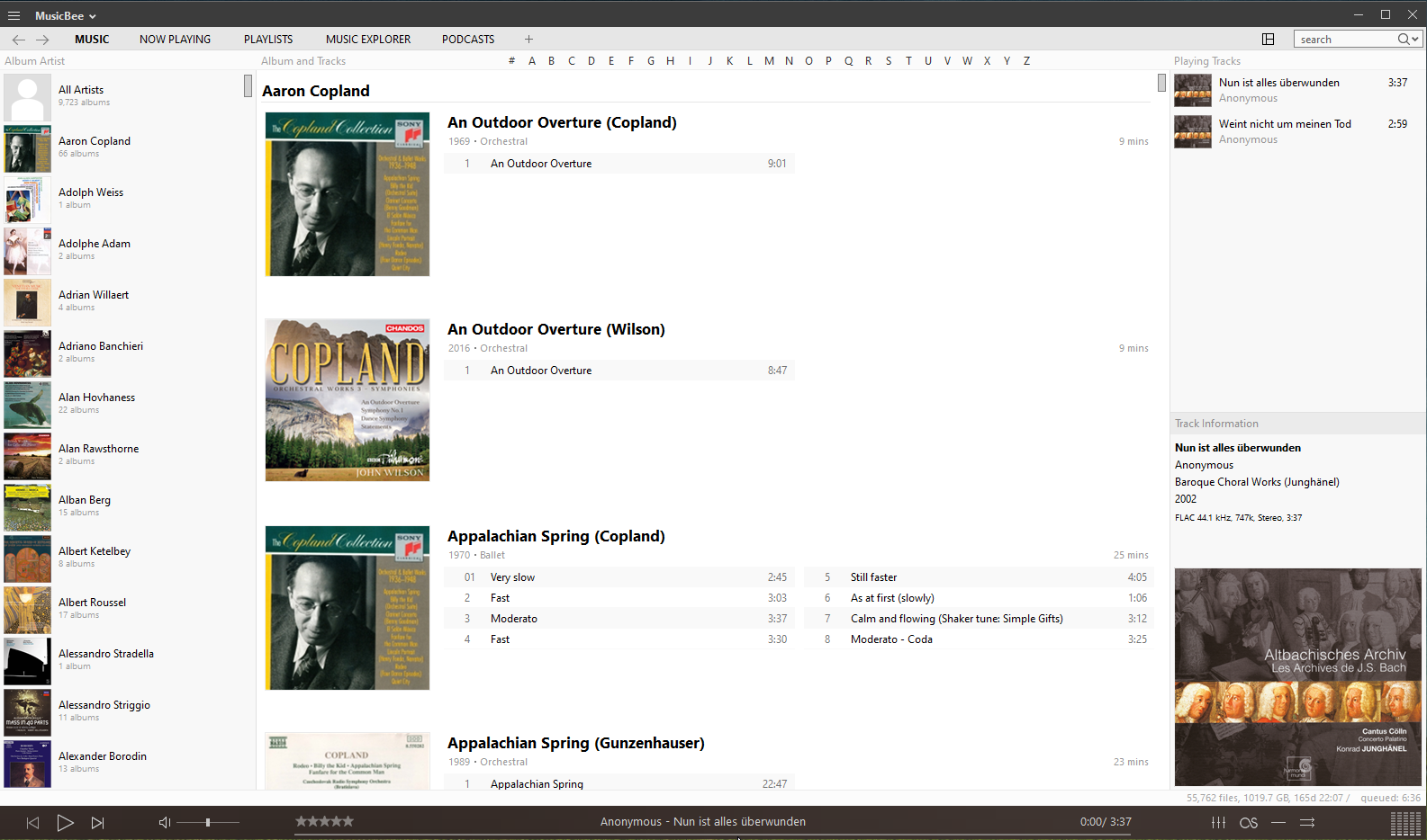
Once the music scan has completed, the main program window will then be displayed. It's a good first impression:

There'splenty to like about this display. It's spacious, so nothing feels too cramped; it's using album art appropriately, so you immediately recognise your music; it's a basic three-column design, with all your 'artists' listed in a tall, scrollable column at the left, the albums listed in the large middle pane, and the right-most column displaying the play queue (plus, at the bottom, the album art associated with the currently-playing track, if there is one).
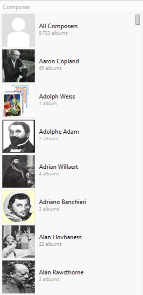
There are a few things that aren't quite right, though. For starters, the name 'Album Artist' at the top of the left-hand column is a bit jarring. This being classical music, I'd like that to say 'Composer', for example. Well... Hover over the grey words 'Album Artist' and a little down-arrow will appear next to it. Click that and praise be! you can select 'Composer' from the drop-down list:
It's a tiny -even trivial- thing, but it gives me a lot of pleasure to see that I don't have to listen to my music with a tool that insists on using terminology that just doesn't apply to me!
A second thing that's a problem: the left-panel displays 'thumbnail art' for each composer. But why? The image displayed is from the first album belonging to that composer, which really doesn't make a lot of sense. Fortunately, this is fixable. Firstly, you can change the size of the thumbnails ...and their content! Just click the 'Composer' word once more: select the 'large thumbnail' option and then repeat and select the 'Show Artist Pictures' option:
It's an improvement: the program has run off to the Internet and found stock photos for each composer. Well, mostly...! It hasn't had a lot of luck finding a mach for Adolph Weiss, for example, so he still gets an album cover rather than an artist image. But no matter: my preferred solution is to click the 'Composer' word once more and select 'Don't Show Thumbnails' option. Now the program looks like this:
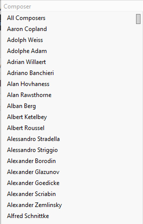
...and I can live with that sort of display very well indeed. If I had one complaint at this point, it's that there's no nice 'divider' between the As and the Bs and the Cs in such a list of names: Aulis Salinen flows straight on to Bedrich Smetana, and Brian Ferneyhough in turn moves straight on to Camille Saint-Saëns:
Visually, it would be nice if some sort of divider or 'separating capital letter' would break up the left-hand pane's flow. But it's a relatively minor quibble. I can cope with the options I have: it's at least nice to have the ability to keep the information density up by not using thumbnails where they aren't really needed!
Now, another thing I wasn't overjoyed with: that long list of things going along the top of the screen: 'Music...Now Playing...Playlists... Music Explorer... Podcasts'. I don't like those at all. This is my music player... why on Earth do I want something about Podcasts listed?! Well, those 'words' are actually tabs: click the words to make the display switch to whatever that tab wants to display. Here, for example, is what clicking the 'Now Playing' tab does for me:
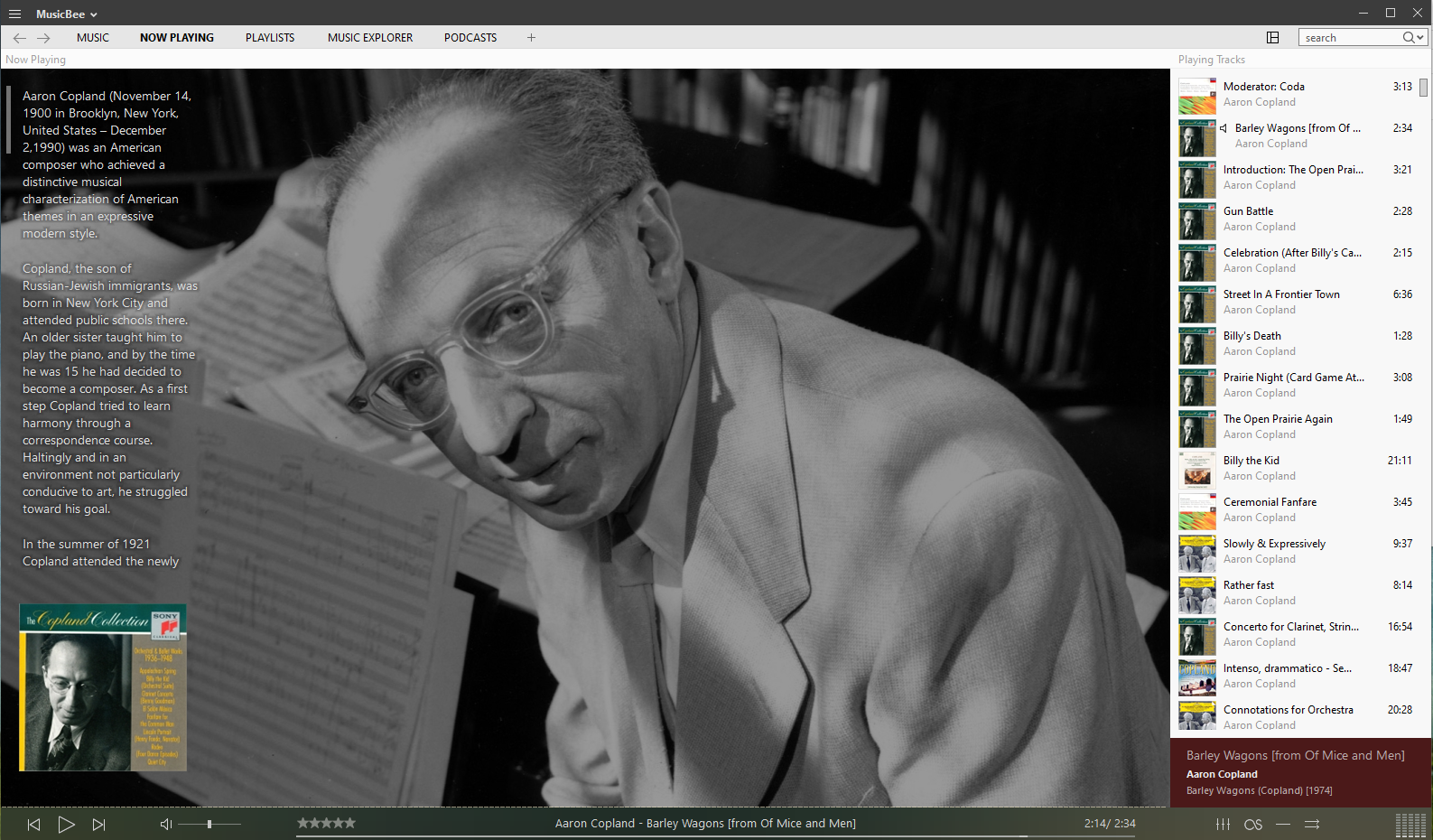
In other words, that tab is configured to fetch information about the composer whose music I've selected to play on the previous 'Music' tab. It's an interesting use of graphics -though as a result of wanting to keep the photo clear, they've squidged the text into a single column on the left. It's not obvious that you can hover over that and scroll your mousewheel up and down to work your way through the entire text, but you can.
I don't generally like this sort of 'web integration' with my music, as the results are often of dubious benefit. The result for a more obscure composer than Aaron Copland, for example, is less than stellar:
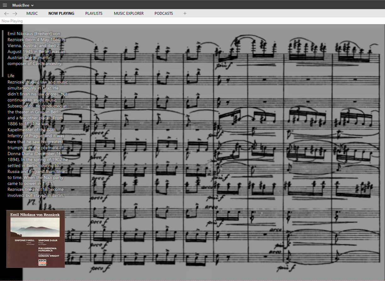
...but it's actually not a feature I hate on this occasion! I can see getting a quick link to a Wikipedia article about a composer might just enhance the listening experience!
Anyway, the real point is that if you don't like some of those tabs which are displayed by default, it's trivially easy to hover over them, right-click with your mouse and select Close Tab: problematic text entries at the top of the screen just disappear! If you want one back after you've accidentally closed it, click the '+' button shown on the top bar and select from the list of possible tabs then shown to you.
In short, MusicBee isn't even hideous to start with -but it's also so easily re-configured that it becomes positively pleasurable to look at and use.
Another example of how good this can get: click the hamburger menu next to the word 'MusicBee' in the very top part of the screen:
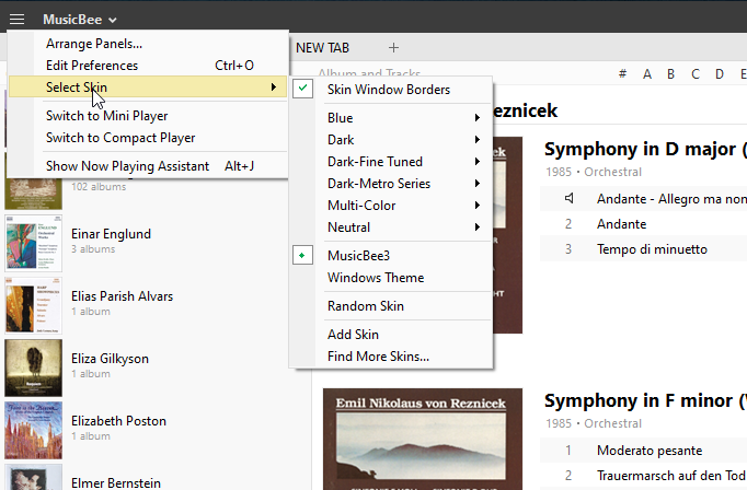
It's easy to re-arrange the panels making up the main display; to change the 'skin' and thus alter the overall appearance of the player; or to select one of the other player 'forms' -mini or compact. I don't generally like this sort of thing hiding under hamburger menus (since they are not obvious to find), but you can get to most of them by clicking the little down-arrow next to the word 'MusicBee' in the window title bar, too... so, whichever way you prefer to do it, the program is easily configured.
The mini-player form is quite useful:
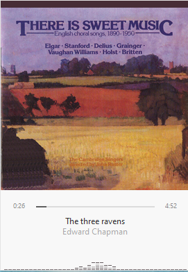
It's very compact, but uses album art to make it obvious what's playing and still manages to give you a control to show you how far through a track you are. These are usability features I like a lot.
In fact, the player is potentially too customisable! If you start clicking through MusicBee -> Edit -> Edit Preferences, you'll find a bewildering number of options to click on and fiddle with:

I'm not going to pretend I've worked my way through fiddling with everything! But one that immediately springs to attention as offering very nice 'completely get out of my way' capability is the option you see at the top of that screenshot: minimise to.... By default, the player will minimise to the Taskbar, as most Windows programs will. But click that down arrow next to that option and you'll be able to select to minimise to Notification Tray -meaning, to the System Tray area, next to the system clock. That means the thing practically disappears in use, continuing to play in the background. It's something I'd like all music players to be able to do, so it's wonderful that MusicBee makes it so easy to configure it to do it.
To be honest, there are probably too many configuration options to play with here. But another great one to start with is the Plugins one. Happily, MusicBee comes with very few plugins built-in, but it's good to see that the 'scrobble to Last.fm' one is built in -but disabled by default. So, to configure the player to scrobble to Last.fm (that is, to report what music you're listening to to www.last.fm, which I have done for years and find very helpful):
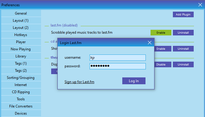
...just click [Enable] against the Last.fm plugin listed on that page and you'll be prompted, as here, for your last.fm username and password. Login when both have been supplied -and MusicBee will immediately start scrobbling your listening habits. Happily, too: though MusicBee will certainly push to the Internet details of what you play, it won't pull a bunch of useless metadata down from the Internet without you telling it to do so. It doesn't update your carefully curated metadata automatically, either.
I have one complaint about this Plugins page, however: if you click the [Add Plugin] button, you don't get shown a list of other plugins you can point to and click to download and install. Instead, the button merely opens a file browser window which you use to navigate to wherever you've previously and entirely manually downloaded plugin files. That lack of proper plugin integration is a bit sad, frankly (though it's no worse than the likes of Foobar2000 manage, it has to be said). So, I simply have to point you to the MusicBee plugins page and tell you to browse for things that might be of interest. Personally, not many of the available plugins are of much use to me, but the MusicBee Remote one is extremely useful! Download that to somewhere on your hard disk; it's an EXE file, so once it's downloaded, double-click to run it and click through the installation wizard. Once it's installed, re-launch MusicBee itself. You should be greeted with two windows appearing, thus:
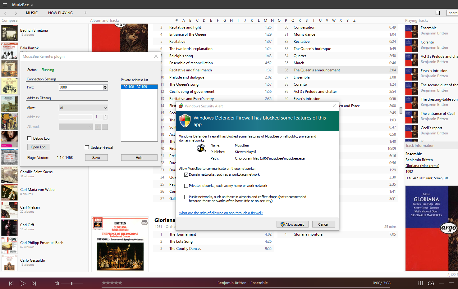
One is the Windows Defender Firewall: click [Allow Access] there. The second is the MusicBee Remote Configuration window (subsequently accessible via that Plugins configuration page we saw earlier). You shouldn't really need to alter anything on that second screen, so just click [Save] and then 'X' to close it. And the point of all that? If you have an Android Phone, you can download an app from the Google Play Store (called MusicBee Remote); when you run that, you can scan your local network and it should discover the new MusicBee installation on your desktop. Once connected, you can then control the desktop player from your phone: handy for making music play when you're tucked in bed at night, for example, and want something soothing to make you pass out! It's not functionality that will appeal to everyone, but I found it useful in the past to do something similar with the Clementine music player -unfortunately, remote control is one feature that Strawberry lost when it was forked from Clementine. So it's good to find a player that can replace that functionality. (Incidentally, if you are an Apple user, equivalent plugins and phone apps are available for that platform, too).
Another nice thing to see in the preferences configuration screen that is easily configured is the Player option: that lets you select the specific audio hardware to play to. If you've only got one soundcard, that's probably not a concern one way or another -but on a desktop that has various sound output devices, it's good to see that specifying a particular output device to use is so easily configured.
Playback is not perfect with MusicBee, however. This part of the screen within the Preferences -> Player option causes me concern:
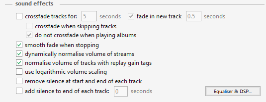
The last thing I want a classical music player doing is applying 'sound effects'! I can live with the 'smooth fade when stopping' one: it's actually quite pleasing to hear music fade out, rather than just abruptly stop. But the option to 'normalise volume' in the next two tick boxes is bad news in a classical music context. No thanks! My music signal should be as it came off the CD, without being messed with. It's easy enough to switch these options off, of course: it would have been nicer if they'd never been on in the first place, though! Fortunately, I've found no other examples of MusicBee being configured to "improve" your music automatically!
In terms of gapless playback, on the other hand, MusicBee passes with flying colours. My usual test for this is two tracks from Britten's Gloriana: the Queen stops singing 'Go!', the chorus takes over with 'Victor of Cadiz!' ...the point where the vocals switch over is actually the transition from one track to another. If you can see a gap in the audio waveform, you're not doing gapless:

The transition takes place around the 5.6 second mark: I defy you to spot the transition at that point in the graph. Your ears likewise won't be able to hear a track switch (again at about 5.6 seconds):
It is astonishing to me that so many players can't do proper gapless playback in 2019! It is, as far as I'm concerned, a sine qua non for any putative classical music player to be able to do it properly. Fortunately, you won't hear a track 'thunk' in that example: MusicBee's gapless playback is flawless.
MusicBee has extensive metadata editing capabilities -which is not something I'm keen on a music player having at all, to be honest. But if you're going to permit re-tagging from within the player, it's nice if you do it well... and MusicBee does indeed do that. Here's me having right-clicked a track and then selected the 'Edit' option from the context menu that appears:
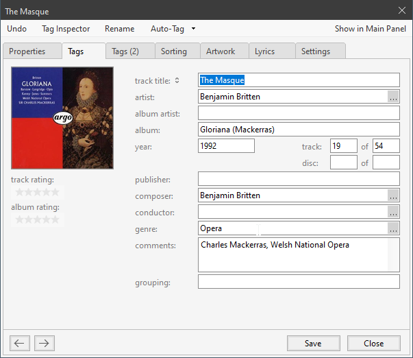
All the proper tags are displayed, ready to be re-typed and saved. The various tabs at the top let you specify a lot of other metadata-related options, such as exporting or importing new album artwork or specifying special 'sort' tweaks for a piece of music. The 'Tag Inspector' option is also there to let you specify 'weird' tags that might not be displayed by default. For example, the built-in selection of tags don't display the 'ENCODED-BY' or 'TAGDATE' tags. So, in Preferences -> Tags1, click the option to [Define New Tags] and fill in the name of the tags in the first window of each line:
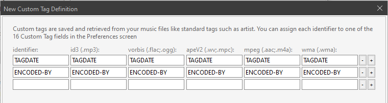
Save those new tag definitions, and then on the main Tag1 preferences window, modify the custom tags definition:

That's me saying that the second custom tag label should be 'Tag Date' (mixed case, with a space: it's just a label). I then say that new field should display the contents of the TAGDATE metadata tag (since it's actually the stored name of a tag, that's all upper case and no spaces). Save that and wait for the information to be re-collected from all your tracks. But once that re-collection has happened, when you re-open the tag panels for a selected track (that is, right-click and select Edit), you'll see this:

I've had to switch to the 'Tag 2' tab, where the custom tabs are displayed, but I can now see the ENCODED-BY and TAGDATE metadata for any track I need to check it for. That's very powerful tag management/display options, from right within your player. As I say, I really prefer to use dedicated metadata editors for this sort of thing, but for an occasional 'touch-up' of troublesome metadata, it's good to have this sort of capability readily to hand and for it to be so customisable as to be able to cope with 'non-standard' tags.
Clearly, there is a huge amount to discover, tweak and re-configure about MusicBee, but it presents a very well thought out graphical display from the very outset. Labels can be reconfigured to display classical-specific attributes. Tabs can be easily added or closed. There are lots of built-in skins and they can be applied and re-applied easily enough. There is a deep mine-full of advanced re-configuration options to be tackled at your leisure (or peril!), but playback is good and gapless and the player will get out of your way when you need it to. Scrobbling to last.fm is built-in, too, which is nice to have; and the ability to remotely-control the player from a phone is something I actually find useful, so finding that so easily configured for MusicBee is an added bonus.
In conclusion, then:
Good Points:
-
- Looks graphically attractive right out-of-the-box: a good default display
- Easy to point to a network store of music
- Good music scanning process, with proper 'X of Y' files processed so far feedback provided
- Nice classical music-specific touches, like being able to configure it to use 'Composer' instead of 'Artist'
- Good composer navigation options available by configuration
- Ability to scrobble to Last.fm built-in
- Powerful metadata tagging and tag-viewing options readily available, should you want them
- Ability to remotely-control the player from a phone is easily added to the player
- Very, very configurable
- Nice mini-player mode
- Proper gapless playback
Bad Points:
-
- Can't play any music until all music has been scanned and added to the program
- In Preferences -> Player, there are a couple of options enabled that will automatically alter the sound signal of tracks being played. Switching them off is not hard, but it would be better (for me!) if they were not on at all
- Probably too configurable for it's own good!
- Plugins preferences don't link into the website: you have to download yourself first and then point the plugins page to it -or, even, run an external plugin installer and see the plugin 'appear' in the plugin page afterwards. It's a bit of a usability mess, to be frank.
- If you double-click a composer's name in the left-most pane, it starts playing the first composition belonging to that composer: that's probably not what you want to do.
Overall Score: 9/10. I really wasn't expecting MusicBee to be a truly capable classical music player, but it is. It has all the powerful configurability of Foobar2000, but with a modern look that uses album art graphics well. Information density is kept usefully high, but without making it look like a spreadsheet! Most of the out-of-the-box defaults are reasonable; tweaking to make them near-perfect isn't too hard. Gapless playback is perfect.