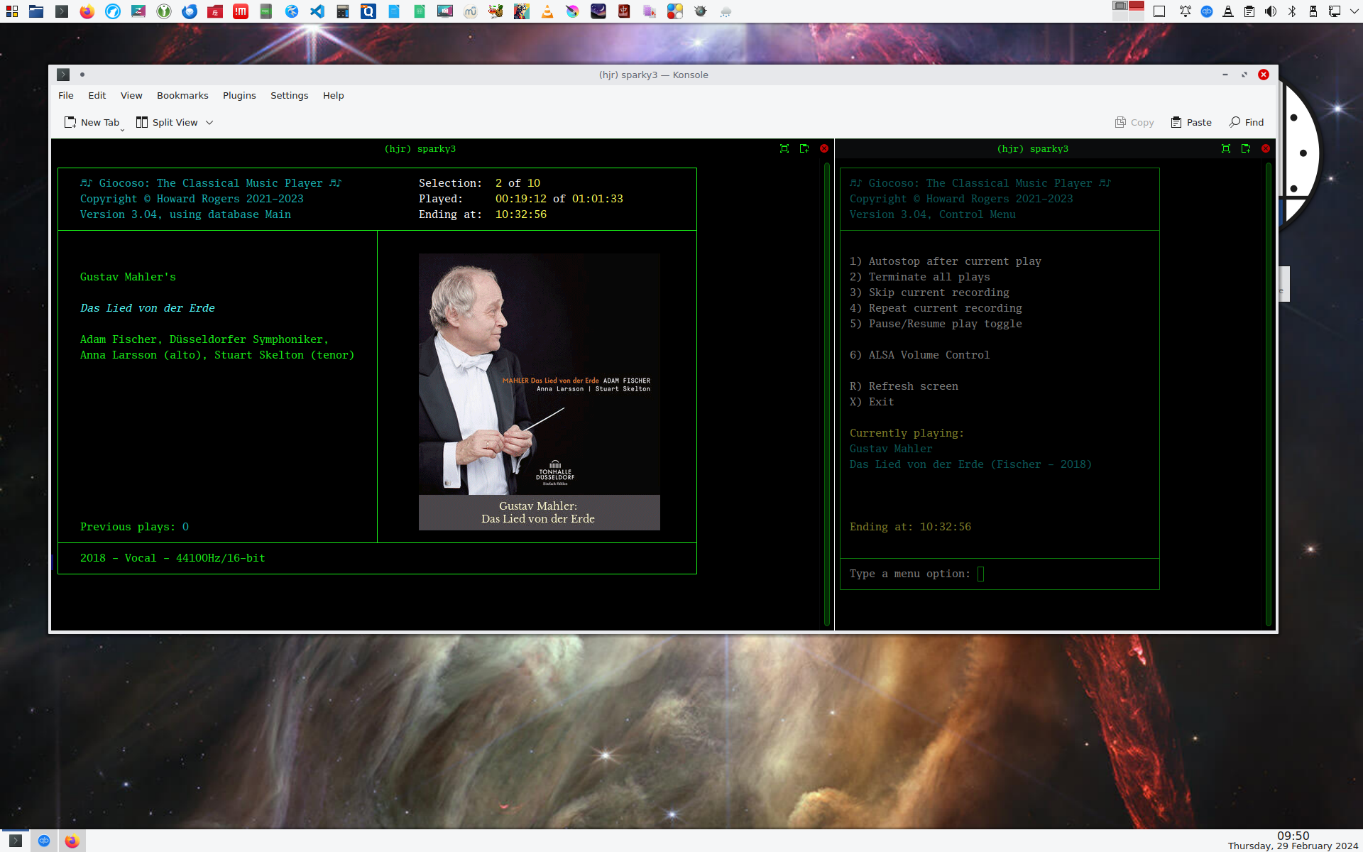
 I just thought I'd show you how I run Giocoso on my main desktop these days: see the screenshot at the left.
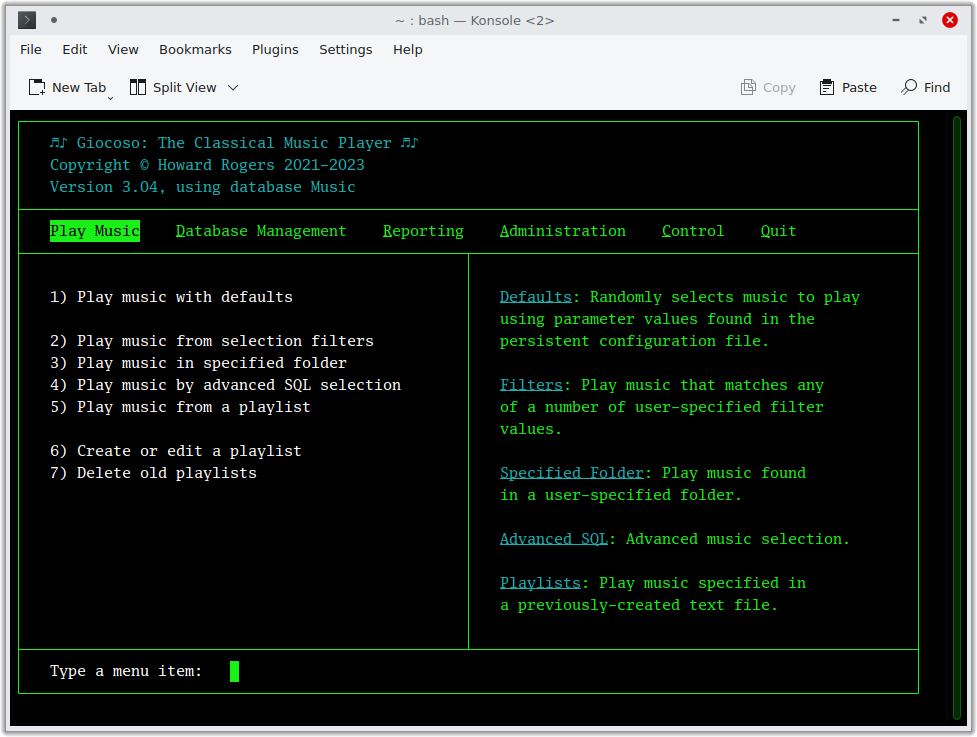
That's just a picture of KDE's default terminal, Konsole, running in 'split view' mode. Open Konsole, click the Split View button at the top of the program area to obtain the drop-down menu and from that select Split View Left/Right.
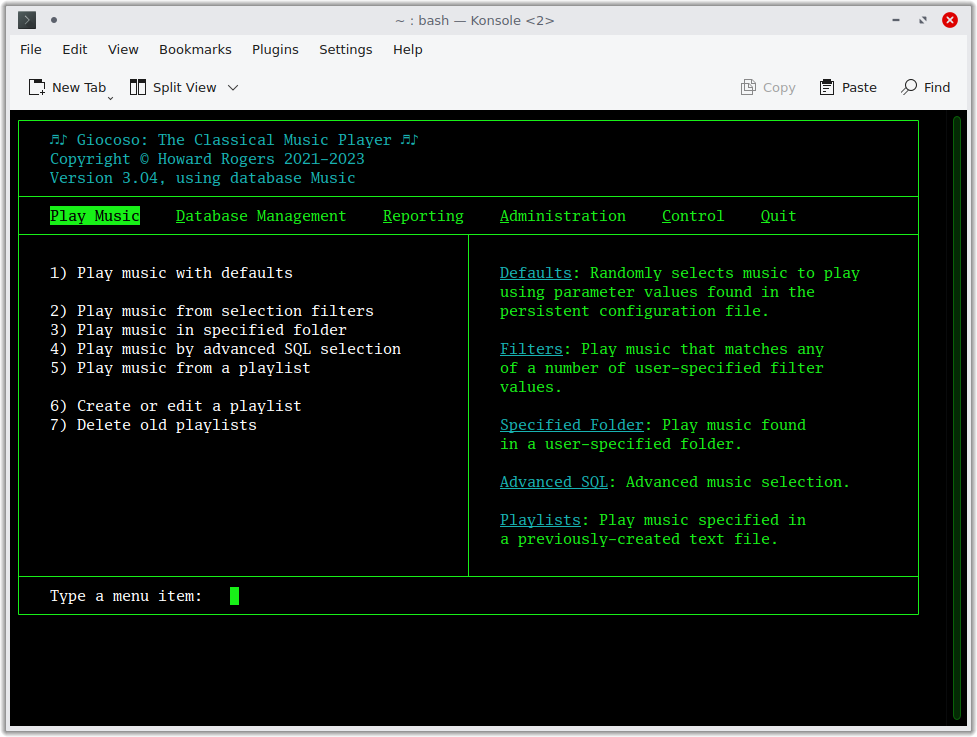
That gets you this sort of outcome:
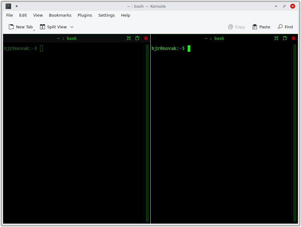
...which is essentially two independent terminal sessions running side-by-side, which you can switch between simply by clicking on each in turn.If you hover your moust over the vertical line that divides them, you can drag the line left or right and thereby re-size each terminal as required. I then ssh to my music-playing PC in both, and from there launch giocoso3.sh in one panel and mgiocoso3.sh in the other. That gets me a player visible in the left-hand pane and a control session in the right-hand one: everything I need to run Giocoso prettily and efficiently, in one 'giant' window.
By the way, though I wrote Giocoso Version 3 to ship with, install and use the Space Mono terminal font, you may notice from the above screenshots that I've had second thoughts about it! I'm instead using the Luxi Mono font, which is freely available to install, and will become Giocoso's default font in a version or two. Using it (at 11pt) requires a bit of tweaking of Konsole's default line-spacing:
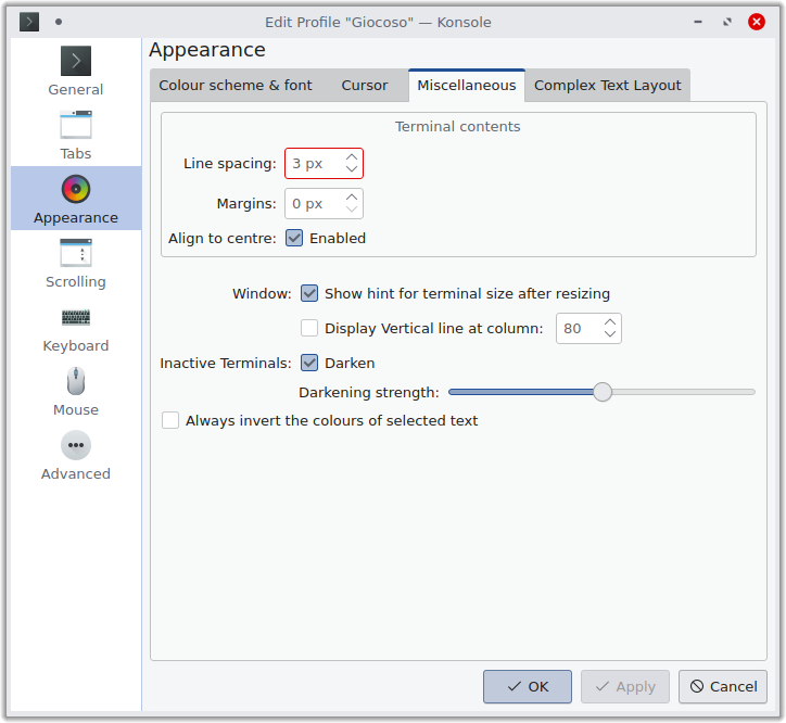
Switching on 3 pixel line spacing (the default is zero) and setting 0 pixel margins (the default is 1 pixel) is the difference between this:
...and this:
The difference is subtle, so no matter if you don't really notice it, but in the default case, everything is 'squished' upwards in the terminal, whereas a line spacing of 3px makes everything 'fill out' the terminal better. The Luxi font seems to have this vertical 'contraction' issue (which this line spacing trick fixes) that other terminal fonts don't. Anyway: I prefer a serif font whenever possible, and Luxi+line spacing adjustments mean I get to stay happy! It's also the case that I've seen some extremely poor kerning issues with Space Mono, practically scrambling the display of composition names at times, for example. So: a replacement is definitely warranted on legibility grounds, even if you aren't as obsessed as I am by serif v. sans serif issues!