1.0 Introduction
You've seen (in Section 3 above) that it's perfectly possible to use Semplice's audio conversion features to convert some input file into something that looks as if it's a Super High Resolution FLAC. So if someone were to sell you a super-dooper high resolution FLAC for lots of cash, how do you know it's a "proper" FLAC and not merely a crappy MP3 that's been converted to look like a good FLAC? One thing you could try to do is see whether high frequency sounds have been thrown away from your file's audio signature: that's something lossy codecs routinely and true FLACs would never do. If only there were a way to analyse a folder full of FLACs and produce some kind of analysis of the sound contained in it! Well, of course, that's exactly what Semplice's Audio Processing menu Option 3 lets you do.
As with all of Semplice's options, make sure either that you launch Semplice from within a folder full of FLACs, or use the W key to select a folder of FLACs as the new working folder.
2.0 Generating a Spectrum Analysis graph
With an appropriate working folder set, taking Audio Processing menu Option 3 immediately results in this sort of output:
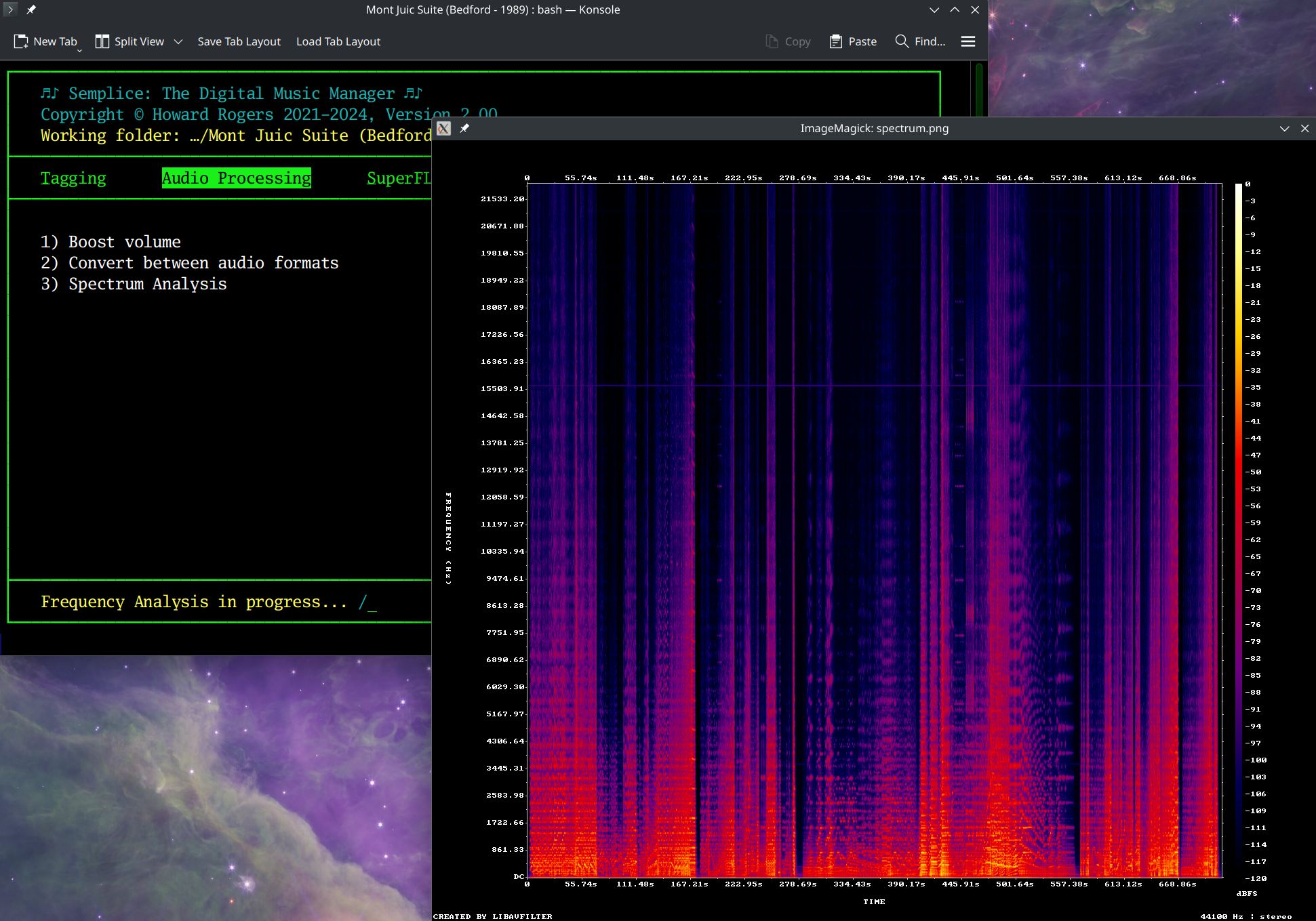
A message appears at the bottom of the main Semplice screen, saying that 'Frequency Analysis is in progress' and a spinner indicates the passage of time: depending on the recording, how long it is and how high the FLAC resolution is, analysis can take anywhere from a few seconds to a minute or so. Be patient! Also be aware that, for the performance of the frequency analysis, Semplice requires double the disk space occupied by the original FLACs in its tmp folder (i.e., $HOME/.local/share/semplice2/tmp). When you finish the analysis, this space is freed back up.
Immediately the analysis is complete, a pop-up window will appear in which a colourful spectrum analysis graph is displayed. You return back to Semplice by closing this pop-up window, whenever you're ready to do so. The pop-up is always a fixed size, such that the graph component of it is displayed at 1024x768 pixels.
3.0 Understanding Spectrum Analysis Graphs
The graphs display time in the x-axis and sound frequency in the y-axis. The x-axis should represent the entire duration of all the FLACs in the current working folder when played one after the other, with its start over on the left and its conclusion over on the right. At each time segment along the x-axis, the audio frequencies present in the audio signal at that moment are plotted vertically, with different colours representing different intensities of sound. Very white/yellow colours indicate 'a lot of this frequency in the signal here', and purple or black indicates 'very little of this frequency here'. Interpreting this spectrum analysis graph is a bit of an art form and I'm not going to be able to get into every nuance and detail here! But let's start by taking a closer look at this particular graph:
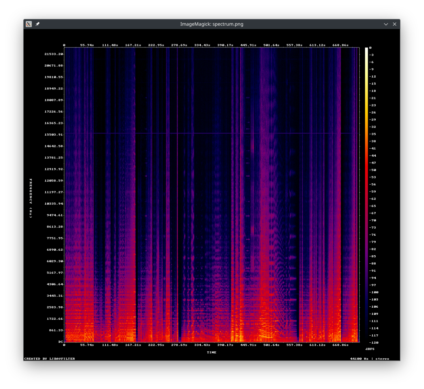
The first thing we notice is that there is some pink/purple colouring all the way up to the top of the graph (which is said to represent a frequency of 21,533Hz. Look especially around the 445 seconds mark: we have three intense bands of colour, the third of which is easily 'shooting pink' up above the 18,000Hz band. That's the mark of a true FLAC: remember that MP3s dispose of higher frequencies because you're allegedly unable to hear them for the most part. So if this was an MP3 that had been converted to a FLAC, we'd expect to see a sharp cut-off of frequencies above the (approximate) 16,000Hz region.
Let me just put that to the test, though. I'll use the Audio Processing menu Option 2 to convert the same FLACs that have just produced that graph to MP3s, then I'll re-convert them back to FLACs from there. Finally, I'll produce the spectrum analysis of the freshly-created FLAC:
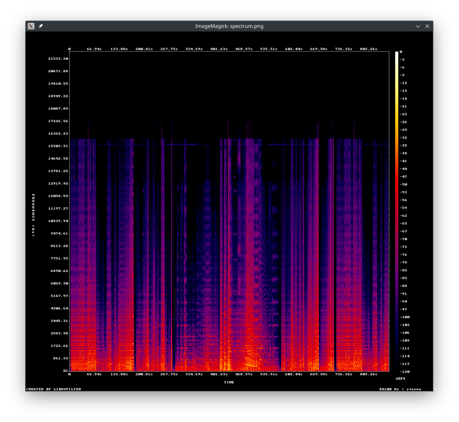
You can see the difference at once, even if the difference isn't audible to tired, old ears! Here, there's a very obvious and unsubtle cut-off of all frequencies above 16,000Hz, though the occasional peak pops up that gets into the 17,226Hz region. That's the hallmark of a lossy file that's been 'upsampled' to look like a FLAC.
The same trick can distinguish between 'real' high resolution FLACs and ordinary ones that have been made to resemble high resolution ones: you'd expect high-resolution FLACs to have frequencies well into the 22kHz range -maybe even into the 40kHz range. If you see a sharp cut-off at around the 20kHz range, you're dealing with a 'high resolution' signal that isn't particular high resolution!
4.0 Scratch Detection
Another use for this business of spectrum analysis is to be able to tell whether your CD rips are scratch- and blemish-free, without actually having to listen to it from go to woe. For example:
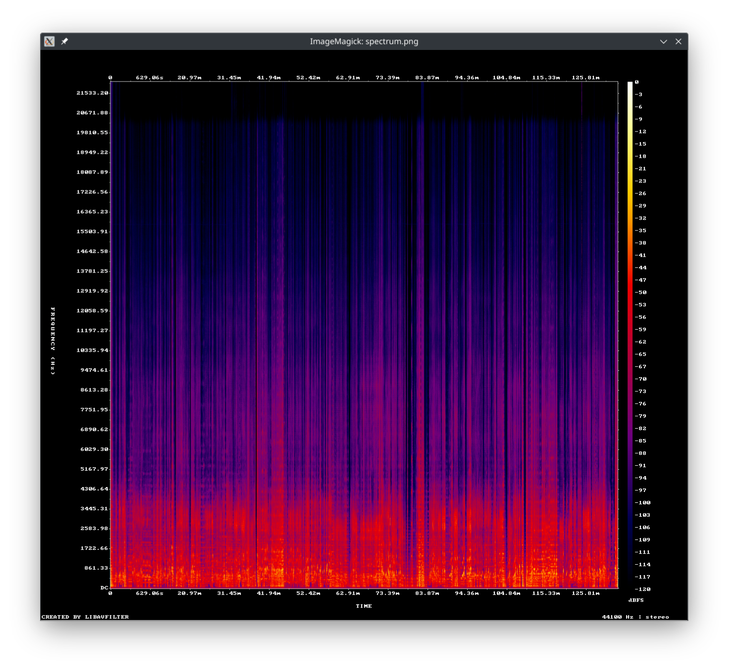 At first glance, this all seems fine, with frequencies going to the 20kHz range, so a 'proper' FLAC... but if you look carefully...
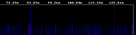
...at around the 83.8 minute mark, and again at the 125 minute mark, there seem to be transitory spikes well above the general frequency cut-off, into the 22kHz range. Those look suspicious, and I'd want to listen to this opera at around those times to make sure the rip was acceptable. When I extracted the audio from around the second of those spikes (which is a little bit pinker and thus more intense, than the earlier one), this is what I heard:
If you are listening around 13 to 15 seconds into that sample, you'll hear what your eyes only previously saw ...and, like me, you'll conclude that I need to re-rip that CD!
Spectrum analysus is not an infallible tool for click detection, though: I couldn't hear anything wrong in the opera around the earlier 83.87 minute mark, for example -though something is clearly not quite right there! But even finding one flaw in my rip by mere visual inspection is good enough for me!
5.0 Final Thoughts
Finally, I just wanted to head off a common question I sometimes get on this subject. Let's re-display that original spectrum analysis:
Do you notice anything odd in that graph, displaying just above the 15,503.91 frequency mark? There's in fact a horizontal line of purple going right through the entire recording at that frequency: and that looks very peculiar, very artificial and very undesirable. At my age, I doubt I could here a 15.5kHz frequency -but it's well within the audible range for young people. It's a fairly faint purple, so the intensity of this sound (especially when compared to the bright orange fire of the lower frequencies that underlies it most of the time) is such that, again, it's probably the case that few people are going to hear it: but the spectrum graph doesn't lie. The frequency is there when it shouldn't be ...and it's potentially audible. So what is it?
Well, there are a couple of possible explanations. Back in the ancient days of yore, we used to use computer monitors that used Cathode Ray Tubes (CRT). They had an electron gun that scans back and forth across the phosphor screen, drawing the image on it. In countries that use the NTSC TV standard, that horizontal scanning frequency is 15.734kHz. In countries that use PAL or SECAM it's 15.625kHz. So, if the recording studio had a computer monitor somewhere in the vicinity, it's quite possible that it caused the low-level 'hum' that horizontal line represents. It could also be general electrical interference, but the 15.something kHz frequencies for these horizontal lines is a bit of a giveaway that its very specific interference of the CRT variety! It is thus likely that recordings older than the 1980s would not have such a line: computer monitors were not exactly widely used before about then. It's also likely that recordings newer than, say, 2005 would not have such a line either: we started using flat panel LED monitors around then, though phasing out the old CRTs wouldn't have happened instantaneously. There's nothing you can do about this, really: the frequency is baked in to the recording thanks to the technology used for around 30 years. It's possible a re-mastering might be able to eliminate it: a good notch filter might take out the offending frequency without making too obvious a change to the music signal... but it's certainly not something you can readily do for yourself!
Anyway: that's spectrum analysis. It's probably not something you'd use a lot of, but it's there as a handy way of checking for flaws in your digital FLACs and for ensuring that if you've paid extra for lossless FLACs, that's what you're actually getting!
|[Back to Front Page]|[Tagging Home]|[Ripping Standard CDs]|[Ripping SACDs]|[All About SuperFLACs]|[Volume Boosting]|[Audio Codec Conversions]|