1.0 Introduction
Giocoso will display album art whenever a new recording starts to play. How -and whether- it does so is controlled by the --artsize runtime parameter. That parameter takes four possible values:
- small (300x300 pixels)
- medium (450x450 pixels)
- large (900x900 pixels)
- none
If the value supplied is 'none' then no album art is displayed at all. If any of the other three values are supplied, then album art will be displayed, at the various different sizes indicated. Giocoso only displays embedded album art: that is, album artwork which is physically stored within the FLAC file itself. External album art (such as 'folder.jpg', which is commonly found on Windows) will not be displayed under any circumstances.
The default value for this parameter is medium. It can be set explicitly to this or any other value in the persistent configuration file. If a value is set in the persistent configuration file, a runtime parameter can be supplied of a different value, and this will take precedence over the configuration file setting. For example, if ARTSIZE=none in the configuration file, but you launch Giocoso with the command:
giocoso --dbname=main --artsize=medium
...then album art will be displayed, at 450x450 pixels, despite the configuration file's assertion that no album art should be displayed.
Note that the embedded album art is virtually resized to the appropriate dimensions for display by Giocoso, meaning that a copy of the album art is extracted and resized for Giocoso's display purposes, but the original remains forever unchanged and unaltered by this process.
Whenever album art is displayed, Giocoso will also construct a caption panel to sit underneath the album art proper. The caption panel will contain the contents of the ARTIST and ALBUM tags of the FLAC file being played, trimmed down to about 80 characters long, and wrapped over two lines. It is assumed that the ARTIST tag will contain the name of the composer of the work (as recommended by my Axioms of Classical Tagging articles). The caption panel will therefore tell you precisely what is being played and by whom it was composed -something that, often, the album art itself won't completely make clear. To take one example:
Here, the caption panel is displayed in a faun/brown colour. You can, however, control the colouring of the panel and the text it displays, as the rest of this article will epxlain.
NB: Giocoso speaks fluent American. This documentation refers to 'colour', 'autocolour' and so on because its author is British-Australian and not utterly insane, but the relevant runtime parameters can all be spelled without the letter 'u'. Thus 'autocolor', 'colorcombo' and 'smartcolor' etc. all work and can be used interchangeably with their 'u-full' equivalents.
Basically, Giocoso does not particularly mind that Noah Webster ever lived, though it regrets it.
2.0 Colouring the Caption Panel
Giocoso Version 1.x used two separate ways of deciding on the colouring of the captionpanel: 1) making a specific choice of colour for the panel background and the panel text, using runtime parameters --captiontext and --captionbackground; 2) selecting from one of a predefined set of panel colour schemes, derived from the Monopoly® board colour schemes, using runtime parameter --colourcombo; or 3) getting Giocoso to automatically use one of the Monopoly®-derived colour schemes depending on the day of the week, using runtime parameter --autocolour.
In Giocoso Version 2, the --captiontext, --captionbackground and --colourcombo parameters have all been obsoleted and can no longer be used. This means --autocolour continues to work as it always did, but would confine you to only using Monopoly® colour schemes for evermore.
To avoid this, Giocoso Version 2 introduces a new caption panel colouring mechanism, using the runtime parameter --smartcolour. The smartcolouring mechanism performs a colour analysis of the album art associated with a recording. Having worked out its predominant colours, it uses one of them as the caption panel's background colour. A contrasting colour is then used to colour the text within the caption panel (this basically means you get a pale yellow text on dark panel backgrounds and a very dark purple text on light panel backgrounds). I go into more technical detail how this smartcolour algorithm works below.
In summary, when you launch Giocoso Version 2 you can affect the look of the caption panel in the following two ways:
- --autocolour - the day of the week determines which Monopoly® board colour scheme is used automatically
- --smartcolour - derive colours dynamically by looking at the album art associated with the music being played
Either of these colouring mechanisms are enabled by launching Giocoso with the --autocolour or --smartcolour runtime parameters. If neither is supplied, smartcolour is used. If both are supplied, the smartcolour mechanism takes precedence.
Either parameter can also be specified in the Giocoso persistent configuration file. The same rules apply: if both are set to 'Yes', then smartcolour will be used; if both are set to 'No' (or both are left commented out), then smartcolour will be used.
The interaction between what you specify in the persistent configuration file (if anything) and what you can specify as runtime ('double-hyphen') parameters can be a little complex but may be summarised as follows:
| Configuration File Settings | Runtime Parameters Supplied | Result |
|---|---|---|
| #AUTOCOLOR #SMARTCOLOR (i.e., both parameters are commented out) | none --autocolour --smartcolour --autocolour --smartcolour --smartcolour --autocolour | Smartcolour will be used Autocolour will be used Smartcolour will be used Smartcolour will be used Autocolour will be used |
| AUTOCOLOR=NO SMARTCOLOR=NO | none --autocolour --smartcolour --autocolour --smartcolour --smartcolour --autocolour | Smartcolour will be used Autocolour will be used Smartcolour will be used Smartcolour will be used Autocolour will be used |
| AUTOCOLOR=YES SMARTCOLOR=NO | none --autocolour --smartcolour --autocolour --smartcolour --smartcolour --autocolour | Autocolour will be used Autocolour will be used Smartcolour will be used Smartcolour will be used Autocolour will be used |
| AUTOCOLOR=NO SMARTCOLOR=YES | none --autocolour --smartcolour --autocolour --smartcolour --smartcolour --autocolour | Smartcolour will be used Autocolour will be used Smartcolour will be used Smartcolour will be used Autocolour will be used |
| AUTOCOLOR=YES SMARTCOLOR=YES | none --autocolour --smartcolour --autocolour --smartcolour --smartcolour --autocolour | Smartcolour will be used Autocolour will be used Smartcolour will be used Smartcolour will be used Autocolour will be used |
Note that when both caption panel colouring mechanisms are enabled via runtime parameters, the order of the parameters matters: the last one of the pair will be the one that takes effect.
I'll now explain the two colouring mechanisms in more detail.
3.0 The Autocolor Mechanism
For people who are not familiar with the traditional colours and names of the UK Monopoly® board game, here is a quick primer:
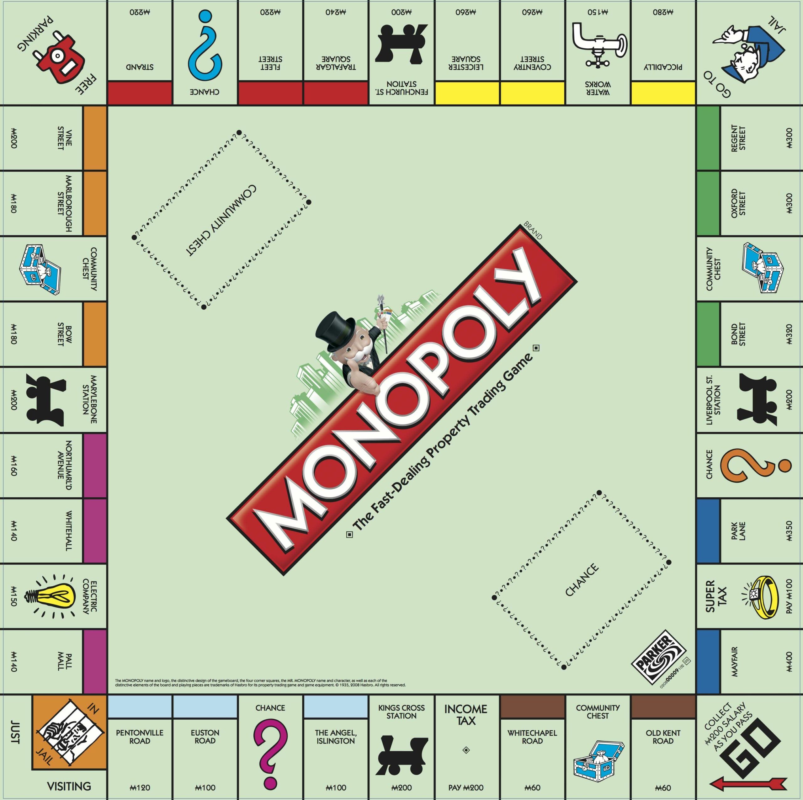
You can click on that image to see a full-sized version, but the short story is, starting at 'Go', and progressing in the direction of the Go arrow, you first visit brown properties; then light blue ones; then purple; then orange; then scarlet; then yellow, green and dark blue. The autocolour mechanism simply does this 'walk' around the board for you, automatically, picking a different property group colour each day of the week. Weeks start on Monday, using the brown property colours (plus white text); on Tuesdays, Giocoso will move on to using light blue of The Angel Islington (with black text); on Wednesdays, it will use the purple of Pall Mall; and so on.
A quick bit of maths will show you that the Monopoly® board contains eight coloured property sets whilst the week only contains seven days: accordingly, the Mayfair dark blue colour combination will not ordinarily be selected for use by the autocolour mechanism. Giocoso makes special provision for this, though: the Mayfair colour combination will be used automatically if it is the first day of the month, regardless of what day of the week it happens to be. Thus the colour combination used on Friday June 24th 2022 will be that of Strand (bright red panel, white text), but that used on Friday 1st July 2022 will be Mayfair's dark blue with white text.
4.0 The Smartcolour Algorithm
Since smartcolouring the caption panel is the default colouring mechanism used in Giocoso Version 2, we should perhaps start by explaining in a little technical detail how it goes about its work -because it can sometimes result in surprises!
The mechanism broadly performs the following operations:
- dynamically produces a 50x50 resized version of the album art
- with all its colours reduced to 8-bit representation
- with dithering to make approximate matches between the 'true' colours and their 8-bit equivalents
- the top 3 colours contained in this 50x50 version of the album art are then found and listed
- the least-common of those three colours is then chosen as the caption panel background
- the background colour is then analysed for its 'luminance' value
- when the luminance is above or below a particular threshold, essentially-black or practically-white is specified as the colour of the text in the caption panel
Let's take each of those steps in turn, using by way of example this piece of album art in my collection:
You can click on that image to see the original 1400x1400 version. I think we might agree by merely looking at it that the 'predominant' colour is a type of yellow -or, perhaps, that the chunk of blue stands out and gives the image a bit of visual 'punch'.
We start the colour-determination process by virtually resizing the image to just a 50x50 thumbnail, which I'll display here zoomed up to the same size as the original:

I think you'll notice immediately that the subtleties of yellow in the main image are hugely simplified. What was a gentle blend of multiple yellows to the right of the black text (and above the block of blue) now seems to be represented by maybe four or five 'chunks' of yellow variants that abruptly transition between themselves. The blue area plus red splashes, too, has been turned into a two-tone area, topped by some brown. Thus, all colour subtleties have been lost... but it nevertheless remains identifiable as a representation of the original image.
Resizing the image in this way thus performs two useful functions: (1) it hugely reduces the amount of data we have to process and analyse. In this specific example, a 4.5MB original was reduced to an 825 byte thumbnail! And (2), it massively reduces the number of distinct colours in an image. Instead of a thousand shades of unique yellows appearing only once or twice each within the original image, we now have blocks of maybe four or five yellows, appearing hundreds of times within the thumbnail.
Once the virtual thumbnail exists, we can analyse it for its 'top colour count'. This is done with another ImageMagick function and produces results in this case as follows:
440: (60.1909,74.026,107.49) #3C4A6B srgb(23.6043%,29.0298%,42.153%)
814: (228.203,221.682,70.9152) #E4DE47 srgb(89.4915%,86.9341%,27.8099%)
1246: (238.362,239.296,180.497) #EEEFB4 srgb(93.4754%,93.8415%,70.7832%)
That tells you that there are 440 instances of colour #3C4A6B, 814 examples of colour #E4DE47 and 1246 examples of colour #EEEFB4. Those hexadecimal representations of colours can be tricky to visualise, so let's put them into context:
 #3C4A6B (440 counts) #3C4A6B (440 counts) |
 #E4DE47 (814 counts) #E4DE47 (814 counts) |
 #EEEFB4 (1,246 counts) #EEEFB4 (1,246 counts) |
From this, we can conclude that ImageMagick is not wrong: the 'majority' colour is that slightly-dirty yellow (extreme right-hand column), followed by a much yellower-yellow (in the middle). If you glance back at the original art work, I think we can agree on those two being the most common colours in the image.
The colour on the far-left is, though, perhaps a bit of a surprise. I don't think it's a surprise that a chunk of something approximately blue has been detected in the image in the first place: it's clearly a significant part of the original artwork. But the particular choice of 'greyish/slate-blue' is maybe not what grabs the eye when looking at the original. You have to remember, though, that the resizing to a 50x50 thumbnail tended to turn the blue/black areas into an 'average' blue, which is why that particular shade of blue has been detected and counted as quite common.
In any event, that blue colour is the least common of the three colours identified, and is accordingly chosen as the caption panel's background colour.
If you were to plug that colour into the HTML Colour Picker made available at the W3Schools website, you will discover that it has a 'luminance' value of 33% (the red underlined figure on the right):

As you can see, with that luminance, both black and white text appear pretty reasonable when written on top of it -but, perhaps, white stands out just a little bit more and just a fraction more clearly. Giocoso in fact uses a 56% threshold: anything above that will result in the caption text displaying in black text (actually a very, very dark purple); anything lower than it will result in white text (actually, a very, very pale yellow).
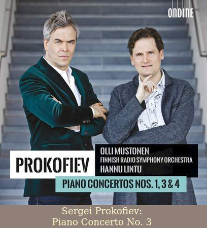
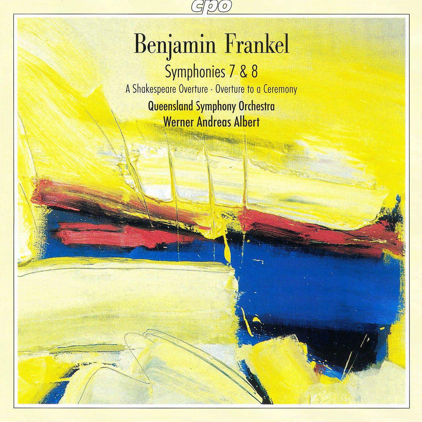
Putting all that together, therefore, it should no longer be a surprise when playing Frankel's Symphony No. 7 results in this album art+caption panel display:
Here's one more example:
The 50x50 thumbnail for that piece of album art looks like this:

...and you can see that shrinking and colour dithering has not been kind to it! Everything is mostly rendered in a shade of black and grey, so that the colour analysis of it produces these results:
828: (78.8633,77.8428,68.555) #4F4E45 srgb(30.9268%,30.5266%,26.8843%)
940: (127.084,132.433,125.187) #7F847D srgb(49.8369%,51.9344%,49.0929%)
732: (150.59,154.015,157.301) #979A9D srgb(59.0549%,60.3979%,61.6865%)
...which means we're going to end up dealing with colour #979A9D, as that's the third-least popular colour in the list. Going back to the W3schools website, we see that this particular colour has these characteristics:

...which is indeed a shade of grey, with a luminance value of 60%. For Giocoso, that high a level of luminance should trigger the use of nearly-black text for the caption panel... and sure enough, that's exactly what we see:
This time, the caption panel text is dark purple, which is Giocoso's version of 'nearly black'.
You will note from this example that Giocoso is sometimes inclined to choose colours for the caption panel background which are, at first sight, baffling: I suspect that when you look at this second piece of album art, you'd pick a sandy colour from the building, or perhaps a blue from the sky, as being the 'dominant' colour... but that's human perception doing its magic, and Giocoso cannot hope to replicate its work every time, using mere code and algorithms. Hopefully, however, the output is at least always legible -and thus useful in identifying precisely what music is being played at any given time by mere visual inspection.
In conclusion, you may care to note that the computation of a luminance value from any particular RGB colour is performed by Giocoso following the photometric definition of luminance. It is not the only way to compute luminance, nor does it always yield entirely sensible outputs... but it's close enough to be usable under most circumstances!
6.0 Re-displaying Album Art
If you ever close the album art display -or, indeed, if you specified --artsize=none and thus never displayed album art in the first place- you can re-display the album art associated with whatever piece of music is currently playing by launching a new instance of Giocoso in a second terminal session with the --artwork runtime parameter. This second session of Giocoso will re-display the artwork associated with the music that the first session is playing at medium size (i.e., 450 pixels wide, by 500 pixels tall), even if you originally asked for it to be displayed at the small or large sizes. If you also add the --withdock runtime parameter in the second Giocoso session, however, the re-displayed artwork will be positioned correctly in the vertical direction. As the second session makes the artwork re-display, it also kills off any existing artwork display, so that your monitor is not littered with multiple examples of the album art being displayed simultaneously.
Here, for example, I have launched Giocoso in my drop-down terminal with --artsize=small, so that the album art associated with the particular bit of Vivaldi that's playing is displayed in a fairly small thumbnail style:
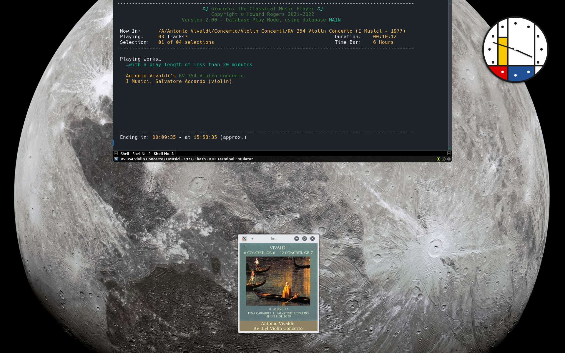
Next, I open a second terminal session and prepare to type the appropriate Giocoso command:
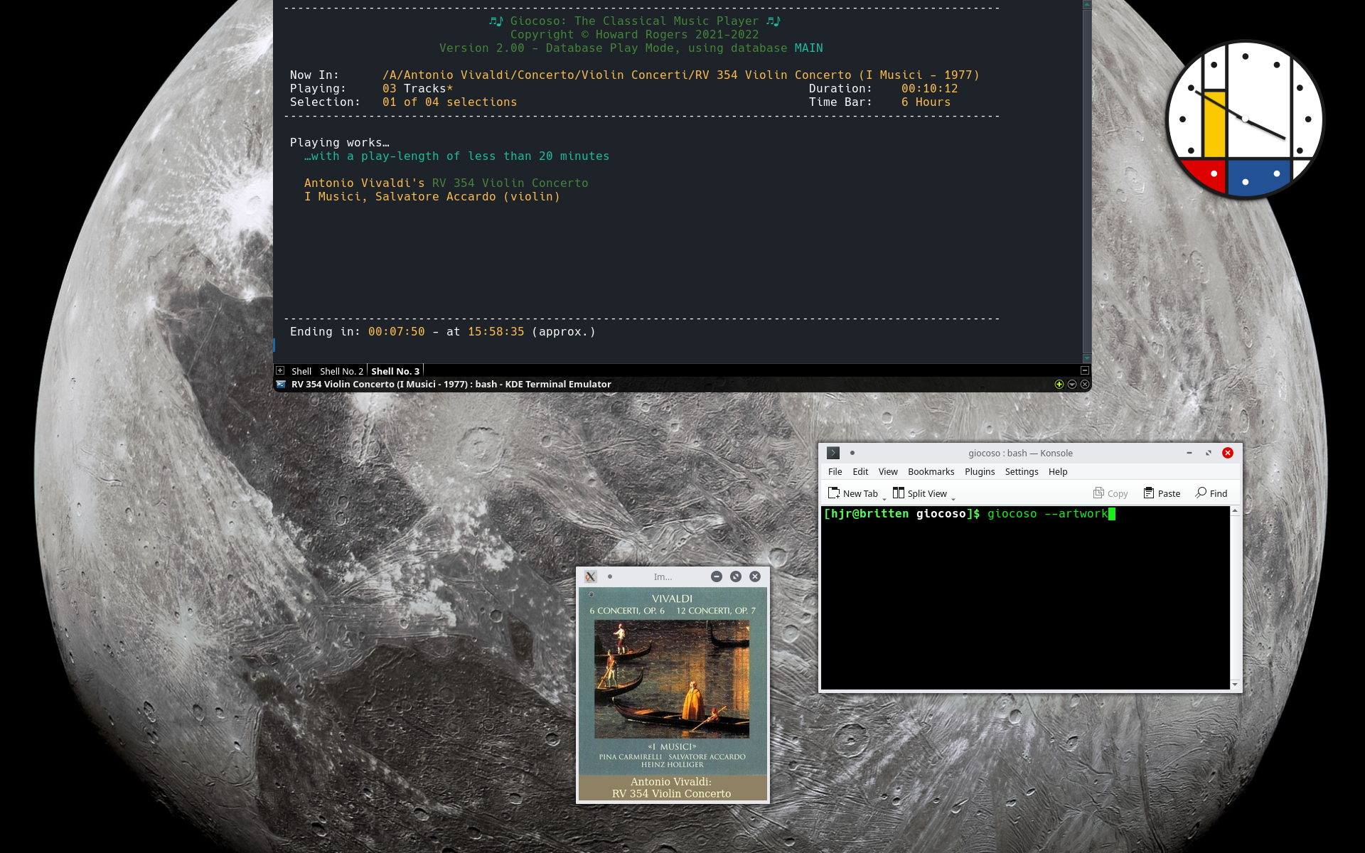
When I submit that giocoso --artwork command in the smaller terminal window, this happens:
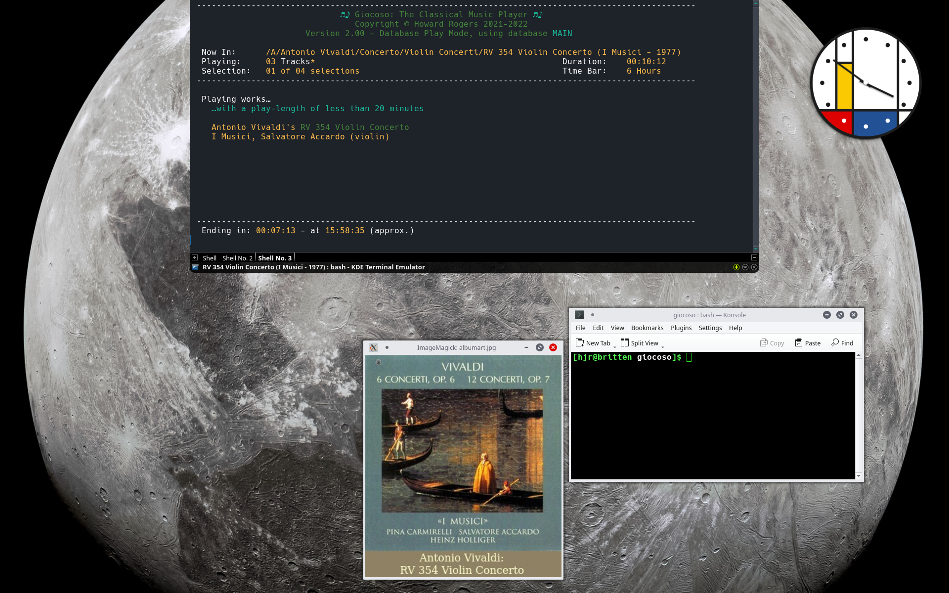
You can now that the album artwork for the Vivaldi is now displayed significantly larger than before: the small album art panel has been killed off and replaced by the 'medium sized' equivalent. The same would happen if you'd originally launched the playing Giocoso session with --artsize=large (the 900x900 album art panel would be replaced by the medium sized one); or with --artsize=none (the non-display of album art at all would be replaced by a medium sized display of the appropriate album art).
You can close the album art panel manually and trigger its re-display by issuing repeated --artwork commands in a second terminal session as many times as you like.
7.0 Conclusion
Summing all of the above up, therefore, we can say:
- Giocoso will display album art if --artsize is set to either small, medium or large; it won't display album art if that parameter is set to none. Artsize can also be set in the persistent configuration file. If not set, or explicitly set to an invalid value, whether by runtime parameter or persistent configuraiton file, medium is the default.
- When album art is displayed, a caption panel is always displayed underneath it, containing the composer's and composition's name, derived from the ARTIST and ALBUM metadata tags
- The caption panel is coloured in one of two ways (1) analysis of colours in the album art ("smartcolour"); or (2) use of a Monopoly®-derived colour scheme that varies, depending on the day of the week or month ("autocolour").
- The default caption panel colouring scheme is smartcolour and will apply unless (1) an --autocolour runtime parameter explicitly overrides the persistent configuration file setting; or (2) unless smartcolour is turned off explicitly turned and autocolour explicitly turned on in the persistent configuration file.
- A second Giocoso session, launched with the --artwork runtime parameter will trigger the medium-sized redisplay of an existing session's artwork. This is the case even if the original Giocoso session was launched with the --artsize=none parameter initially.
For most purposes, the smartcolour algorithm works well and is recommended for general use.
See also:
- Changing Giocoso's Appearance
- Appearance Runtime Parameters
[Back to Front Page]|[Changing Giocoso's Appearance]|[Appearance Runtime Parameters]