 To recap the story so far: I organise my music on disk in a Composer/Genre/Composition hierarchy. I sometimes play music via the Emby Media Server. Emby does not, however, really support a Composer/Genre/Composition hierarchy, tending to go directly from Composer to Composition. Fortunately, if you use Folders view, Emby will mirror your physical layout of files and folders on disk exactly. But -and this is the point we reached in the last post- Composer artwork you may have applied to Emby's Artist View doesn't display in the Folders view... but, if you arrange for JPGs of each composer to be present in each composer folder, named precisely the same as the folder, it will display composer artwork in Folders view automatically.
This gets us 90% of the way to a usable Emby interface -but, unfortunately, it leaves us with some fairly ugly display screens to wade through on the way to finding a particular piece of music to play.
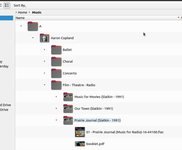
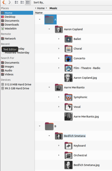
Let's see if I can demonstrate that to you now, using a cut-down copy of part of my music collection! First, let's remind ourselves what my music collection looks like on disk:
Within a Music folder, I create an 'A' folder, to house all the composers whose first names begin with 'A'; so Aaron Copland is the first composer contained in that folder. Inside the Aaron Copland folder, there are separate sub-folders for each genre he wrote in: Ballet, Choral, Concerto and so on. Inside each one of those sub-folders are composition- and recording-specific sub-sub-folders. Note that the 'Aaron Copland' folder has a little image associated with it: that's the Aaron Copland.jpg artwork I put there as part of the Emby 'fix' I discussed in my last post. Each recording folder also displays a little graphic, because the album art has been embedded within each FLAC file it contains, and the File Manager is able to interpret that and display it as the appropriate 'folder thumbnail'. The booklet.pdf that most of my recording folders also contain is also displayed as part of that folder's graphical iconography.
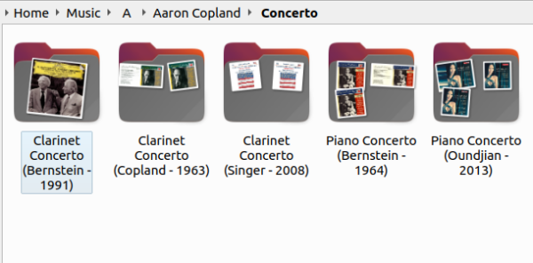
Here's a different File Manager view, with the preview icons configured to be significantly larger than default:
Sometimes, a recording folder will apparently contain only one graphic: the Clarinet Concerto (Bernstein - 1991) folder, for example, is only displaying a single image, whereas the Copland - 1963 folder next to it is displaying two -and the piano concerto folders are both displaying three! The different number of images shown reflect the presence or absence of a booklet.pdf (I only started filing them after I'd ripped a couple hundred CDs, back in the day, I'm afraid!); it also reflects the number of individual FLACs in a folder: where a composition has been ripped to a single whole-piece FLAC, only one image is present. The piano concerto folders, however, each contain two FLACs -one for each separate movement.
Anyway, regardless of the specifics, you can see that there's plenty of graphical goodness in both the Composer and Recording folders. But let's see what Emby displays as we navigate our way through this music collection.
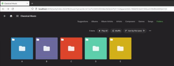
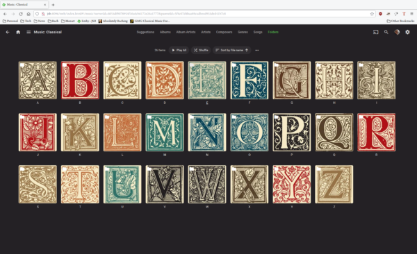
So this is Emby's Folders view of the top of my physical folder structure: the A, B, C and so on 'parent' folders, in which the specific Composer folders are found. They are as devoid of artwork as the same folders were when displayed in the file manager -but, this time, they are huge square icons, rather than the file manager's relatively small representations of filing cabinet folders. The effect in Emby is for the display to look quite garish on the one hand (all those semi-primary colours!) and incredibly dull and boring on the other! But anyway, let us click on one of these folders to see what we get:
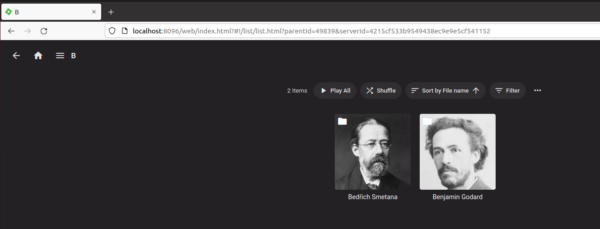
This time, I've clicked into the 'B' parent folder ...and lo and behold, we find two composer-specific folders, with nice photos of each named composer. That's being displayed because in the last post, you'll remember, I copied composer-specific imagery into each composer folder, making sure to name the image file precisely the same as the folder that was housing it. Emby has automatically found appropriately-named artwork, therefore, and is displaying it without my having to do anything to make that happen. The fix described in the last blog post has worked!
Now, drilling into one of those composer folders, we see this:
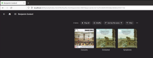
Now Emby displays the genre sub-folders, as it should, if it's mirroring the physical folder hierarchy correctly. But, a keen eye will note that whilst the display is at least colourful, it's also entirely wrong! The imagery here is grabbed from the album art associated with recordings found within the genre folders. That is, the picture being displayed for 'Concerto' is actually the artwork associated with the specific recording of Goddard's first piano concerto. Here, I'm afraid, we have Emby once again jumping a level in the logical folder hierarchy: where we need it to display genres in the abstract, it's decided to grab some album art from a specific recording... and that's not good.
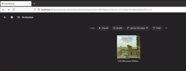
Anyway, let's keep going: if I click on the 'orchestral' icon there, I see this:
Now, we're looking at a specific recording of 'Trois Morceaux' -and, again, if you check, you'll see that it's the album art for this specific recording that was being used for the art work displayed for the 'orchestral' icon in the previous screenshot.
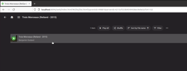
Finally, if I click on that 'Trois Morceaux icon, I get to this:
An item for each FLAC found is now displayed (in this case, there's only one file, comprising all three pieces mentioned in the composition's title!); if you hover over one of those, you see a green 'play' button and can click it to play that specific file. Alternatively, click the 'Play All' button shown toward the top of the display and you can play all the FLACs in this folder, in order, in one hit.
So, summing up: Emby certainly works to play music, in just a few clicks, because it's faithfully reporting the physical folder structures found on the hard disk, just as the file manager does. But: the view of each level is sometimes fine, with appropriate artwork, and sometimes pretty awful, with just multi-coloured squares providing very little by way of visual feedback. Worse, it's sometimes wrong... because the folder will sometimes display artwork associated with a folder below itself, when no other artwork is available. Hence, the genre folders end up showing the artwork associated with the FLACs stored in the recording-specific folders below it.
In this fourth episode of Emby and the art of storing digitial music, therefore, I wanted to explore how to fix up these display quirks, so that each screen as you navigate through it provides good and accurate visual feedback, to help you better navigate the folder hierarchy. There's really only one trick to getting this right -and that's remembering the lesson we learnt in the last post. If a JPG or PNG is found in a folder; and if its name matches the name of the folder exactly; then Emby will use that JPG or PNG as the artwork for that folder's display in its various screens.
I mean, for example, if we had a JPG that depicted, say, something to do with orchestras, and it was called Orchestra.jpg, and it was stored in one of those Orchestra genre folders, then Emby would use that when displaying the genre-level folders, not the artwork grabbed from the recording-specific folder beneath it. Let's see if I can demonstrate that. First, I need a JPG or PNG that represents 'Orchestral' -which is a bit of a tall order! We're talking adjectives and generalities, after all 🙂
But how about this:
 I mean, it's not brilliant, but it's sort-of 'orchestra-y', in a conceptual, non-specific kind of way, right?!
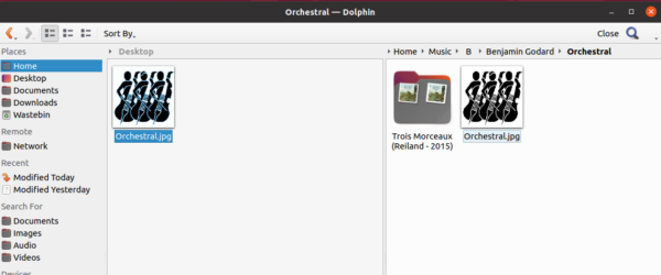
Let me now physically copy that icon into the appropriate folder on my hard disk:
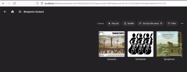
Here you see I've copied the 'Orchestral.jpg' into the Orchestral genre sub-folder belonging to Benjamin Goddard. If I now click into Emby's Settings -> Advanced -> Scheduled Tasks and manually run the 'Scan media library' job to completion, and then re-navigate my way through its Folders view, I see this:
And bingo! The Orchestral genre folder is now displaying the genre-themed artwork, not the album-specific stuff that the other two folders are still displaying: this is the kind of display we really want to see, and all it takes to get it right is to copy a genre JPG (or PNG) into every genre sub-folder, for every composer. Which sounds reasonable when you're dealing with a cut-down copy of part of your music collection in a virtual machine! When you have 570+ composers, each of which has maybe up to 12 genres, that's a lot of file copying, and I had zero intention of copying genre icons nearly 7000 times 🙁
Fortunately, a little Bash scripting can come in hand. Assume your genre icons are all found in a folder called /home/hjr/music/Classical Music Genres; that they're all JPG files; that they each have a name that exactly matches the equivalent genre folder (i.e. Orchestral.jpg, Symphonic.jpg and so on, with genre folders then called Orchestral, Symphonic and so on); and that your music collection is housed within a folder called /home/hjr/Music. Then this script will copy the correct icon to the correct genre folder for every composer, en masse:
iconDir="/home/hjr/music/Classical Music Genres"
rootDir="/home/hjr/Music"
find "$rootDir" -type d -exec sh -c '
iconDir="$0"
for thisDir in "$@"
do
iconName="${thisDir##*/}.jpg"
[ -f "$iconDir/$iconName" ] && echo /usr/bin/cp -rp \""$iconDir/$iconName"\" \""$thisDir"\" > $HOME/Desktop/copygenres.sh
done
' "$iconDir" {} +
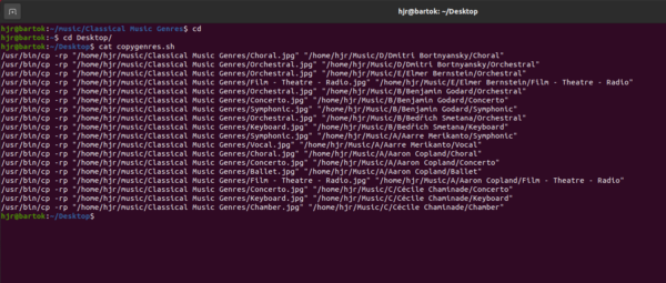
Actually, the script won't itself copy anything: the third line from the end says to output a sequence of copy commands that would do all the required copying to a text file on your desktop, called 'copygenres.sh'. The idea is to generate a bunch of copy commands in a way that allows you to review them from sanity, but without itself actually splattering a bazillion icon files around your music collection's folders! In my case, for example, I can review the copygenres.sh file, and I'll see this:
...and those copy commands certainly look reasonable. I can then run them all at once (and thus actually get my genre icons copied throughout my music collection) with the command:
sh $HOME/Desktop/copygenres.sh
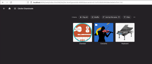
Once that's run, I can again run the Emby scheduled task for scanning the media library, and next time I start navigating through the various folders of my collection, I'll see this:
Here, you see that all three genres in which Cécile Chaminade composed have all got their appropriate 'genre-themed' icon. I'm sure you could find or draw or think up better icons to represent each of the possible genres than I've managed to do here, but at least the genres aren't incorrectly using album-specific artwork... and there's some sort of visual clue about the sorts of composition you'll find behind each genre folder, at least!
Back in the File Manager, too, the folders now appear a bit more colourful and a bit more informative than before:
Every composer has his/her artwork as before... but now every genre sub-folder has its own unique icon too. I've made all my icons available from my 'List of Genres' page, incidentally, so if you want to use the same icons for yourself, go right ahead and download them from there.
There's just one last remaining fly in the ointment: the initial capital letters that separate the 'A' composers from the 'B' ones. Those folders are still blank: they have no 'alphabet-themed' icons stored within them, so the file manager still shows them as boring, vanilla filing cabinet folders, lacking anything distinctive. This is therefore still something Emby does too. The fix, once again, is to copy some alphabet artwork into the 26 separate parent folders, where the name of the artwork file exactly matches the name of the folder it's being copied to. Thus A.jpg will go in the A folder; B.jpg to the B folder, and so on. Twenty six bits of file copying is not really excessive -but, change the name of the 'iconDir' folder mentioned at the start of my earlier script to whatever folder contains your choice of 26 alphabet icons and you can re-run that script to achieve this file copying in bulk too.
For my real music collection, I decided to go for something a bit William Morris-y for my alphabet icons. The result is this:
...which might be a bit 'busy' for many people's tastes, but suits me nicely!
So now our story of knocking Emby into shape comes to a close. Summing everything up:
- Use the Folders view to get Emby correctly working with your chosen physical storage model for your music collection, skipping no points of the organisational hierarchy
- Put appropriate composer artwork into each Composer folder, making the name of the artwork match that of their folder exactly
- Put appropriate genre and alphabet artwork into every genre sub-folder and parent alphabet-letter folder, again making sure that the name of the file in each case matches the name of the folder it's being placed into
- Manually get Emby to re-scan its media library folders (or wait 12 hours when it will re-scan them automatically anyway)
Do all of that, and Emby becomes an attractive, visually pleasing and visually informative way of navigating your physical, digital music collection in an intuitive manner. Here's how I navigate its now properly-decorative screens to play a particular piece of Benjamin Britten, for example:
...and I find that both visually pleasing and (more importantly) highly effective.
